You've got a spreadsheet full of numbers, maybe its ad spends vs. sales revenue, or study hours vs. exam scores, and you want to know: is there actually a relationship here?
An scatter chart answer that question instantly. Instead of squinting at rows of data, you get a visual map where patterns, trends, and outliers jump out at you. And if you're using Google Sheets, you're just a few clicks away from building the scatter chart.
This guide walks you through everything: what a scatter chart is, how to create one in Google Sheets, common mistakes to dodge, and how ChartApps can make the whole process even smoother.
What Is a Scatter Chart?
A scatter chart (also called a scatter plot or XY graph) places individual data points on a two-dimensional grid. Each dot represents one observation, its horizontal position shows one variable, and its vertical position shows another.
Use a scatter chart when you want to:
- Explore the relationship (or correlation) between two numeric variables
- Identify data points that deviate from the overall pattern.
- Visualize clusters within a dataset
- Add a trendline to understand direction and strength of a relationship
Don't use a scatter chart for:
- Comparing categories (create a bar chart instead)
- Tracking changes over time (create a line chart to track better)
- Showing proportions or percentages (create a pie chart to track better)
- Non-numeric data on either axis
Example: You want to see if more marketing spend leads to more sales. Plot marketing spends on the X-axis and sales revenue on the Y-axis. Each month becomes a dot. If the dots trend upward left to right, you've got a positive correlation.
Quick Answer: How to Create a Scatter Chart in Google Sheets?
Select your two columns of data, click Insert → Chart, then change the chart type to "Scatter chart" in the Chart Editor. Customize the title, axis labels, and add a trendline if needed. Your scatter chart is ready in under two minutes.
How to Create a Scatter Chart in Google Sheets (Step-by-Step)
Here's the example we'll use throughout this guide, marketing spend vs. monthly sales revenue:
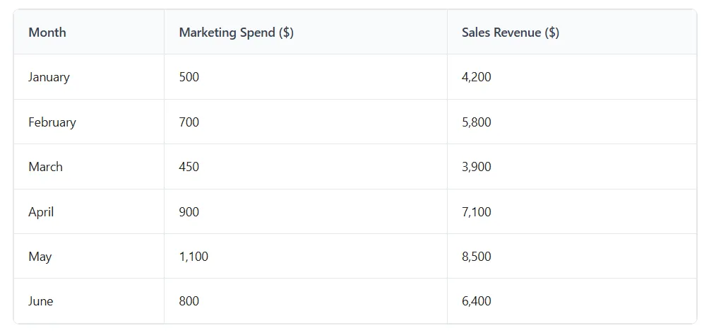
Step 1: Organize Your Data
Put your two variables in side-by-side columns. The first column becomes the X-axis (horizontal), and the second becomes the Y-axis (vertical). Include a header row with clear labels, this helps Google Sheets title your axes automatically.
Make sure there are no blank rows or merged cells in your data range.
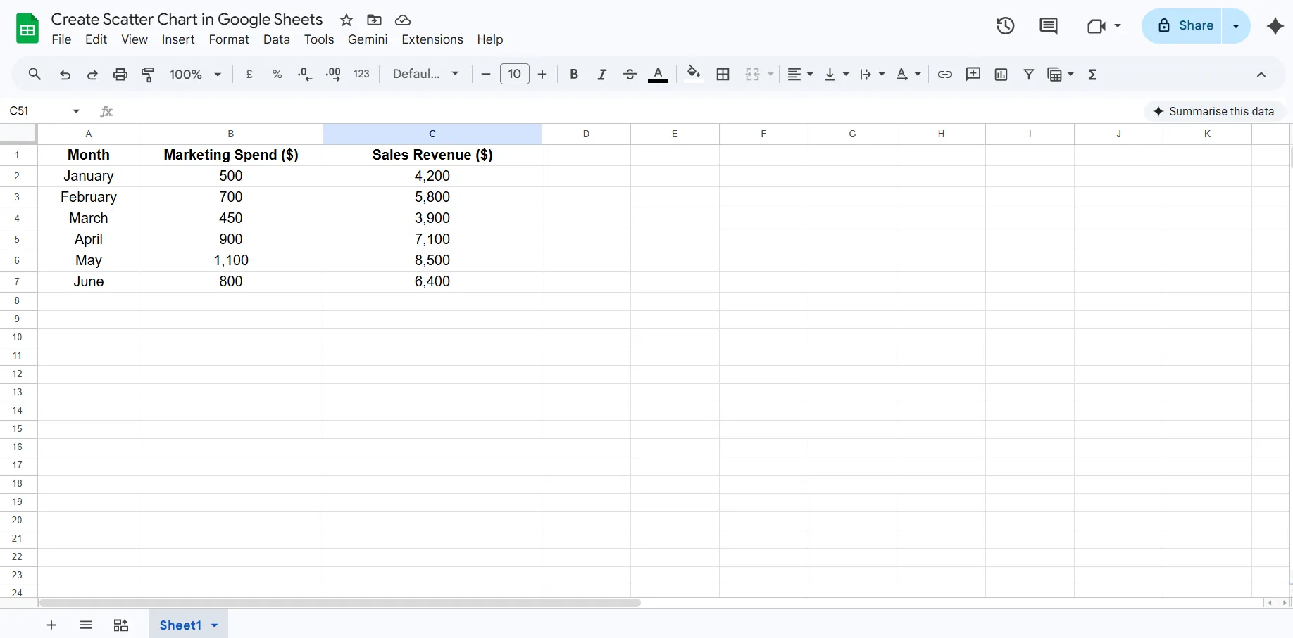
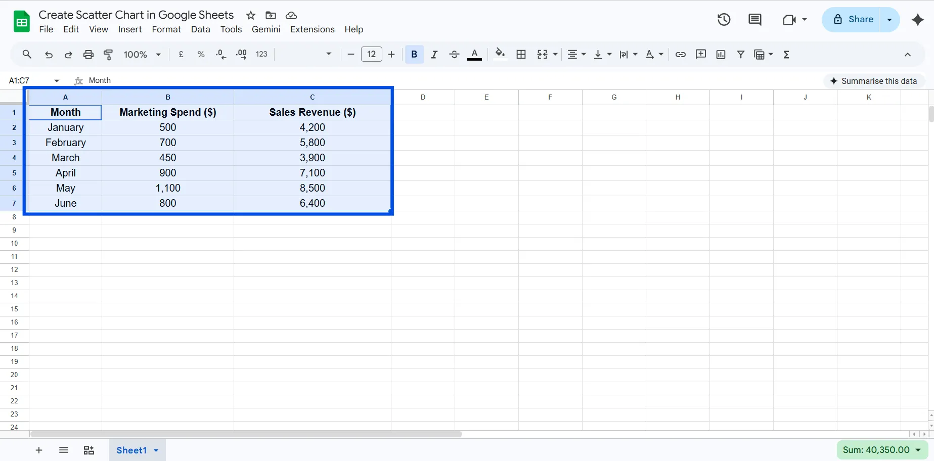
Step 2: Select Your Data
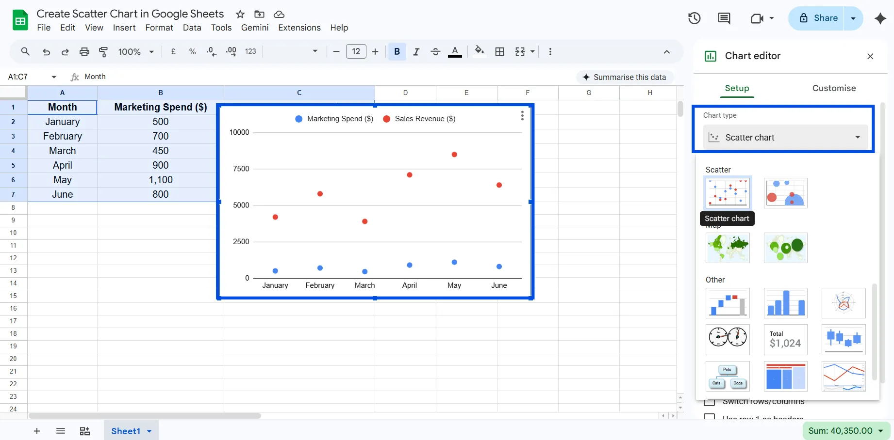
Click on the first cell of your data range and drag to select all rows including the header. In the example above, you'd select A1:C7, all months and both numeric columns.
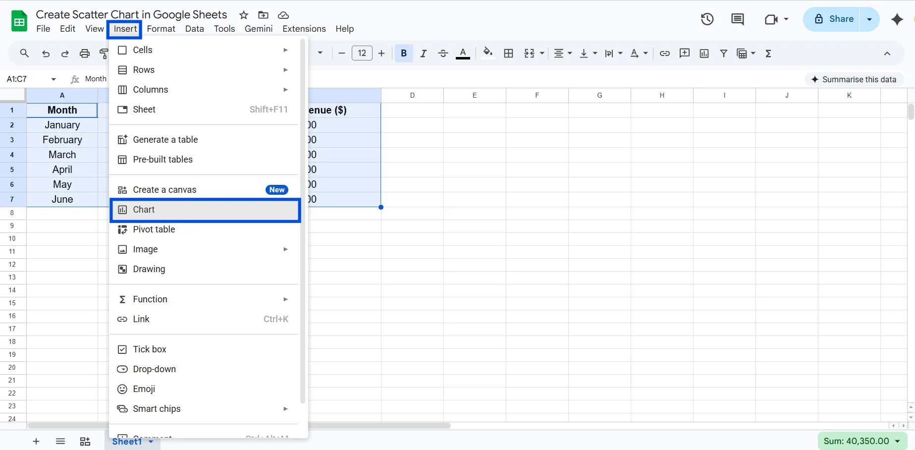
Step 3: Insert a Chart
Go to the menu bar and click Insert → Chart. A chart will appear on your sheet, and the Chart Editor panel opens on the right side.
Step 4: Change the Chart Type to Scatter
Google Sheets might auto-suggest a bar or line chart. Don’t worry, just head to the Setup tab in the Chart Editor, click the Chart type dropdown, and select Scatter chart. You’ll see your data points plotted instantly.
Step 5: Customize Your Scatter Chart
This is where your chart goes from functional to polished:
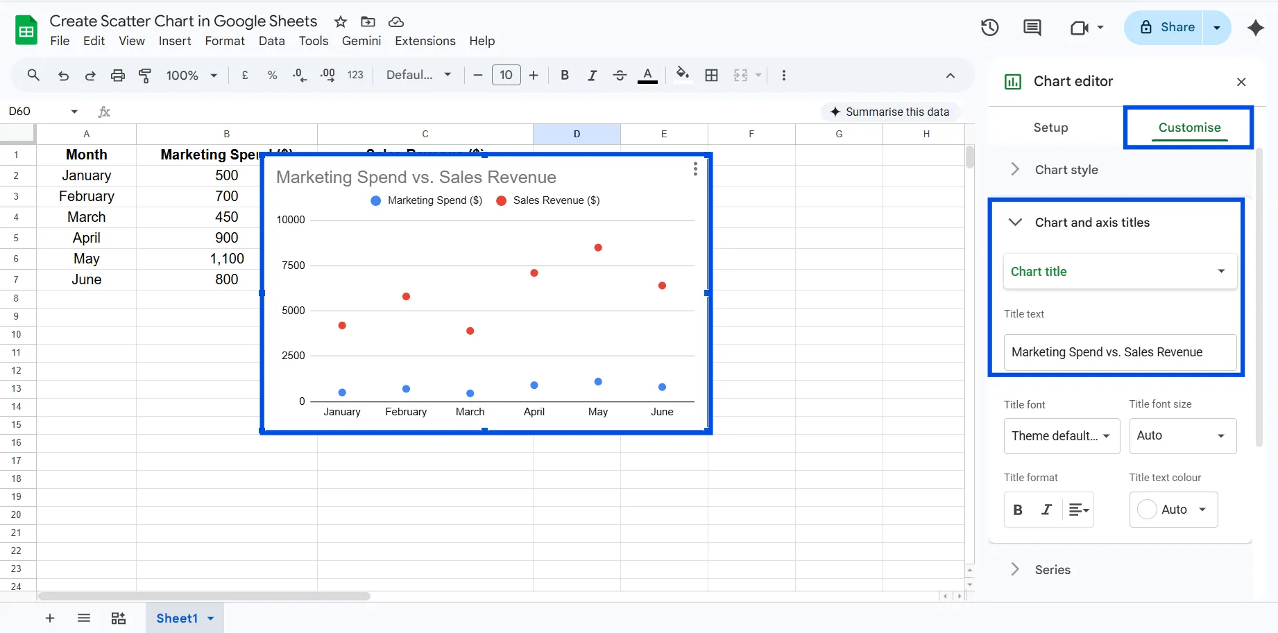
Chart & Axis Titles: Click the Customize tab, then Chart & axis titles. Add a descriptive chart title like "Marketing Spend vs. Sales Revenue." Label both axes clearly.
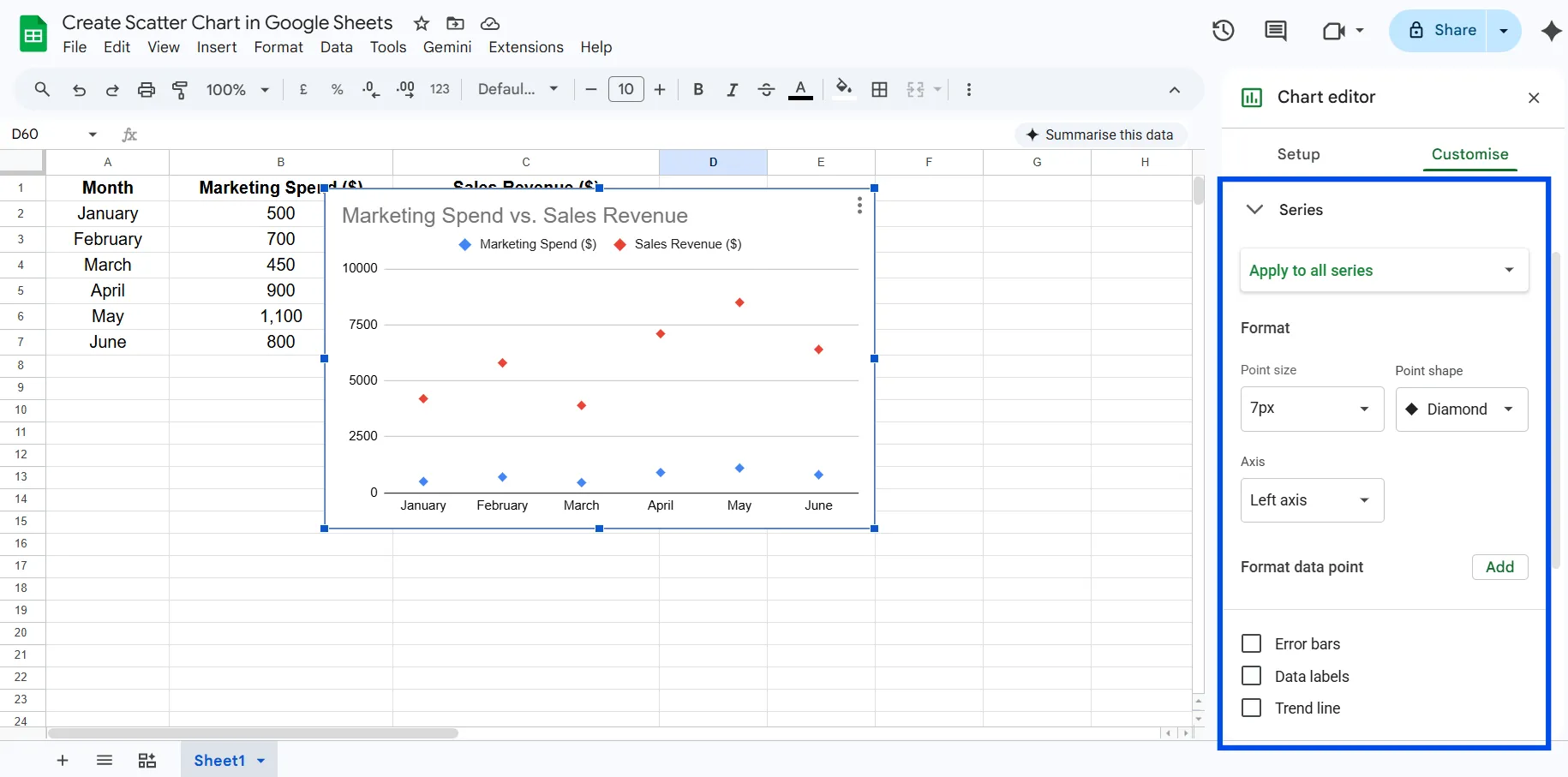
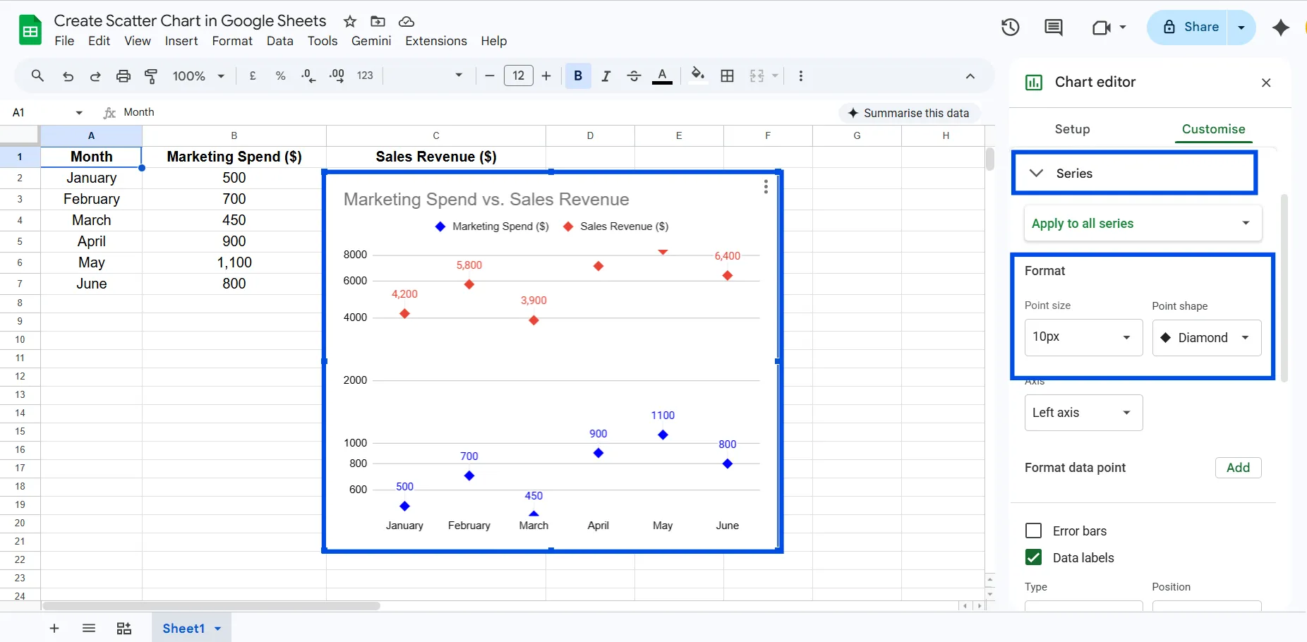
Point Style: Under Series, change point shape (circle, square, diamond) and point size for better visibility.
Colors: Assign a distinct color to your data series, especially useful if you're plotting multiple series.
Step 6: Move and Resize
Click anywhere outside the chart to deselect. You can drag the chart to any position on your sheet and drag the corners to resize it. Double-click anytime to re-open the editor.
Types of Scatter Charts in Google Sheets
Google Sheets keeps chart selection simple. In the scatter category, you’ll find only two actual chart types:
Scatter Chart
This is the standard chart used to plot relationships between two numeric variables.
Key features:
- X-axis and Y-axis plotting
- Supports multiple series
- Can include trendlines and labels
Best for: Correlation analysis, pattern detection, and outlier identification.
Bubble Chart
A bubble chart is an advanced version of a scatter chart that adds a third dimension using point size.
Key features:
- X-axis (first variable)
- Y-axis (second variable)
- Bubble size (third variable)
Best for: Showing deeper insights when an additional variable matters.
Advanced Scatter Chart Techniques in Google Sheets
Once you’ve created a basic scatter chart, you can enhance it using Google Sheets’ customization options. These aren’t separate chart types in the UI, but powerful variations built on top of the scatter chart.
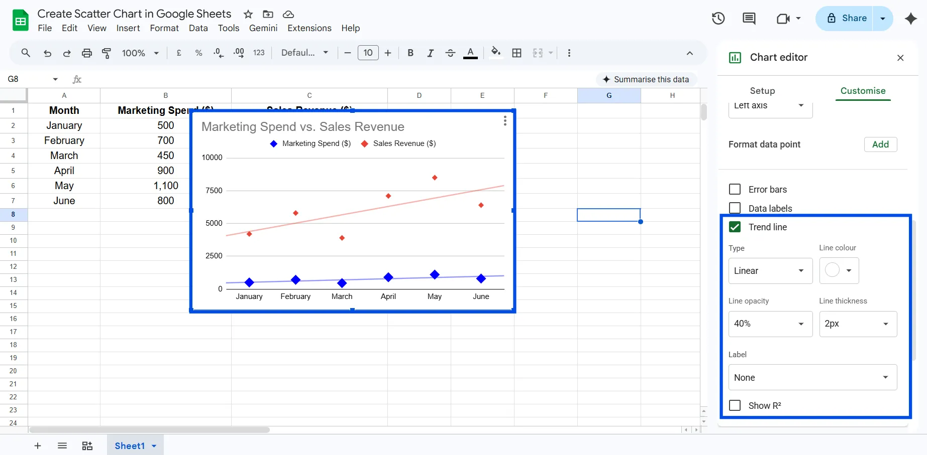
Add a Trendline
A trendline helps you quickly understand the overall direction of your data.
- Go to Customize → Series → Trendline
- Choose from linear, exponential, or polynomial
Use this when: You want to identify correlation or make simple predictions.
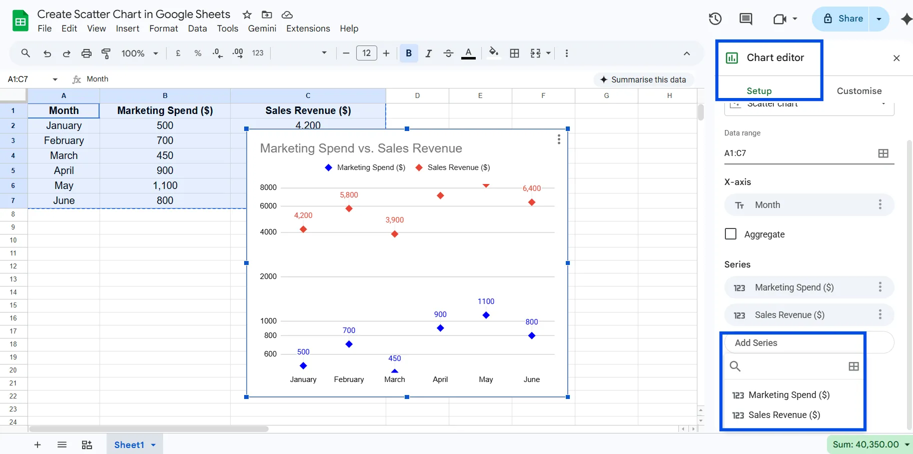
Create a Multi-Series Scatter Plot
You can compare multiple datasets on the same chart by adding additional series.
- Add another numeric column
- In Chart Editor → Setup → Add Series
Use this when: Comparing campaigns, regions, or different variables side-by-side.
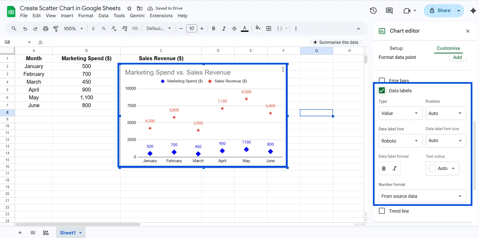
Use Data Labels
Adding labels makes your chart easier to interpret, especially in reports.
Customize → Series → Data labels
Use this when: You want to highlight specific points (e.g., months or product names).
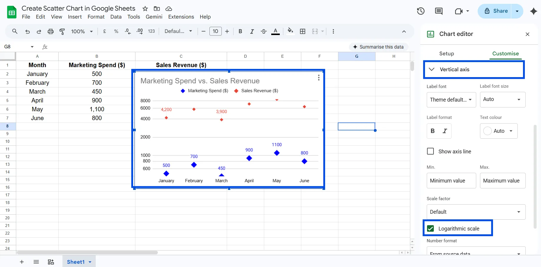
Apply Logarithmic Scale
If your data varies widely, a log scale helps reveal hidden patterns.
Customize → Horizontal/Vertical axis → Enable log scale
Use this when: Working with exponential growth or skewed datasets.
Adjust Axis Range (Zoom Effect)
Instead of starting from zero, you can focus on your actual data range.
Customize → Axis → Set min/max values
Use this when: You want clearer pattern visibility without distortion.

Style for Clarity
Small visual tweaks can dramatically improve readability:
- Increase point size
- Change point shape
- Use contrasting colors (avoid red/green combinations)
Common Mistakes to Avoid
- Non-numeric data on an axis: Scatter charts require numbers on both axes. Text categories belong in a bar chart.
- Reversed columns: The first column you select becomes the X-axis. Make sure the independent variable (the one you're "controlling") goes in the first column.
- Skipping the header row: Without headers, Google Sheets can't label your axes automatically, making the chart harder to read.
- Too few data points: A scatter chart with 3 or 4 points isn't meaningful. Aim for at least 10 - 15 observations to reveal real patterns.
- Ignoring outliers: That one dot far from the rest isn't a display error. It's a real data point worth investigating before you draw conclusions.
Pro Tips for Better Scatter Charts
Add a descriptive trendline: A trendline tells the story of your data in a single line. For most datasets, start with the linear option, it's easy to interpret. If your data curves, try polynomial or exponential.
Label both axes clearly: "X" and "Y" mean nothing to a reader. Write "Monthly Ad Spend and “Sales Revenue” so the chart is self-explanatory.
Clean your data first: Missing values, duplicates, or data entry errors will skew your chart. Run a quick scan before inserting.
Use color purposefully: If you're comparing two data series on the same chart, use contrasting colors (not similar shades). Avoid red/green combinations, they're invisible to color-blind readers.
Set custom axis ranges: Under Customize → Horizontal/Vertical axis, you can set a minimum and maximum value. Zooming into your data range (instead of starting at zero) often makes patterns much clearer.
Creating a Scatter Chart with ChartApps
Google Sheets is great for quick charts, but if you want more visual flexibility or if you're creating charts regularly for reports, presentations, or dashboards, ChartApps is worth knowing about.
ChartApps is a dedicated charting tool built for speed and design quality. It connects to your data and produces publication-ready charts without the back-and-forth of customizing inside a spreadsheet editor.
How to Create a Scatter Chart in ChartApps
- Sign up or sign in to ChartApps.
- Connect your Google Sheets data to ChartApps.
- Click “New Block” and add a Chart Block. A chart with dummy data will appear, allowing you to experiment with the chart.
- Select your Data Source in the top right “Properties” tab
- Choose the X-axis in the Chart Configuration (for example, Month).
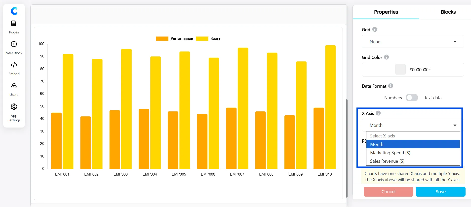
- Add the Y-axis using the Axes Configuration.
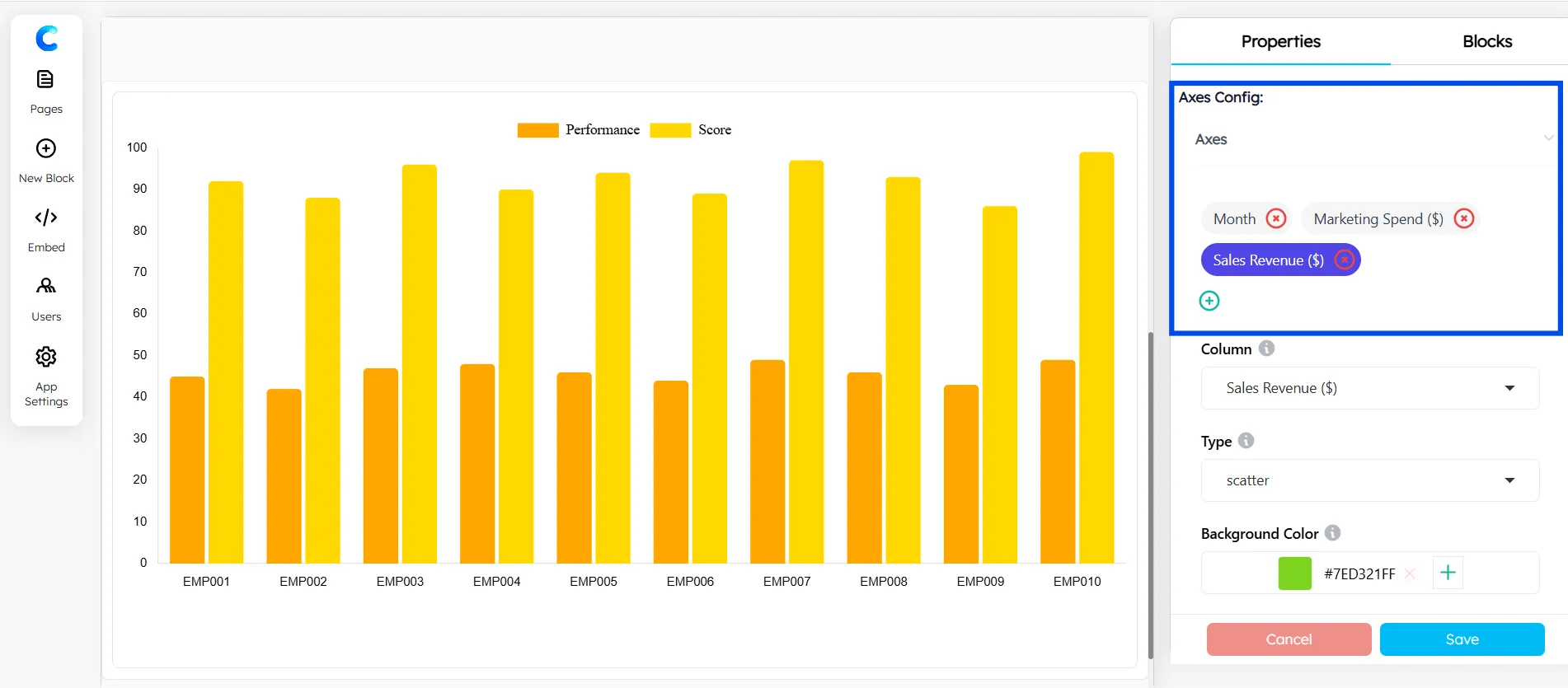
- Select Scatter Chart for each axis from the available chart types.
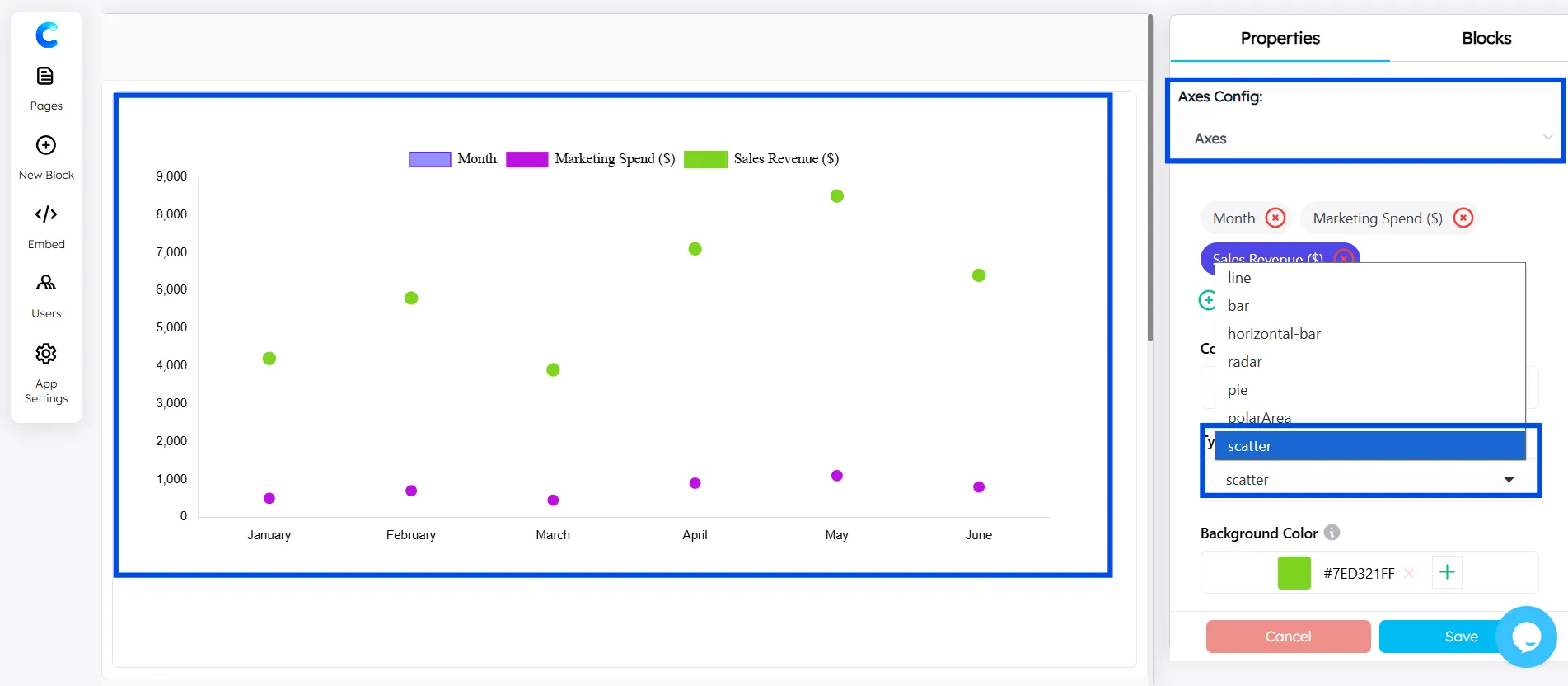
The whole process takes about 90 seconds once your data is ready. You can try ChartApps for additional styling and export flexibility.
Key Takeaways
- A scatter chart plots two numeric variables to reveal correlations, clusters, and outliers.
- In Google Sheets: select your data → Insert → Chart → change type to Scatter chart.
- Always label both axes and include a descriptive title.
- Add a trendline to make the relationship direction obvious briefly.
- Keep your data clean, blank rows and text values break scatter charts.
- ChartApps is a faster, more design-friendly alternative for client-facing or published charts.
Conclusion
Creating a scatter chart in Google Sheets is one of the most practical data skills you can pick up. In just a few clicks, you can turn a column of numbers into a clear visual story about correlation and patterns.
If you need something more polished for a presentation or report, you can try ChartApps. It works with the same data and offers more control over styling and export options. At the same time, creating a chart in Google Sheets is quick and efficient, making it a great choice for fast analysis, internal reporting, and everyday data visualization.
Frequently Asked Questions
What is the purpose of the scatter diagram?
A scatter diagram (or scatter plot) is a graphical tool used to analyze the relationship, correlation, and pattern between two paired numerical variables. It is primarily used to identify potential root causes of problems, visualize trends, and detect outliers by plotting data points on a horizontal (X) and vertical (Y) axis.
What is the difference between a scatter plot and a line chart?
A scatter chart shows individual data points with no connection between them — it's used to find correlations. A line chart connects data points in sequence to show change over time. Use scatter for "do these two variables relate?" and line for "how did this change month by month?"
How to read a scatter diagram?
Reading a scatter plot involves identifying the relationship between two variables by analyzing the direction, form, and strength of clustered data points. Key steps include checking axis labels (independent vs. dependent), identifying positive or negative correlations, noting the linearity, and looking for outliers or clusters.
What data do I need to create a scatter plot in Google Sheets?
You need two columns of numeric data, one for the X-axis and one for the Y-axis. There's no minimum row count, but at least 10 data points will give you a meaningful picture. Make sure both columns contain numbers, not text.