TL; DR: To create a line graph in Google Sheets, select your data → click Insert → Chart → in the Chart Editor, choose "Line chart" as the chart type → customize and publish. That's it in 5 seconds.
Want a complete guide with expert tips, multiple line graph insights, and real-world applications? continue reading for deeper understanding.
Want a complete guide with expert tips, multiple line graph insights, and real-world applications? continue reading for deeper understanding.
What Is a Line Graph and How to Use It Effectively?
A line graph (also called a line chart) is a type of data visualization that connects individual data points with a continuous line. It's one of the most powerful tools in any analyst's or marketer's arsenal and Google Sheets makes it freely accessible to everyone.
Line graphs excel at one thing above all others: showing change over time. Whether you're tracking monthly revenue, website traffic week by week, or temperature fluctuations across a year, a line graph turns raw numbers into an instantly readable story.
Here's why line graphs are so widely used:
- They reveal trends briefly. Upward or downward patterns are immediately visible.
- They handle time-series data naturally. Dates, months, and quarters sit perfectly on the X-axis.
- They support comparison. Multiple lines let you compare two or more data series side by side.
- They're universally understood. Any audience, from executives to clients, can read a line graph without explanation.
In Google Sheets specifically, line graphs are built directly into the charting engine, meaning you can go from raw data to a publishable visual in under two minutes.
When Should You Use a Line Graph in Google Sheets?
Line graphs are powerful, but they're not always the right chart type. Here's a quick decision framework:
Use a line graph when:
- Plotting data over time (days, weeks, months, quarters, years)
- Show trends, growth, or decline
- Comparing two or more continuous data series
- X-axis represents a continuous or ordered variable (e.g., time, age, temperature)
Don't use a line graph when:
- Categorical data with no natural order is better represented using a bar chart.
- Data showing parts of a whole is more effectively visualized with a pie or donut chart.
- Having fewer than three data points can make a line graph appear incomplete.
- Disconnected data can lead to misleading interpretations when displayed as a line graph.
Real-world use cases where line graphs shine:
- Monthly sales performance tracking
- Website traffic over a campaign period
- Stock price movement analysis
- Product usage metrics over time
- Year-over-year comparison of KPIs
- A/B test result tracking across a test window
How to Make a Line Graph in Google Sheets (Step-by-Step)
Let's walk through the complete process from scratch. We'll use a simple monthly sales dataset as our example.
Step 1: Prepare Your Data
Before you open a single menu, your data needs to be structured correctly. Google Sheets is smart, but it needs a clean starting point.
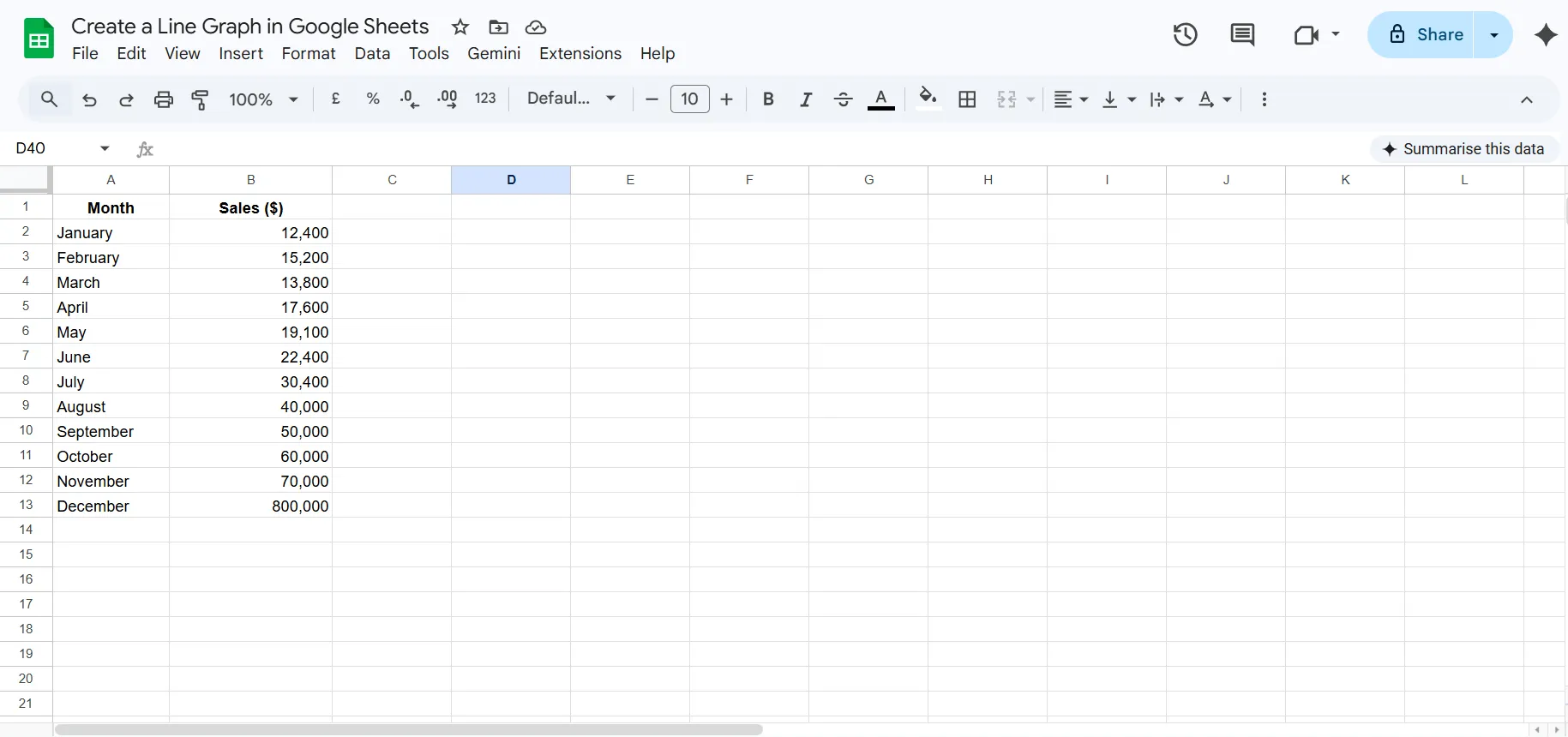
Key rules for good data structure:
- Row 1 should be your headers. These become the chart's labels automatically.
- Column A is typically your X-axis (the independent variable - usually time).
- Column B onwards is your data (the dependent variable - the values being measured).
- No blank rows or columns in the middle of your dataset.
- Keep data in a single contiguous range (e.g., A1:B7, not A1:A7 and C1:C7 with a gap).
Pro Tip: If your dates are stored as text rather than actual date values, Google Sheets may not sort them correctly. Always format date columns as proper dates using Format → Number → Date.
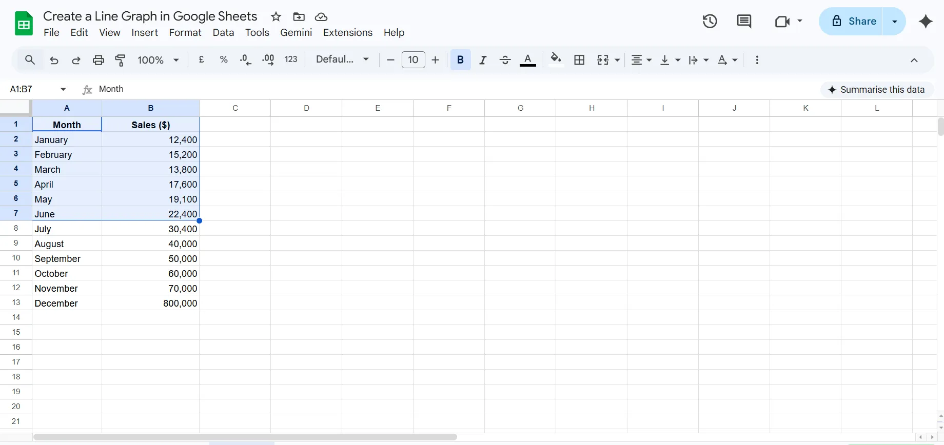
Step 2: Select Your Data Range
Click on cell A1 and drag to the last cell of your data (B7 in our example). You should see the entire dataset highlighted in blue.
Shortcuts:
- To select an entire column of data: click the column header letter.
- To select non-contiguous columns (e.g., A and C but not B): hold Ctrl (Windows) or Cmd (Mac) while selecting.
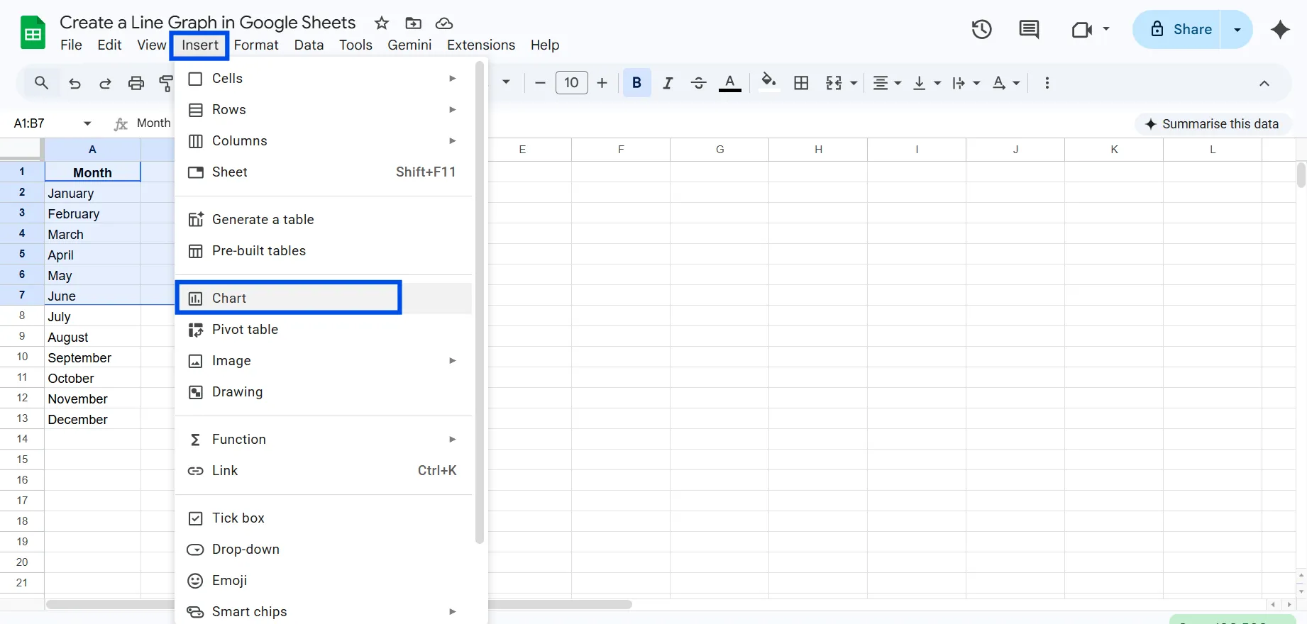
Step 3: Open the Chart Editor
With your data selected, navigate to the top menu and click:
Insert → Chart
Google Sheets will automatically create a graph in your spreadsheets and open the Chart Editor panel on the right side of the screen.
Step 4: Change the Chart Type to Line Chart
Google Sheetṡ will create a bar chart as default. To change the chart type, in the Chart Editor panel on the right:
- Make sure you're on the Setup tab.
- Scroll down to the Line section.
- Click Line chart.
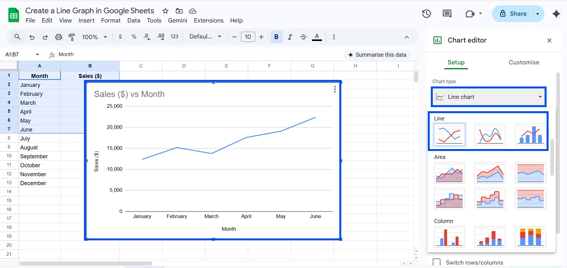
Your chart will immediately update to display a line graph.
Note: If you want a smooth line, select Smooth line chart from the same dropdown. For a filled area, select Area chart.
Step 5: Verify Your Data Range
Still in the Setup tab, look at the Data range field. It should show the exact range you selected (e.g., Sheet1! A1:B7).
If it's wrong, click the field and type the correct range manually, or click the grid icon to select it visually.
Also check:
- X-axis: Should show your date/label column (Column A in our example).
- Series: Should show your data column (Column B, "Sales ($)").
If these are swapped or incorrect, you can manually reassign them using the dropdowns in the Setup tab.
Step 6: Customize Your Line Graph
Click the Customize tab in the Chart Editor. This is where the chart comes alive. Here's what you can configure:
Chart & axis titles:
- Chart title (e.g., "Monthly Sales Performance - 2026")
- Subtitle (optional)
- Horizontal axis title (e.g., "Month")
- Vertical axis title (e.g., "Revenue ($)")
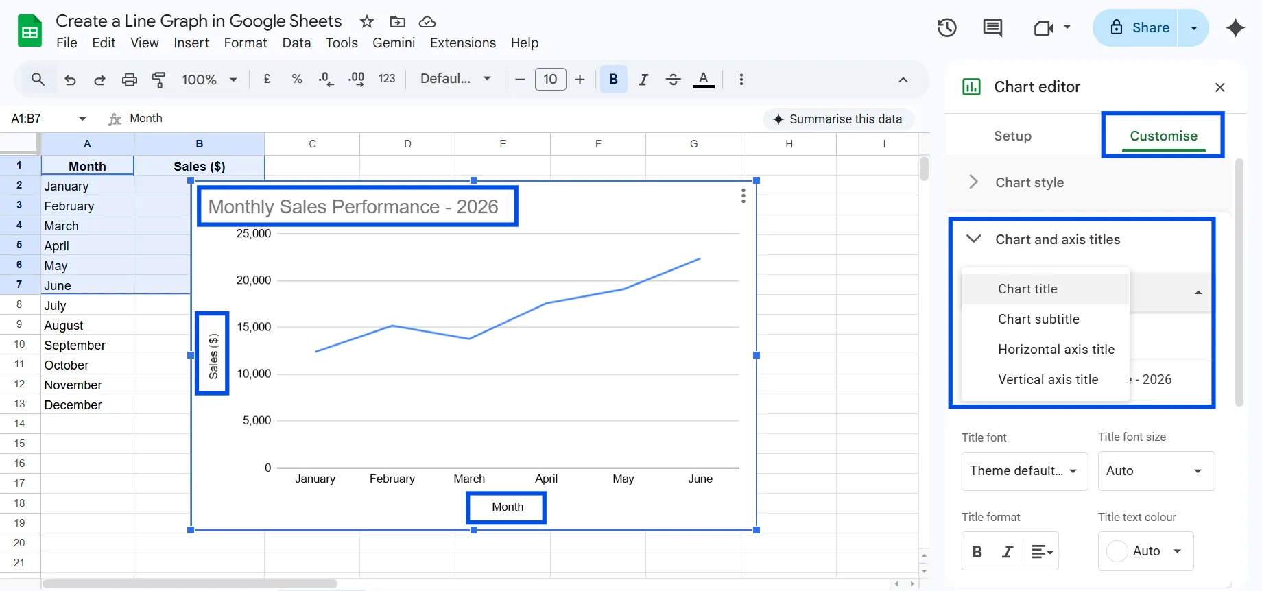
Chart style:
- Background color (white is clean for presentations; transparent works well for dashboards)
- Font family for all chart text
- Border color and width
Series:
- Line color (use your brand color for consistency)
- Line thickness (2px is standard; 3-4px for emphasis)
- Line style (solid, dashed, or dotted)
- Point size (add dots at each data point for precision)
- Point shape (circle, triangle, square, etc.)
Legend:
- Position (top, bottom, left, right, or inside)
- Font size and style
Gridlines and ticks:
- Major and minor gridlines on both axes
- Tick marks
Step 7: Move the Line Chart to its Own Sheet (Optional)
By default, your chart appears floating on top of your spreadsheet data. This can make it hard to work with both simultaneously.
To move the chart to its own dedicated sheet:
- Click the three-dot menu in the top-right corner of the chart.
- Click Move to own sheet.
- Google Sheets creates a new tab called "Chart 1" (you can rename it).
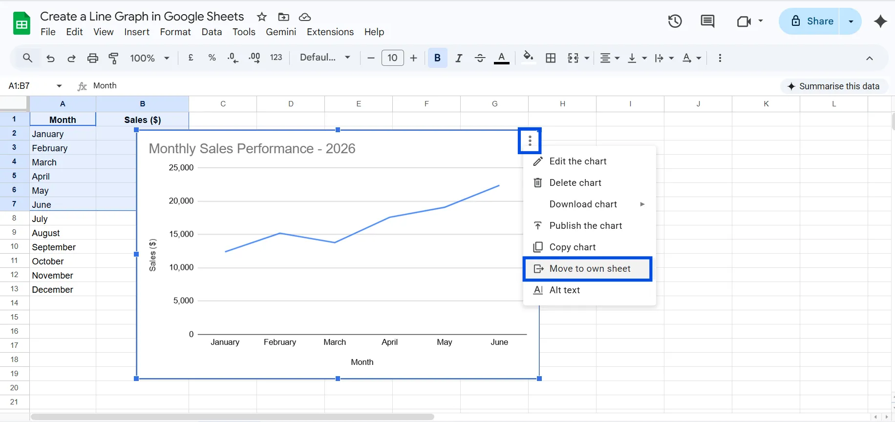
This is especially useful when you want to present or share the chart without showing the underlying data.
Step 8: Save and Share
Your line graph is now complete. Google Sheets auto-saves, so there's nothing to manually save.
To share the chart:
- Share the whole spreadsheet: Click the blue Share button in the top-right corner.
- Download the chart only: Click the chart → three-dot menu → Download → choose PNG, PDF, or SVG.
- Embed in a website: Three-dot menu → Publish chart → copy the embed code.
How to Create a Line Graph with Multiple Lines in Google Sheets
One of the most powerful things you can do in Google Sheets is plot multiple data series as separate lines on the same chart. This lets you compare trends visually without juggling multiple charts.
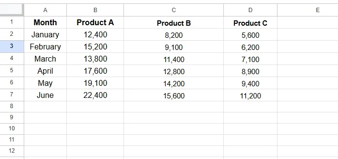
Setting Up Your Data for Multiple Lines
The key is to structure your data so that each series occupies its own column, with a shared X-axis column.
Comparing sales across three product lines:
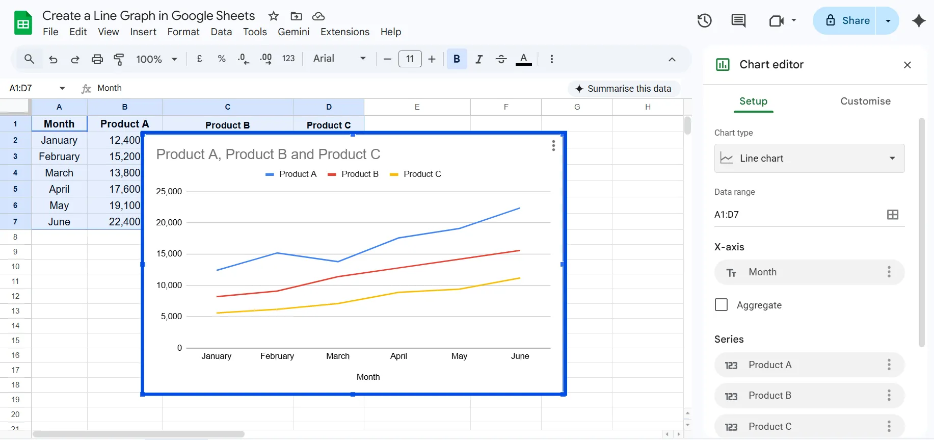
Step-by-Step: Multiple Lines
- Select the entire dataset including all columns (A1:D7 in the example above).
- Go to Insert → Chart.
- In the Chart Editor, select Line chart as the chart type.
- Google Sheets automatically creates three separate lines, one for each product column.
- Each line is assigned a different color automatically.
How to Customize Your Line Graph Like a Pro
The difference between a chart that communicates and one that impresses is usually in the details. Here's a complete breakdown of every customization option available in Google Sheets' line chart editor.
Chart Title and Subtitles
The title is the headline of your chart. Don't just describe what the data is, tell the reader what to conclude from it.
How to change it: Customize tab → Chart & axis titles → Chart title → type your title → adjust font, size, and color.
Axis Formatting
For the vertical (Y) axis:
- Set a minimum value. If all your data is between 10,000 and 25,000, don't start the axis at 0, start it at 8,000 to emphasize the variation.
- Add a unit suffix (e.g., "K" for thousands) in the axis label instead of showing "22,400."
- Toggle gridlines on or off depending on chart density.
For the horizontal (X) axis:
- Rotate labels if they're long (e.g., month names overlapping).
- Set the label font size so it's readable at the chart's intended display size.
Line and Point Styling
- Thicker lines (3-4px) work better for presentations shown on large screens.
- Thinner lines (1-2px) work better for dense dashboards with many charts.
- Adding data points (circles, squares, etc. at each data value) helps readers identify exact positions, especially in smooth line charts where interpolation can mislead.
- Dashed lines are conventionally used for projections or forecasts, a useful visual convention to borrow.
Color Strategy
Colors in a chart serve three purposes: identification (this is Product A), emphasis (this series is the one to focus on), and branding (these are company colors).
- Use your primary brand color for the most important line.
- Use gray for comparison lines that are context, not focus.
- Never use more than 6-7 distinct colors on a single chart.
Background and Borders
- Keep backgrounds white or light gray for documents and reports.
- Use transparent backgrounds for charts that will be embedded in dashboards or websites.
- A subtle border (light gray, 1pt) gives the chart a clean frame without being distracting.
How to Make a Smooth Line Graph in Google Sheets
Smooth line graphs use curved interpolation between data points instead of sharp angles. The result is a more visually flowing, aesthetically pleasing chart.
When to Use Smooth Lines
- Use smooth lines when the trend matters more than precise point-by-point accuracy. Marketing dashboards, executive summaries, and presentations benefit from the polished look.
- Avoid smooth lines when exact data point values are critical, the curved line visually implies data exists at positions that may not be real.
How to Enable Smooth Lines
- Open the Chart Editor (double-click the chart or use the three-dot menu → Edit chart).
- In the Setup tab, click the Chart type dropdown.
- Select Smooth line chart instead of the standard "Line chart."
How to Add a Trendline to a Line Graph in Google Sheets
A trendline (also called a line of best fit) draws a mathematically smoothed line through your data to make the overall direction clearer, cutting through noise and fluctuation.
Adding a Trendline
- Double-click your chart to open the Chart Editor.
- Go to the Customize tab.
- Scroll to the Series section.
- Click the Trendline checkbox.
- Choose a trendline type:
- Linear - for steady, proportional growth
- Exponential - for accelerating growth (e.g., viral metrics)
- Polynomial - for curved trends with peaks and valleys
- Moving average - for smoothing out noise in volatile data
- Optionally check Show R² to display how well the trendline fits your data (1.0 = perfect fit, 0 = no fit).
For Example:
Imagine your monthly website traffic data fluctuates significantly week to week. Adding a linear trendline immediately reveals whether traffic is growing or declining overall, regardless of individual spikes or drops.
Line Graph Google Sheets: Pro Tips & Best Practices
These are the techniques that separate a good chart from a great one.
1: Use Dynamic Date Ranges with QUERY or FILTER
Instead of hardcoding a fixed data range, use Google Sheets formulas to feed your chart dynamic data.
=QUERY(A:B, "SELECT A, B WHERE A >= DATE '2025-01-01' ORDER BY A")
This means your chart automatically adapts as new data is added, without any manual range updates.
2: Add Annotations Directly on the Chart
For major events (a product launch, a campaign start, a market event), you can add reference lines or annotations to your line chart:
- In the Customize tab → Series → check Data labels and customize specific points.
- Alternatively, add a vertical line by inserting a new series with a constant value and formatting it as a reference line.
3: Use Conditional Color Zones
For KPI charts, consider using area chart variants with different colored zones (e.g., red zone below target, green zone above). This requires some column manipulation, but creates highly readable performance dashboards.
4: Create Sparklines for Quick Trend Views
If you need tiny, compact line graphs directly inside cells (without a full chart), use Google Sheets' SPARKLINE function:
=SPARKLINE(B2:B13, {"charttype","line";"color","#2196F3";"linewidth",2})
This renders a miniature line graph within a single cell, perfect for dashboard tables.
5: Anchor Chart Position
When adding rows or columns near your chart, it can jump around the page. To lock its position:
- Click the chart to select it.
- Click the three-dot menu → Edit chart is not what you want here.
- Right-click the chart border → Alt-text → no, right-click → go to the three dots → in Google Sheets, charts can be anchored via Format image (if inserted as image) or simply position and size precisely using click-and-drag to a spot away from your data area.
6: Use Named Ranges for Cleaner Chart Setup
Instead of referencing raw ranges like Sheet1! A2:B25, create a named range:
Formulas → Name ranges → Define "SalesData" = Sheet1!A1:B25
Then reference it in your chart's data range field as just SalesData. Much cleaner, and it self-documents what the data is.
7: The "Two-Second Rule" for Charts
Every chart should communicate its core insight within two seconds of a reader seeing it. If someone needs to study your line graph to understand what it's saying, it needs simplification. Test your chart by showing it to someone unfamiliar with the data, if they can't state the trend in two seconds, simplify.
How to make a line chart in Google Sheets using ChartApps
Creating a line chart with ChartApps is simple, even if you’re not a technical expert. It’s designed to be user-friendly, so you don’t need advanced skills to build and customize your charts. This makes it a great option if you want more flexibility without relying heavily on tools like Google Sheets.
- Sign up or sign in to ChartApps.
- Connect your Google Sheets data to ChartApps.
- Click “New Block” and add a Chart Block. A chart with dummy data will appear, allowing you to experiment with the chart.
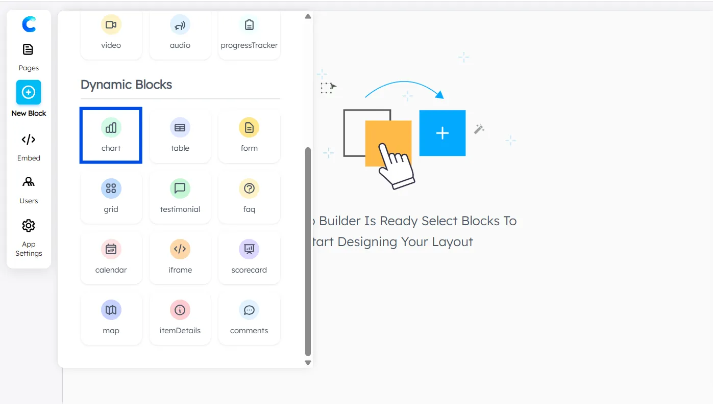
- Select your Data Source
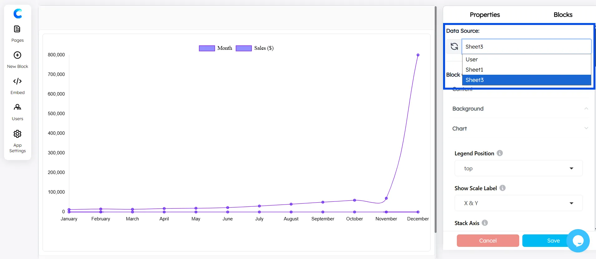
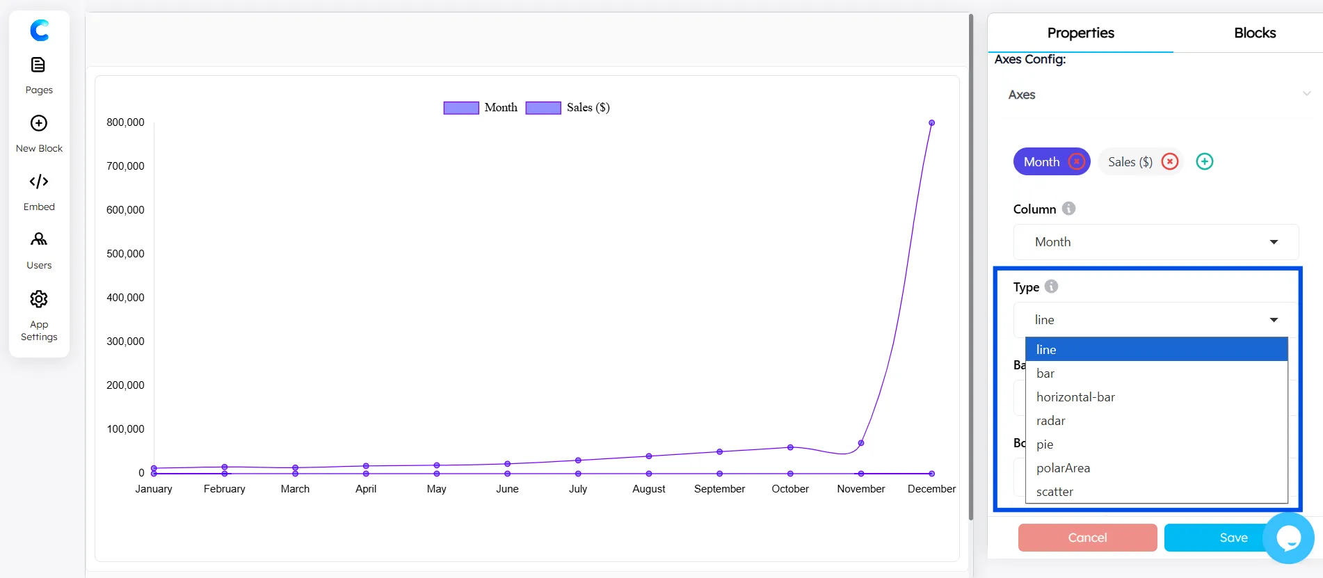
- Choose the X-axis in the Chart Configuration (for example, Month).
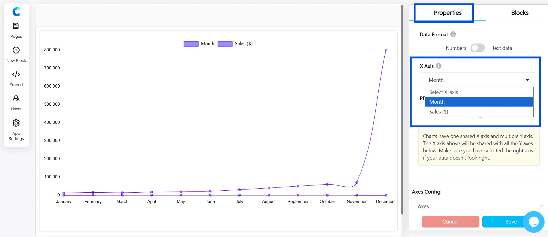
- Add the Y-axis using the Axes Configuration.
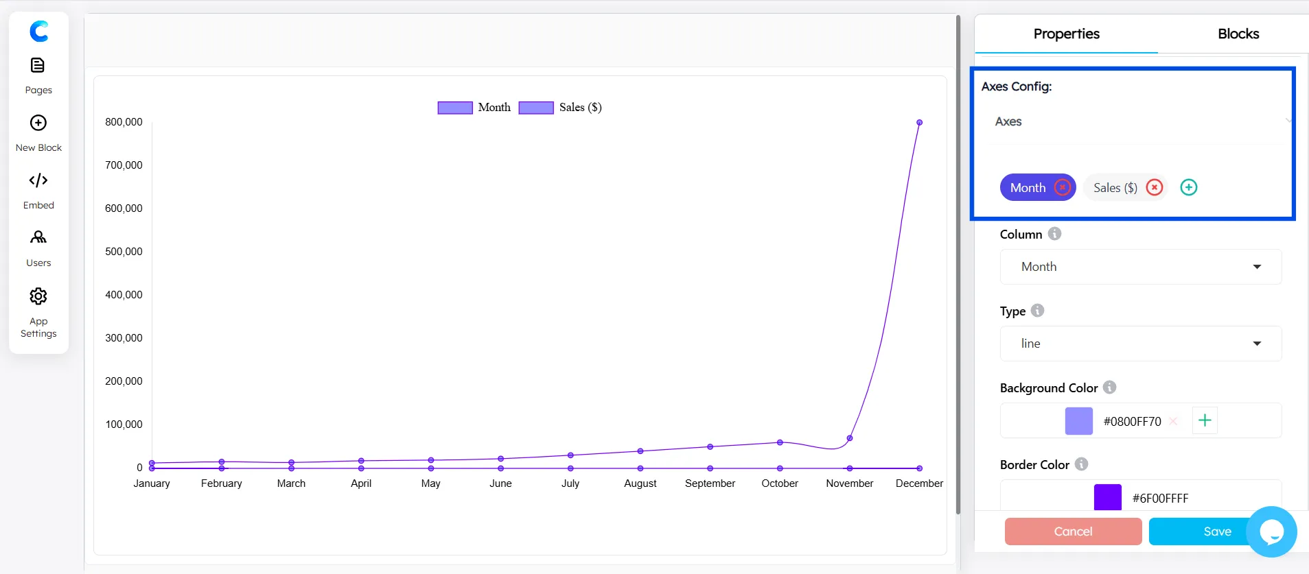
- Select Line Chart as the chart type for your data.
The line chart in ChartApps is fully customizable, giving you greater control over how your data is visualized and styled.
Conclusion
Creating a line graph in Google Sheets is one of those skills that pays dividends far beyond the five minutes it takes to learn. Whether you're tracking sales performance, monitoring website traffic, or visualizing project progress, a well-constructed line graph transforms raw numbers into a story your audience can immediately understand.
Here's a quick recap of what you've learned:
- The basics: Select your data → Insert → Chart → Choose Line chart → Customize
- Multiple lines: Structure your data with multiple value columns and select all of them before inserting the chart
- Pro customization: Use the Customize tab to control colors, titles, axes, labels, and trendlines
- Common mistakes: Watch out for text-formatted dates, incorrect axis assignments, and overly compressed Y-axes
- Sharing: Download as PNG, publish for embedding, or link to Google Docs and Slides
Ready to take your data visualization further? Explore ChartApps for advanced chart types, enhanced customization, and one-click publishing tools that go beyond what Google Sheets natively offers.
Frequently Asked Questions
How do I make a line graph in Google Sheets with two sets of data?
Structure your data with two columns of values next to your X-axis column (e.g., Column A = Month, Column B = Product A, Column C = Product B). Select all three columns and insert a chart. Google Sheets will automatically create a two-line chart.
How do I make a line graph without connecting missing data points?
If your data has gaps (blank cells), Google Sheets by default leaves those gaps as breaks in the line. To instead interpolate across gaps, go to Customize tab → Series → and look for the "Missing data" handling option (available in newer versions of Google Sheets). Alternatively, fill blank cells with the IFERROR or interpolation formulas.
How do I add a second Y-axis to a line graph in Google Sheets?
Double-click the chart → Customize tab → Series → select the series you want on a second axis → under "Axis," choose "Right axis." This is especially useful in combo charts where two series have very different scales.