You open your spreadsheet and see endless rows of data. Sales totals, ad clicks, and monthly expenses. The numbers keep growing, but the meaning feels hidden.
You know you need a graph. But where do you click? Which chart should you choose? Why does your chart sometimes look wrong?
If you’ve ever felt confused about how to make a graph in Google Sheets, this guide will walk you through it clearly and confidently.
To make a graph in Google Sheets, select your data range including headers, click Insert, choose Chart, select the appropriate chart type in the Chart Editor, and customize titles and labels before saving. Clean data and proper formatting ensure your graph displays correctly and communicates insights clearly.
In 2026, professionals across marketing, finance, education, and operations rely heavily on cloud-based tools. Google Sheets remains one of the most widely used spreadsheet platforms because it is free, collaborative, and accessible from anywhere.
Learning how to create a graph in Google Sheets is not just a student skill. It is a business skill. When done correctly, graphs help teams make faster decisions, identify trends early, and communicate insights effectively.
What is a Graph in Google Sheets?
A graph in Google Sheets is a visual representation of structured data. Instead of scanning rows of numbers, you can instantly identify patterns, growth trends, comparisons, and relationships.
At its core, creating a graph means transforming raw data into a visual story that is easy to interpret and act upon.
Global data creation continues to grow at an unprecedented rate. Businesses generate massive volumes of information daily, yet many struggle to interpret it effectively.
According to industry projections, global data generation is expected to exceed 180 zettabytes by 2026. However, the challenge is no longer collecting data. The real challenge is presenting it clearly.
Google Sheets allows teams to collaborate in real time. When graphs are used correctly, meetings become shorter, decisions become sharper, and performance improves.
Step-by-Step Guide to Create a Graph
Let’s say you want to visualize monthly sales performance.
Here is your example dataset:
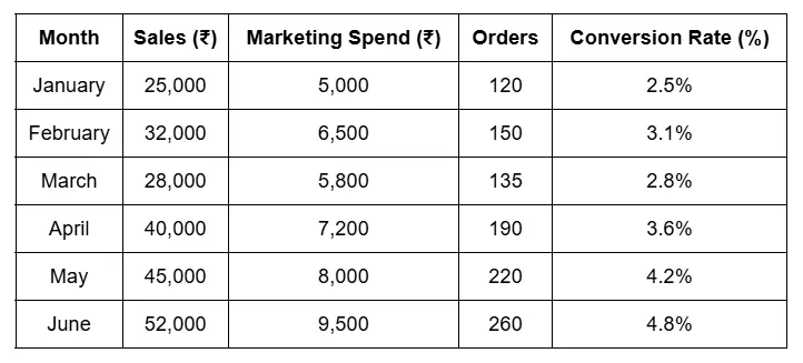
Now let’s turn this into a graph.
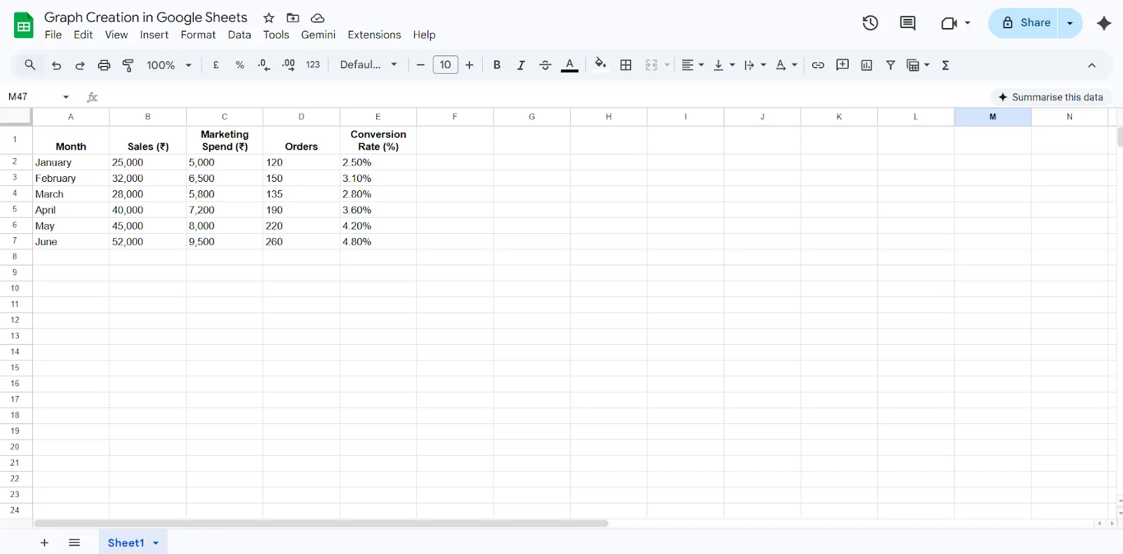
Step 1: Prepare Your Data
Start by organizing your data correctly. Each column should have a clear header that describes what the data represents. Make sure there are no blank rows within your dataset, as gaps can confuse the chart tool. Also, ensure that numeric values are formatted as numbers and not stored as text. Clean data is the foundation of an accurate graph.
Make sure:
- “Month”, “Sales (₹)”, “Marketing Spend (₹)”, “Orders”, and “Conversion Rate (%)” are in Row 1.
- There are no empty rows.
- Sales and Marketing Spend are formatted as Currency (₹).
- Orders are formatted as a number.
- Conversion Rate is formatted as a percentage.
Proper formatting ensures Google Sheets reads and analyzes the data correctly.
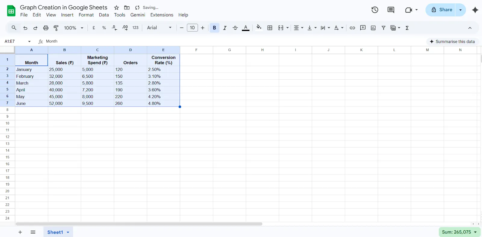
Step 2: Select the Data Range
Once your data is structured properly, highlight the entire range you want to include in the graph. Be sure to select the headers along with the data. Including headers helps Google Sheets automatically label your chart correctly.
- Click on cell A1.
- Drag down to E7 so the full dataset (including headers) is selected.
- This tells Google Sheets what data should be visualized.
Step 3: Insert the Chart
After selecting your data, go to the top menu and click Insert, then choose Chart. Google Sheets will automatically generate a default chart based on how it interprets your data. This is usually a column chart.
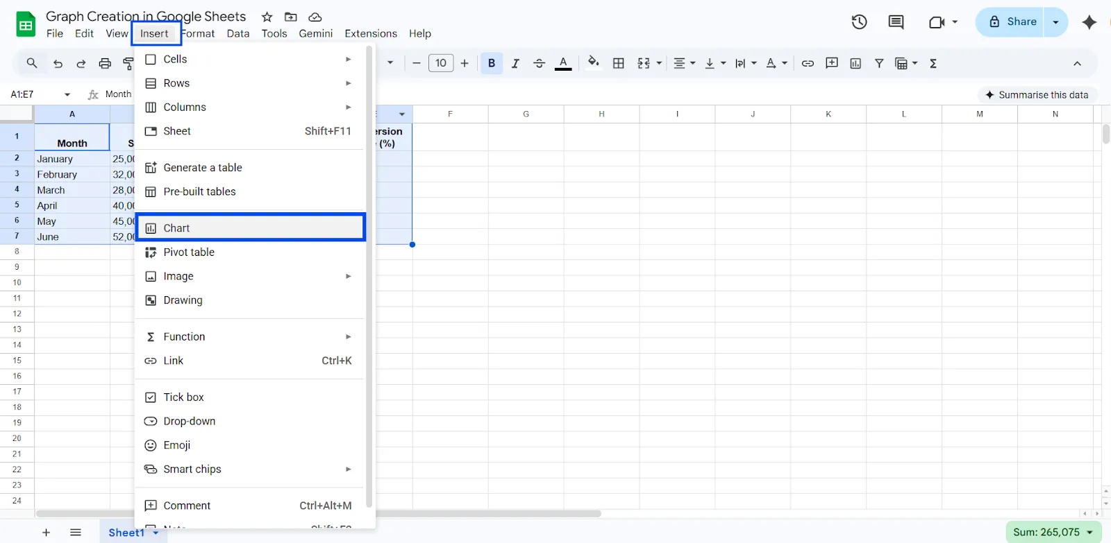
Google Sheets will generate a default chart (usually a column chart).
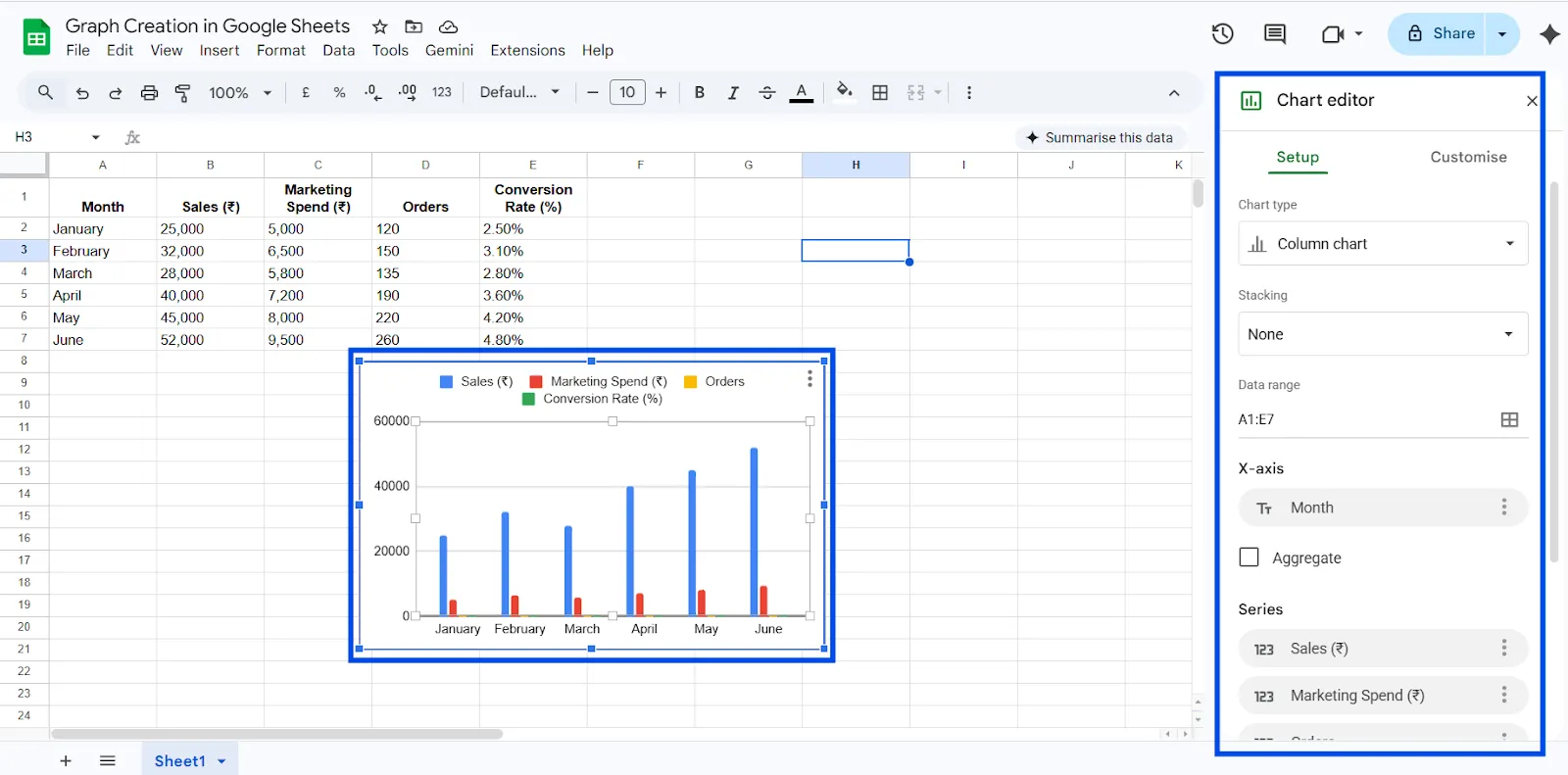
Step 4: Review the Chart Editor
When the chart appears, a Chart Editor panel will open on the right side of your screen. In the Setup section, you can change the chart type if the default option does not match your needs. This is where you decide how your data should be visualized.
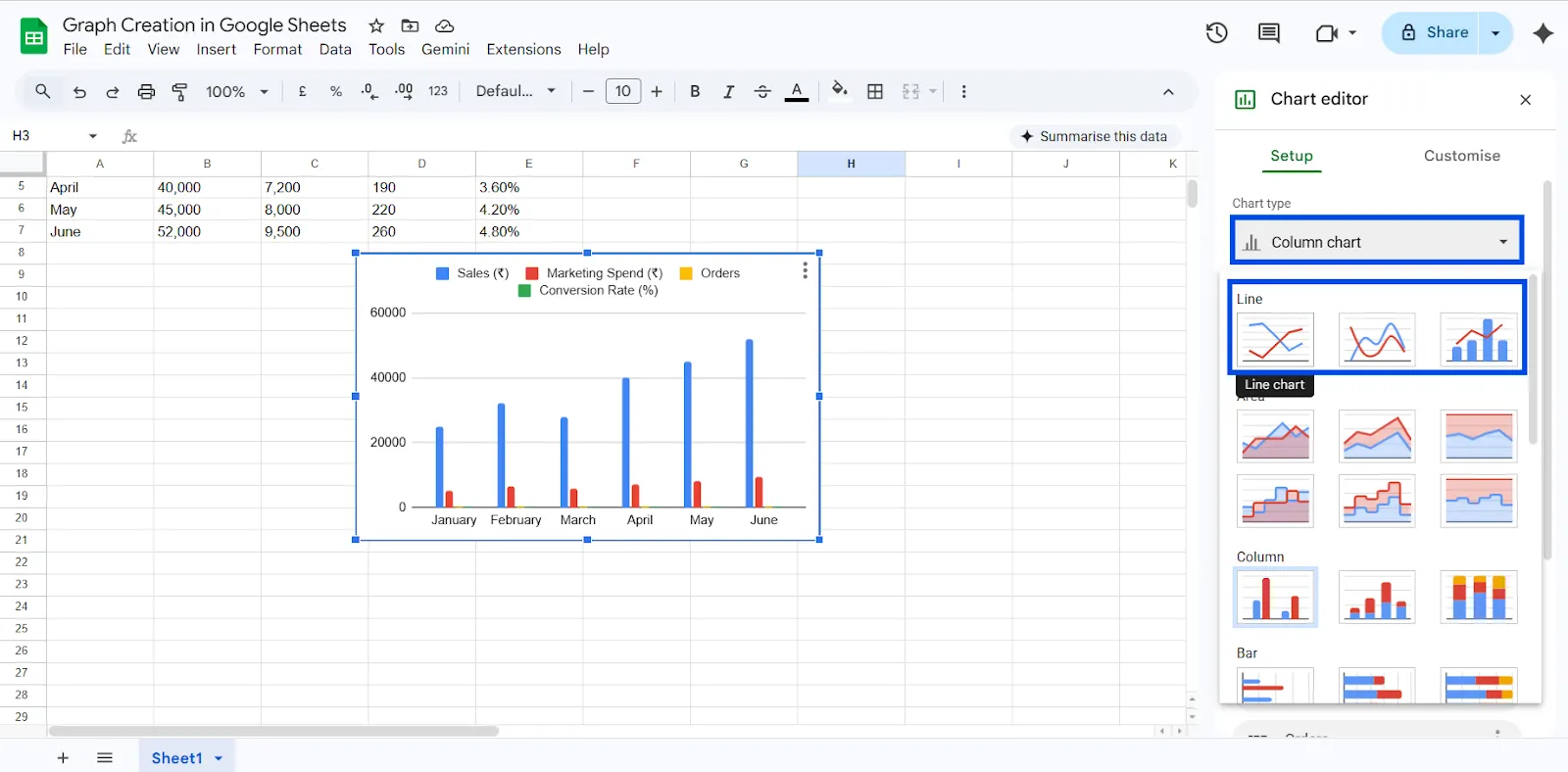
Step 5: Choose the Best Chart Type
Select a chart type that fits your data purpose. Use a line chart for trends over time, such as monthly growth. Choose a column or bar chart when comparing categories. If you are showing proportions or percentage breakdowns, a pie chart may be more suitable.
Use this simple rule when choosing the right chart in Google Sheets:
→ Showing change over time - create Line Chart
→ Comparing categories - Use Bar Chart or Column Chart
→ Showing percentage distribution - Use Pie Chart
→ Showing relationships or correlations between two variables - Create Scatter Chart
→ Comparing two related metrics - Use Combo Chart
→ Summarizing large datasets - Create Pivot Table first, then create a chart
When your chart matches your goal, it becomes a decision tool instead of just a visual element.
In the Chart Editor:
- Go to the Setup tab
- Click Chart Type
- Select Line Chart
The Chart Editor panel will open on the right side.
You will now see multiple lines:
- Sales trend
- Marketing Spend trend
- Orders trend
- Conversion Rate trend
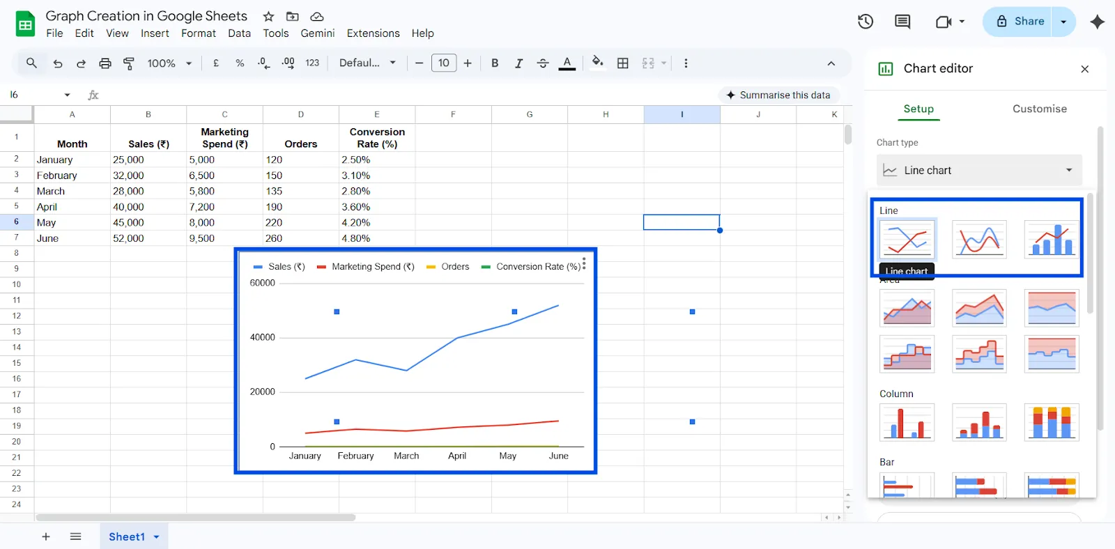
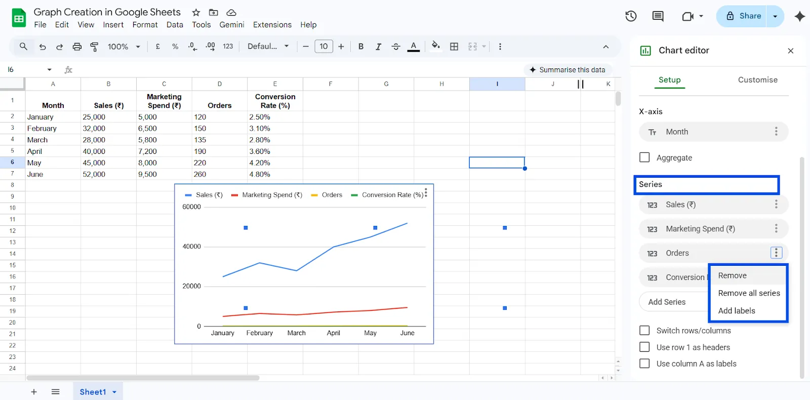
If it looks crowded, you can:
- Click “Series”
- Remove some metrics (for example, show only Sales first)
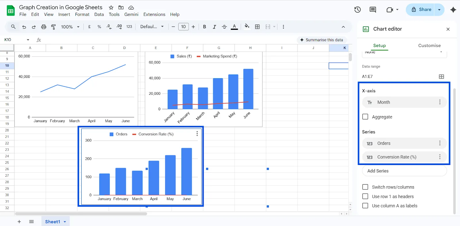
Step 6: Create Different Charts for Better Insights
Instead of putting everything into one chart, you can create separate visualizations:
Chart 1: Sales Growth Trend
Select only:
- Month
- Sales (₹)
Best Chart Type: Line Chart
Purpose: Identify revenue growth pattern.
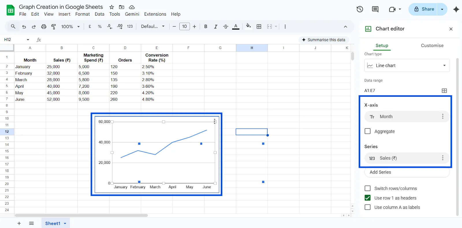
Chart 2: Sales vs Marketing Spend
Select:
- Month
- Sales (₹)
- Marketing Spend (₹)
Best Chart Type: Combo Chart
Set:
- Sales as Columns
- Marketing Spend as Line
Purpose: See if higher marketing spend leads to higher sales.
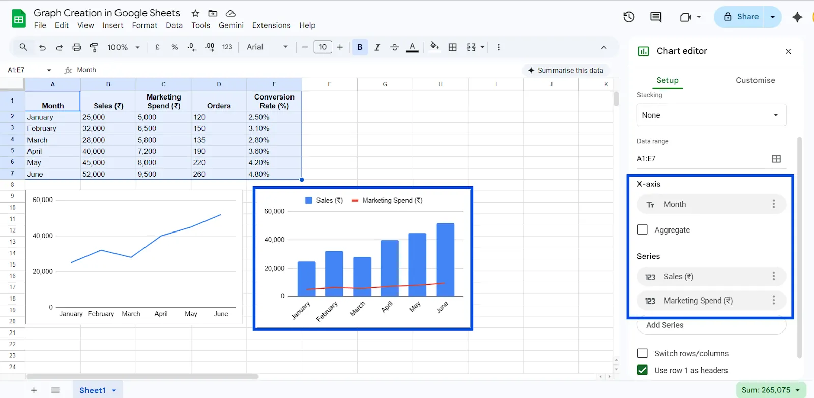
Chart 3: Orders & Conversion Rate
Select:
- Month
- Orders
- Conversion Rate (%)
Best Chart Type: Combo Chart
Set:
- Orders as Columns
- Conversion Rate as Line
Purpose: Measure performance efficiency.
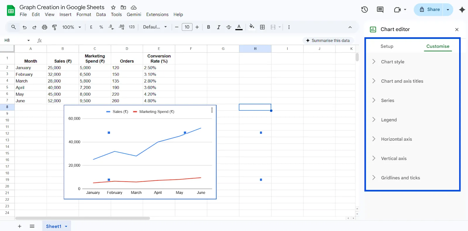
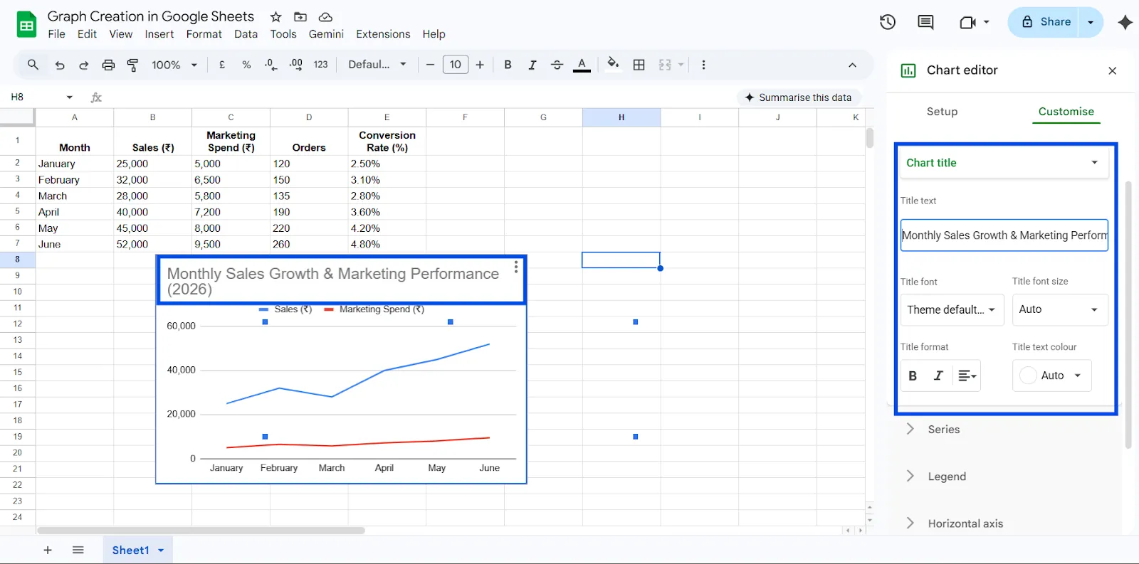
Step 7: Customize Your Chart
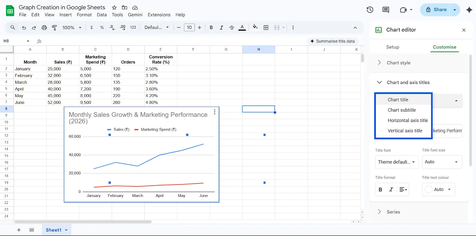
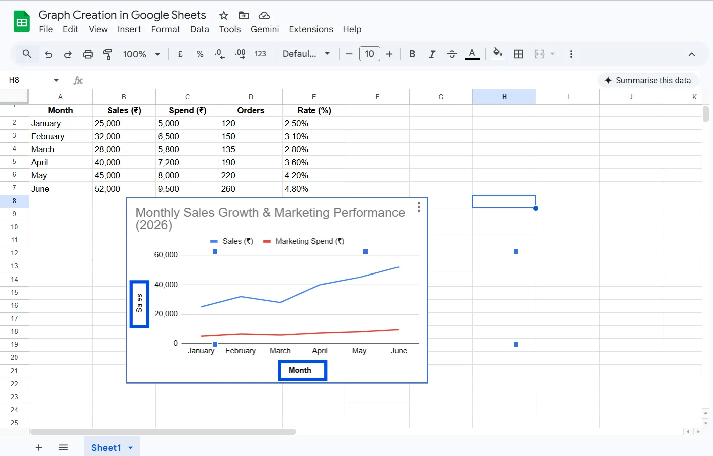
After selecting the correct chart type, switch to the Customize section in the Chart Editor. Add a clear and descriptive title. Label both axes properly so viewers understand what they are seeing. Adjust colors if necessary and position the legend where it is easy to read.
Improve clarity:
- Add Chart Title: “Monthly Sales Growth & Marketing Performance (2026)”
- Add Axis Titles
- Vertical Axis: Sales (₹) / Orders
- Horizontal Axis: Month
- Adjust colors for better contrast
- Enable data labels if needed
- Move legend to top or right
Professional formatting makes your chart presentation-ready.
Step 8: Final Review and Save
Take a moment to review your chart. Make sure the data is accurate, labels are clear, and the visualization matches your intended message. Once everything looks clean and professional, your graph is ready to use.
Now, instead of just numbers, you can clearly see:
- Strong upward revenue trend from January to June
- Noticeable growth after increased marketing spend
- Significant improvement in conversion rate
- A sharp performance jump between March and April
Best Practices
A strong graph begins with a specific purpose. Ask yourself what decision the viewer needs to make after seeing the chart.
Use clear and descriptive titles that explain exactly what the chart represents. Instead of writing “Sales,” specify “Monthly Revenue Growth for 2026.”
Keep design simple. Limit unnecessary colors, remove clutter, and ensure consistent time intervals.
When graphs are simple and focused, they become powerful decision-making tools rather than decorative elements.
Advanced Tips
Once you master the basics, you can build more dynamic charts. Dropdown menus can be added to filter data automatically, allowing the graph to update based on selected criteria.
Pivot tables can summarize large datasets before visualization. This keeps charts clean and easier to interpret.
Combo charts allow you to display two types of data simultaneously, such as revenue and growth percentage. This approach delivers layered insights in a single visual.
You can also connect Google Sheets with reporting dashboards to create live, auto-updating visualizations for business reporting.
Use ChartApps for Advanced Dashboard Reporting
While Google Sheets is excellent for creating individual graphs, growing teams often need more structured and interactive reporting. This is where ChartApps adds value.
ChartApps allows you to create professional, interactive charts designed for business reporting and decision-making. With ChartApps, users can,
- Combine multiple graphs into a single performance dashboard
- Add interactive filters like Month, Campaign, or Region
- Create structured KPI sections (Revenue, Marketing, Conversions)
- Share live dashboard links with stakeholders
- Automate recurring monthly or quarterly reports
Instead of sending static charts, you can present a clean, interactive dashboard where decision-makers can explore the data themselves.
For businesses in 2026, the real advantage is not just creating graphs but organizing them into actionable reporting systems. ChartApps helps transform spreadsheet visuals into professional, shareable dashboards built for real business decisions.
Common Mistakes to Avoid
One common mistake is selecting the wrong chart type. For example, using a pie chart to show monthly growth creates confusion because pie charts are designed for proportions, not trends.
Another frequent error is including too much data. Overcrowded charts become difficult to read and defeat their purpose.
Some users forget to add labels or meaningful titles. Without context, even accurate graphs fail to communicate effectively.
Improper axis scaling can also distort interpretation. Starting the vertical axis at an unusual value can exaggerate differences and reduce credibility.
Final Thoughts
Creating a graph in Google Sheets is more than just inserting a chart. It is a core business skill that helps transform raw numbers into clear, actionable insights. Instead of scanning endless rows of sales data, marketing spend, or conversion rates, a well-structured graph instantly reveals patterns, trends, and performance gaps. When your data is clean and your chart type matches your goal, decision-making becomes faster, presentations become clearer, and collaboration becomes more effective.
In 2026 and beyond, professionals who can visualize data confidently will always have an advantage. By organizing your dataset properly, selecting the right chart, and customizing it with clear labels and titles, you turn complexity into clarity. Tools like ChartApps further enhance this process by helping teams build structured, interactive dashboards from spreadsheet data. Graphs are not decorative elements. They are powerful tools that help teams identify opportunities, justify strategies, and make smarter, data-driven decisions.
Frequently Asked Questions (FAQ)
1. How do I make a simple graph in Google Sheets?
To make a simple graph in Google Sheets, first select your data, including the headers. Then click Insert from the top menu and choose Chart. Google Sheets will generate a default chart, which you can adjust by selecting a suitable chart type and customizing it as needed.
2. Why does my chart appear incorrect?
If your chart looks wrong, it is usually due to improper data formatting or selecting an incomplete data range. Make sure there are no blank rows, your numbers are formatted correctly, and you have highlighted all relevant data before inserting the chart.
3. What is the best chart type to use?
There is no single “best” chart type. The right choice depends on your goal. Use a line chart for trends over time, a column or bar chart for comparisons, and a pie chart for showing proportions or percentages.
4. Can I edit my chart after creating it?
Yes, you can edit your chart anytime. Simply click on the chart to reopen the Chart Editor. From there, you can change the chart type, update data ranges, modify labels, adjust colors, and customize other settings.
5. Can I export or download my chart?
Yes, Google Sheets allows you to download your chart. Click the three-dot menu on the chart and choose to download it as a PNG, PDF, or SVG file, depending on your needs.
6. Can I create charts directly in ChartApps instead of Google Sheets?
Yes, with ChartApps, you can create charts directly within the platform using your Google Sheets data. Instead of building individual graphs in Google Sheets and managing them separately, ChartApps allows you to design interactive visualizations inside a centralized dashboard environment.