In 2026, data powers almost every decision, where marketing dashboards update constantly, sales reports grow larger, CRM exports expand, and finance trackers record every transaction. The challenge is not collecting data anymore. The real challenge is making sense of it quickly. Scrolling through thousands of rows does not help you spot trends or make smarter decisions. Manual calculations slow you down and increase the chances of mistakes.
This is where a pivot table in Google Sheets becomes essential. A Google Sheets pivot table helps you organize, summarize, and analyze large datasets in minutes without complex formulas. Instead of struggling with raw numbers, you can instantly see totals, trends, and performance insights. If you have never created a pivot table Google Sheets report before, this guide will walk you through the process step by step so you can turn messy data into clear, actionable information.
What Is a Pivot Table?
A pivot table in Google Sheets is a built-in data analysis tool that helps you quickly organize, summarize, and analyze large datasets without needing complex formulas. It lets you group information, calculate totals, and uncover patterns in just a few clicks.
With a pivot table in Google Sheets, you can:
- Summarize totals from large datasets
- Count entries automatically
- Calculate averages and other metrics
- Group data by category, date, or region
- Identify trends and patterns instantly
Instead of relying on formulas like SUM, COUNTUNIQUE, or STDEV functions, a Google Sheets pivot table gives you a visual and interactive way to transform raw data into clear insights. It is one of the fastest ways to turn messy spreadsheets into meaningful reports.
Why does it matter?
In 2026, pivot tables are essential because businesses rely heavily on data for daily decisions. They save time, reduce manual work, minimize errors, and help you uncover insights faster, making them one of the most valuable skills for working efficiently with spreadsheets.
How to Create a Pivot Table in Google Sheets
Let’s break the process into simple, practical steps you can follow immediately.
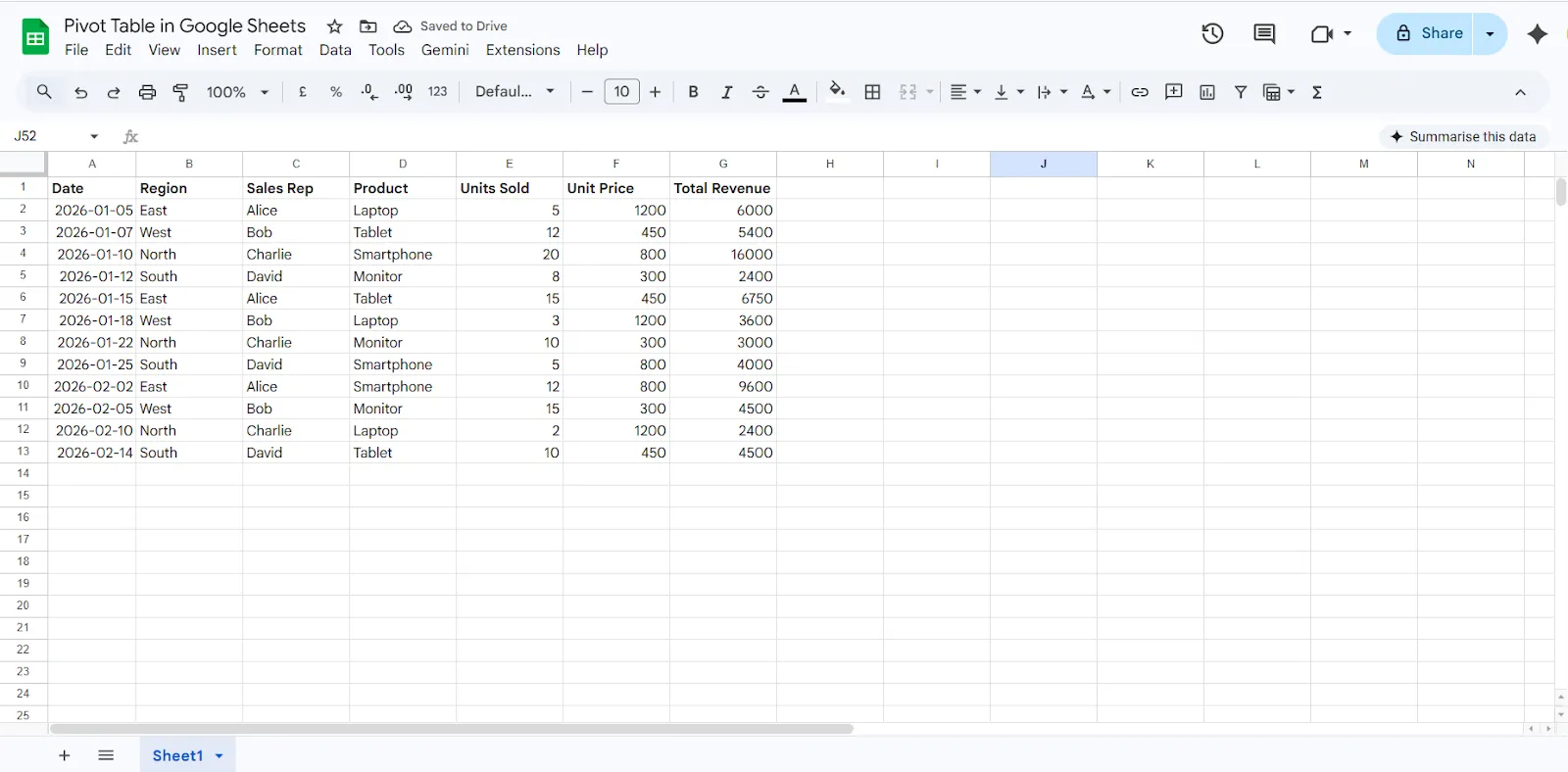
Step 1: Prepare Your Data Properly
Before creating a pivot table in Google Sheets, your dataset must be structured correctly. Poor formatting is the main reason pivot tables fail or show incorrect results.
Make sure your data follows these rules:
- No empty header row
- Each column has a clear and unique label
- No merged cells
- No completely blank rows in between data
- All related data is in a single continuous table
Step 2: Select Your Data
Once your dataset is ready:
- Click anywhere inside the table
- Press Ctrl + A to select the entire dataset
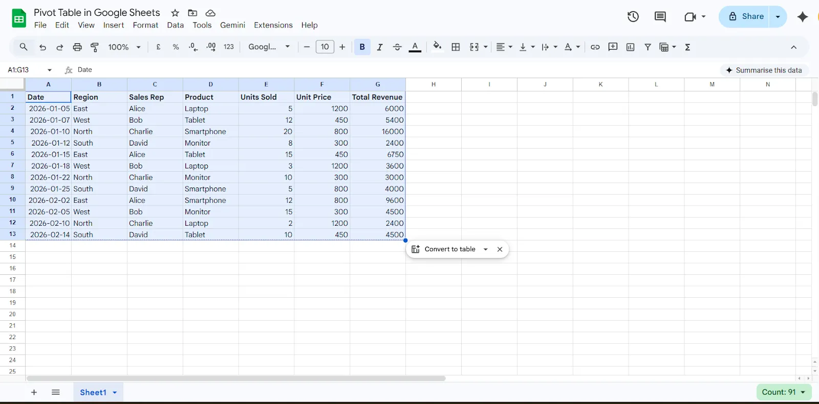
Alternatively, you can manually drag and select the full data range. Selecting the complete dataset ensures your pivot table includes all relevant rows and columns.
Step 3: Insert the Pivot Table
Now it is time to create the pivot table.
- Click Insert in the top menu
- Choose Pivot table
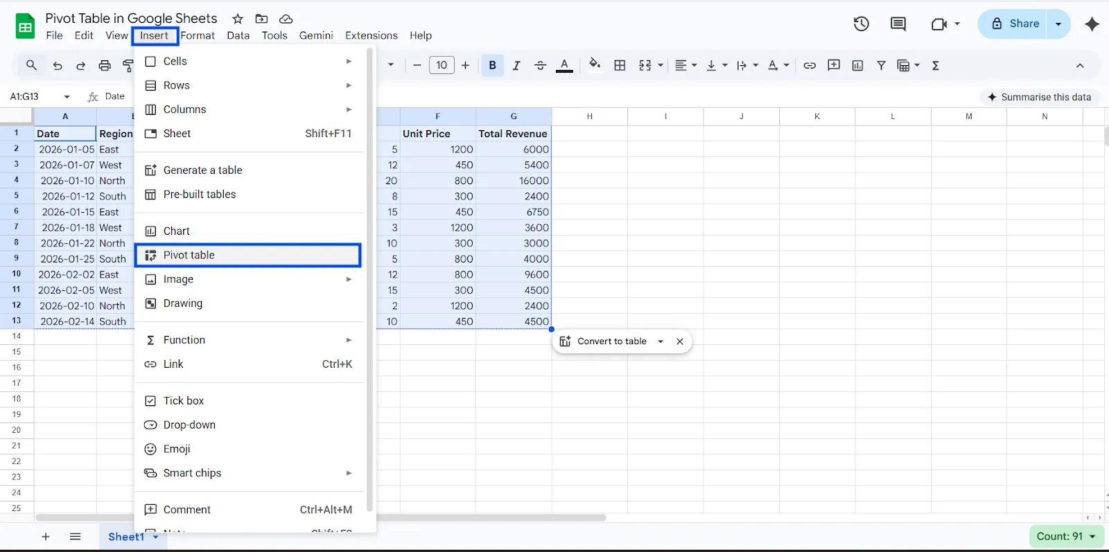
- Select where you want it:
- New Sheet, which is recommended for better organization
- Existing Sheet, if you want it in the same tab
- Click Create
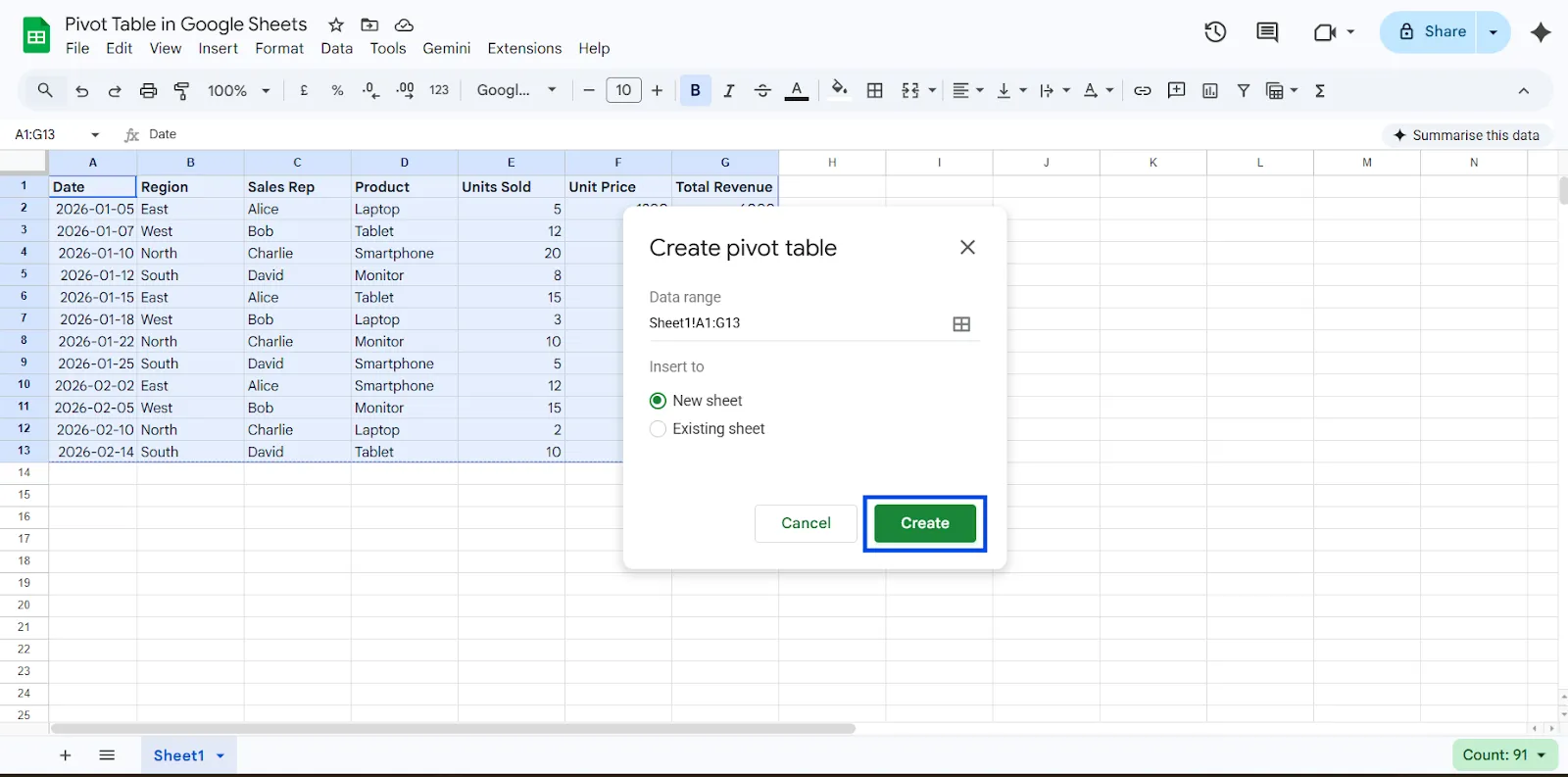
Google Sheets will open a new sheet and display the Pivot table editor panel on the right side. This panel is where you control how your data is grouped, summarized, and analyzed.
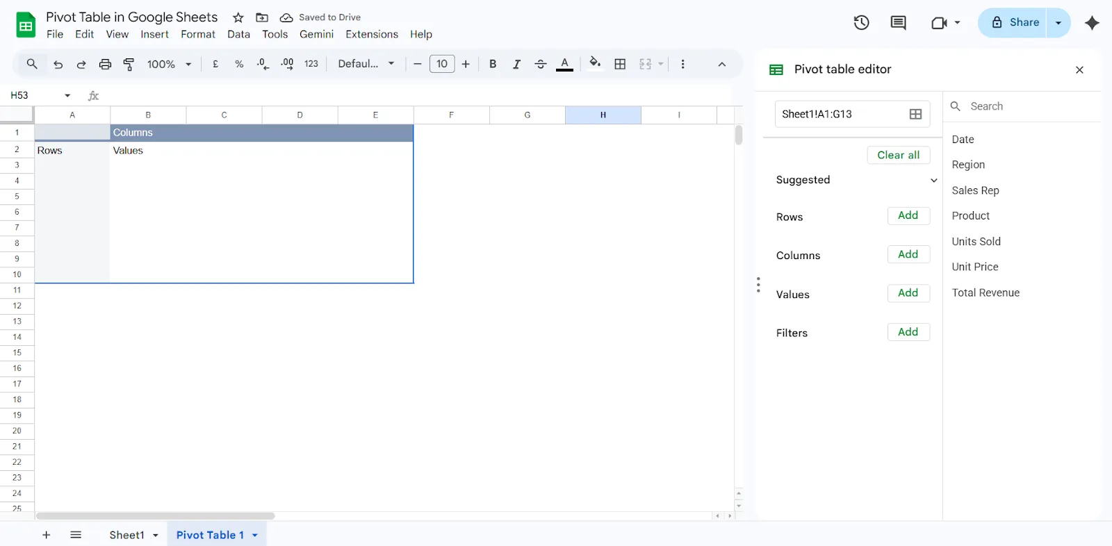
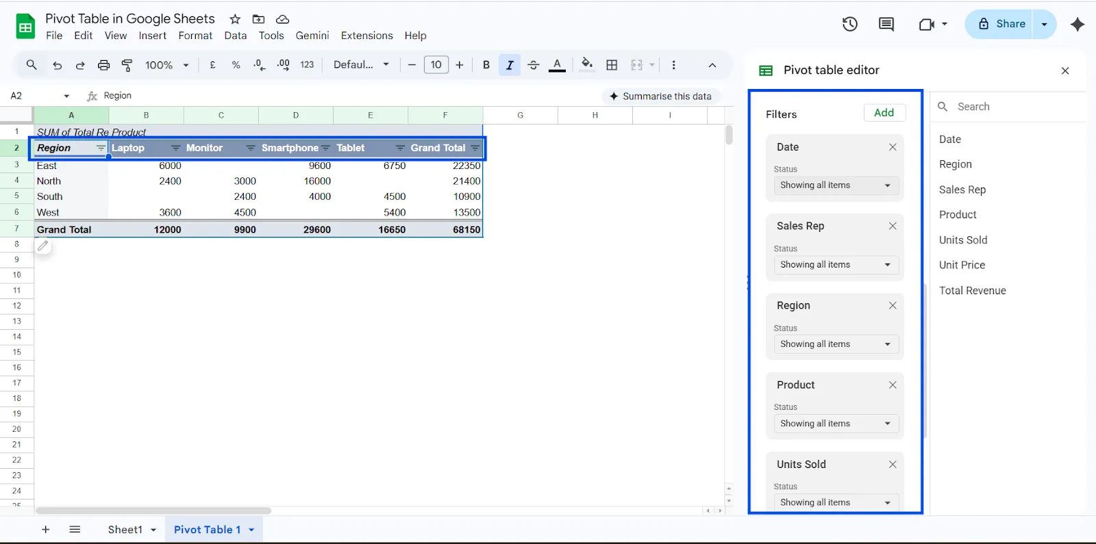
Understanding the Pivot Table Editor
When you create a pivot table in Google Sheets, the editor panel appears on the right side of your screen. This panel controls how your data is organized and analyzed. It has four main sections: Rows, Columns, Values, and Filters. Once you understand these four areas, building a Google Sheets pivot table becomes much easier.
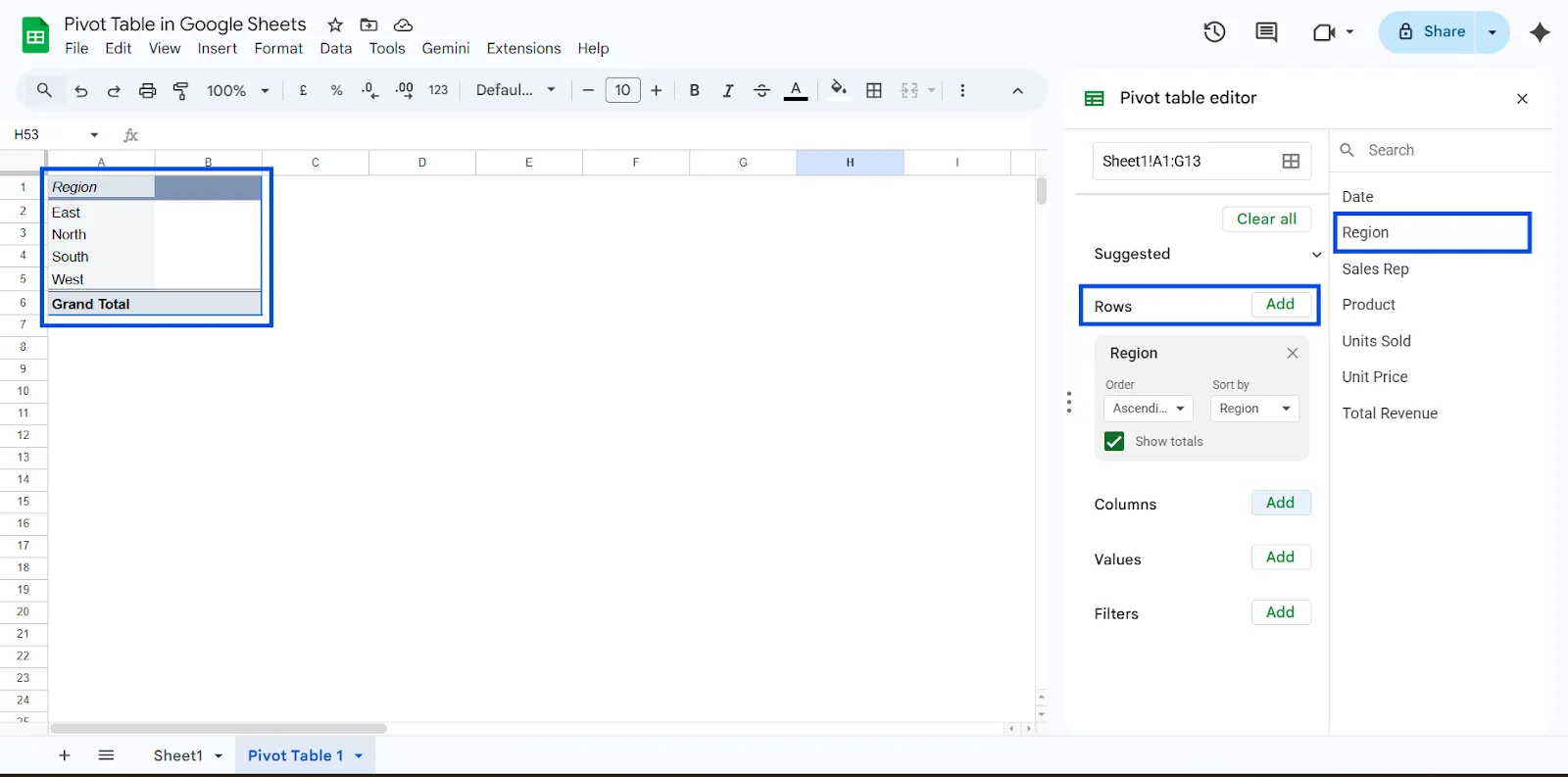
1. Rows: Group Your Data
The Rows section determines how your data is grouped vertically. It helps you organize information into categories that are easy to read and compare.
For example, if you add Region to the Rows section, your pivot table will automatically group all entries by region, such as South, North, East, and West. This allows you to see performance or totals for each region without manually sorting your dataset.
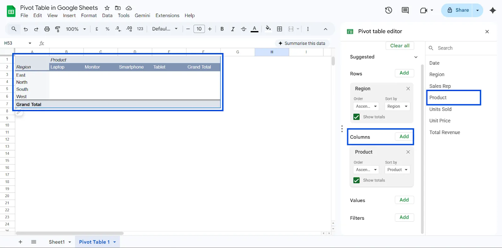
2. Columns: Add a Second Layer of Grouping
Columns create a secondary grouping across the top of your pivot table. This helps you compare data across categories.
For example, if you set Rows as Region and Columns as Product, your pivot table will show revenue for each product within each region. This layout makes it easy to compare how different products perform across different locations.
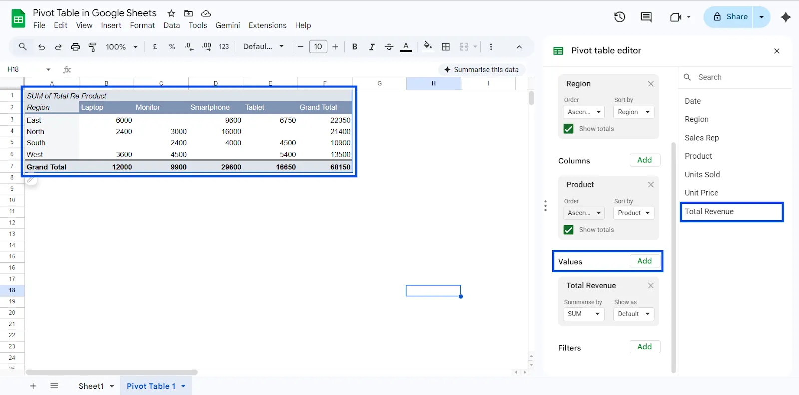
3. Values: Choose What to Calculate
The Values section determines what numbers you want to calculate. This is where you choose whether to show totals, counts, averages, or other metrics.
You can summarize data using options such as:
- Sum
- Count
- Average
- Maximum
- Minimum
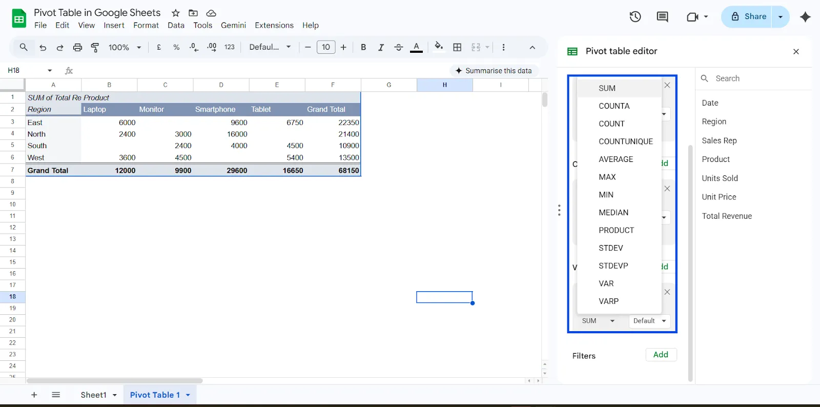
For instance, if you add Revenue to the Values section and set it to summarize by Sum, your pivot table in Google Sheets will display the total revenue for each category you selected in Rows or Columns.
4. Filters: Narrow Down Your Data
Filters let you display only specific parts of your dataset. This makes your pivot table more flexible and interactive.
You can use filters to:
- Show only one region
- Focus on a specific product
- View data for a certain month
- Analyze a single salesperson
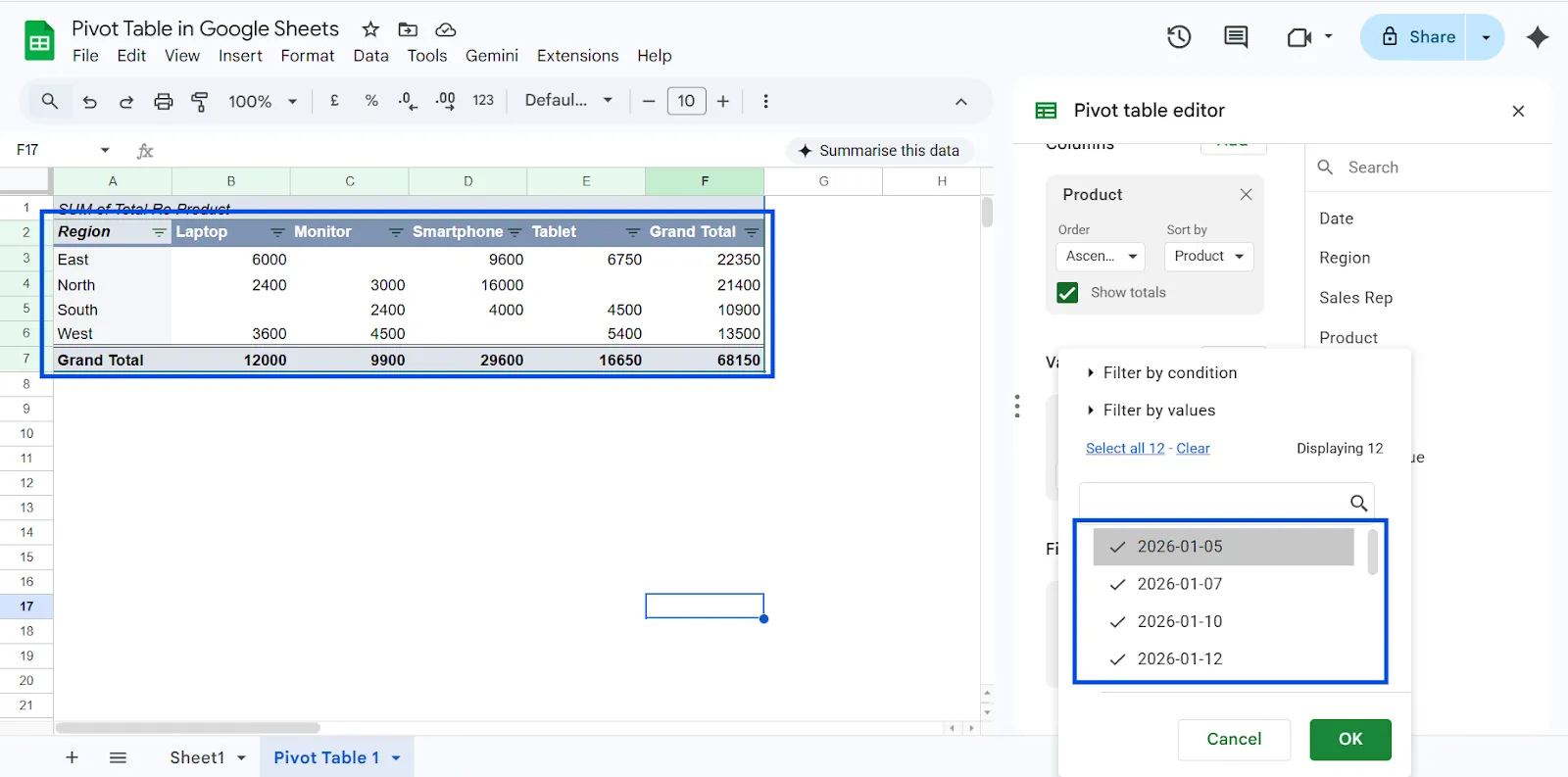
For example, if your pivot table shows revenue by region and product, you can add a filter for Month and select January to see only January’s performance. You can then switch the filter to February to compare results without rebuilding the table.
Filters help you refine the information shown in your pivot table without changing the original dataset. This makes the pivot table dynamic and useful for ongoing analysis.
Real-World Example: Building a Sales Dashboard
Imagine you manage a sales team and need quick answers from your data. You want to know which region generates the most revenue, which product performs best, and who your top salesperson is. Instead of writing multiple formulas or creating separate reports, you can build a pivot table in Google Sheets to get all these insights in one place.
Here’s a simple setup you can use. Add Salesperson to the Rows section, Product to the Columns section, and Revenue to the Values section with the summary set to SUM. In seconds, your Google Sheets pivot table will show total revenue by salesperson and product. From there, you can instantly identify top performers, compare product performance across the team, and make smarter decisions based on clear data. No complex formulas required, just structured insights that update automatically as your data grows.
Best Practices to Enhance Pivot Table
Once you understand the basics, you can use advanced features to turn a simple pivot table in Google Sheets into a powerful reporting tool. These techniques help you extract deeper insights without changing your original dataset.
1. Show Percentage of Total
Instead of only viewing raw revenue numbers, you can display how much each category contributes to the overall total. This is especially useful for understanding market share and performance distribution.
Steps:
- Click the field under Values (for example, Revenue)
- Open the dropdown menu
- Choose Show as → % of grand total
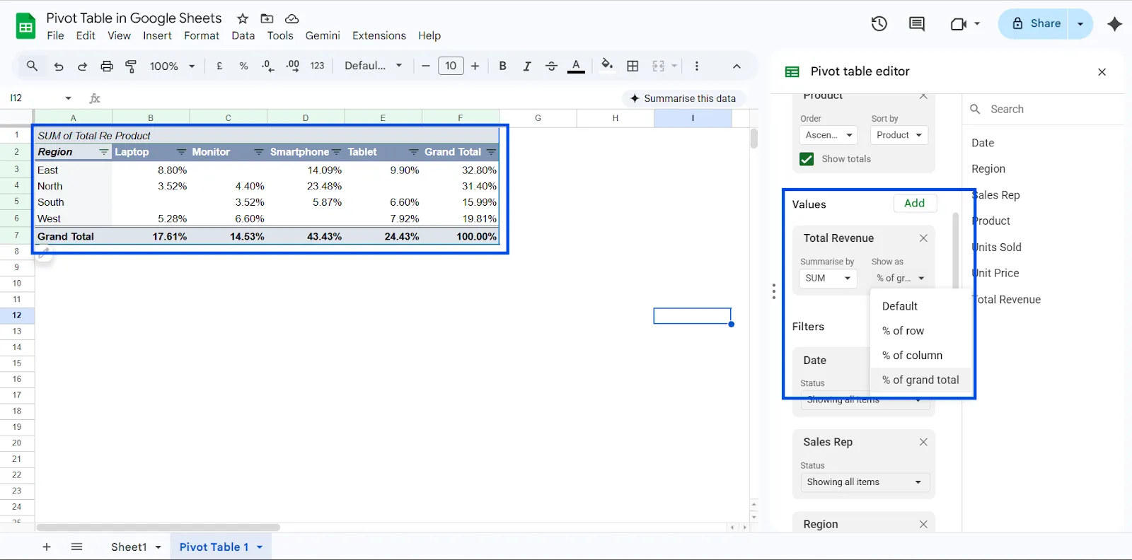
Your pivot table will now display percentage contribution instead of just totals.
This is perfect for:
- Market share analysis
- Team performance comparison
- Revenue contribution tracking
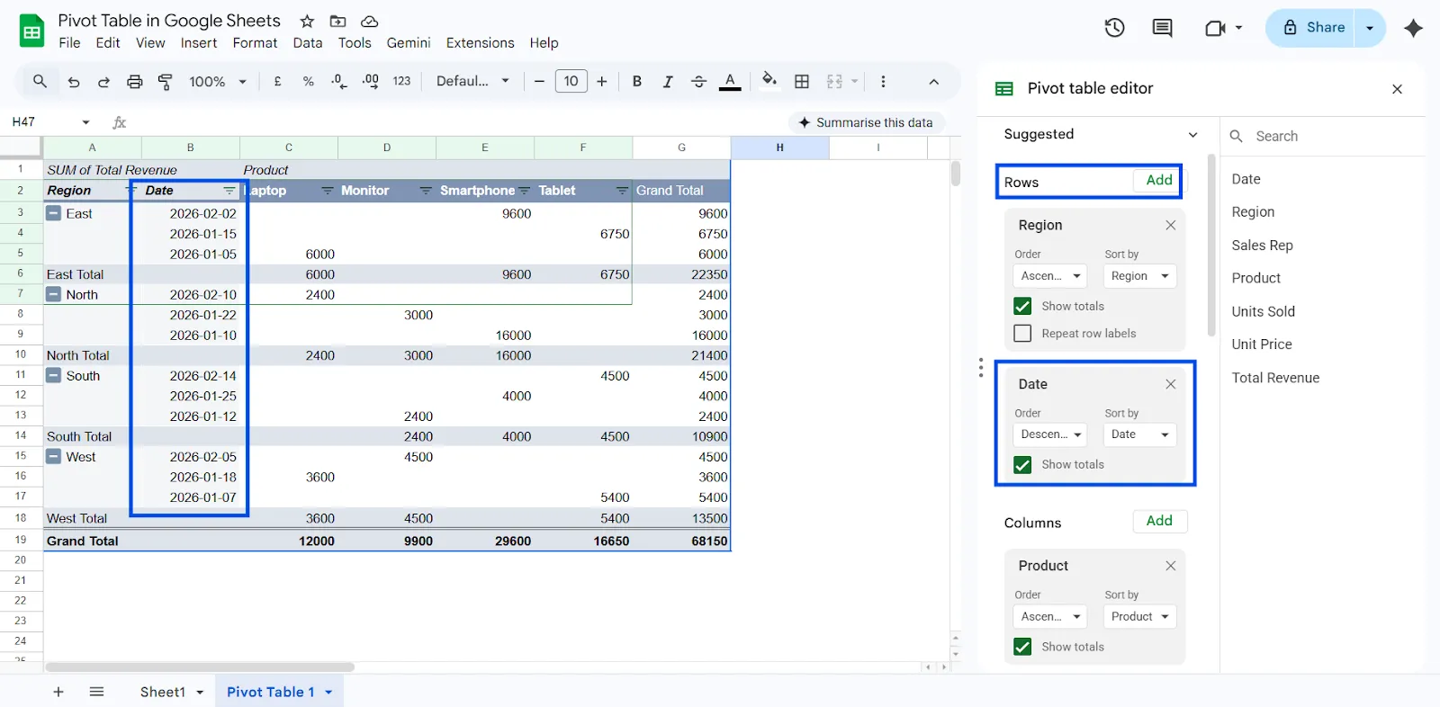
2. Group Dates by Month or Year
If your dataset includes dates, grouping them helps you analyze trends over time.
Steps:
- Add Date to the Rows section
- Click the dropdown beside the date field
- Select Create pivot date group
- Choose Month or Year
Your pivot table will instantly transform into a monthly or yearly performance report. This is useful for tracking growth, seasonal trends, or campaign performance over time.
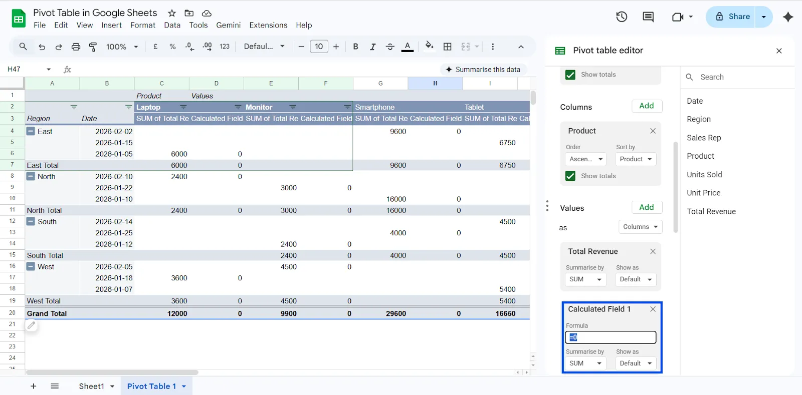
3. Use Calculated Fields
Calculated fields let you create custom formulas directly inside your Google Sheets pivot table without editing the original dataset.
Example:
You want to calculate profit.
You want to calculate profit.
Profit = Revenue − Cost
Instead of adding a new column in your raw data:
- Open the pivot editor
- Click Add under Values
- Choose Calculated field
- Enter your formula
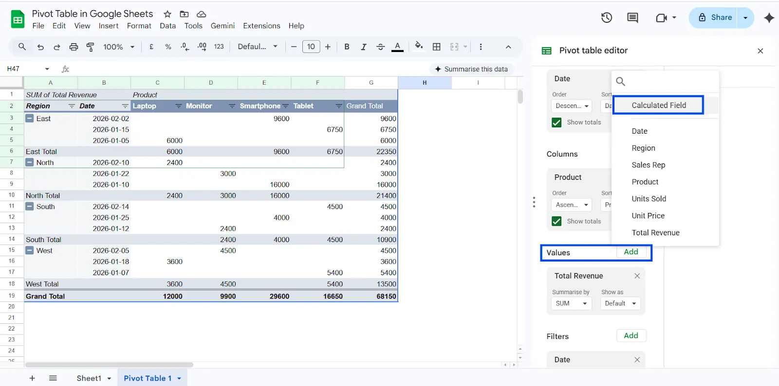
This keeps your source data clean while allowing advanced analysis within the pivot table itself.
4. Using Slicer in Google Sheets Pivot Table
As your reports grow larger, manually changing filters inside the pivot table editor can slow you down. This is where Slicers become extremely useful.
A Slicer in a Google Sheets pivot table provides an interactive way to filter data visually. Instead of opening the pivot editor and adjusting filter settings, you can simply click on a slicer dropdown directly on your sheet to refine the data instantly.
Follow these steps to add a slicer:
Step 1: Select Your Pivot Table
Click anywhere inside your pivot table.
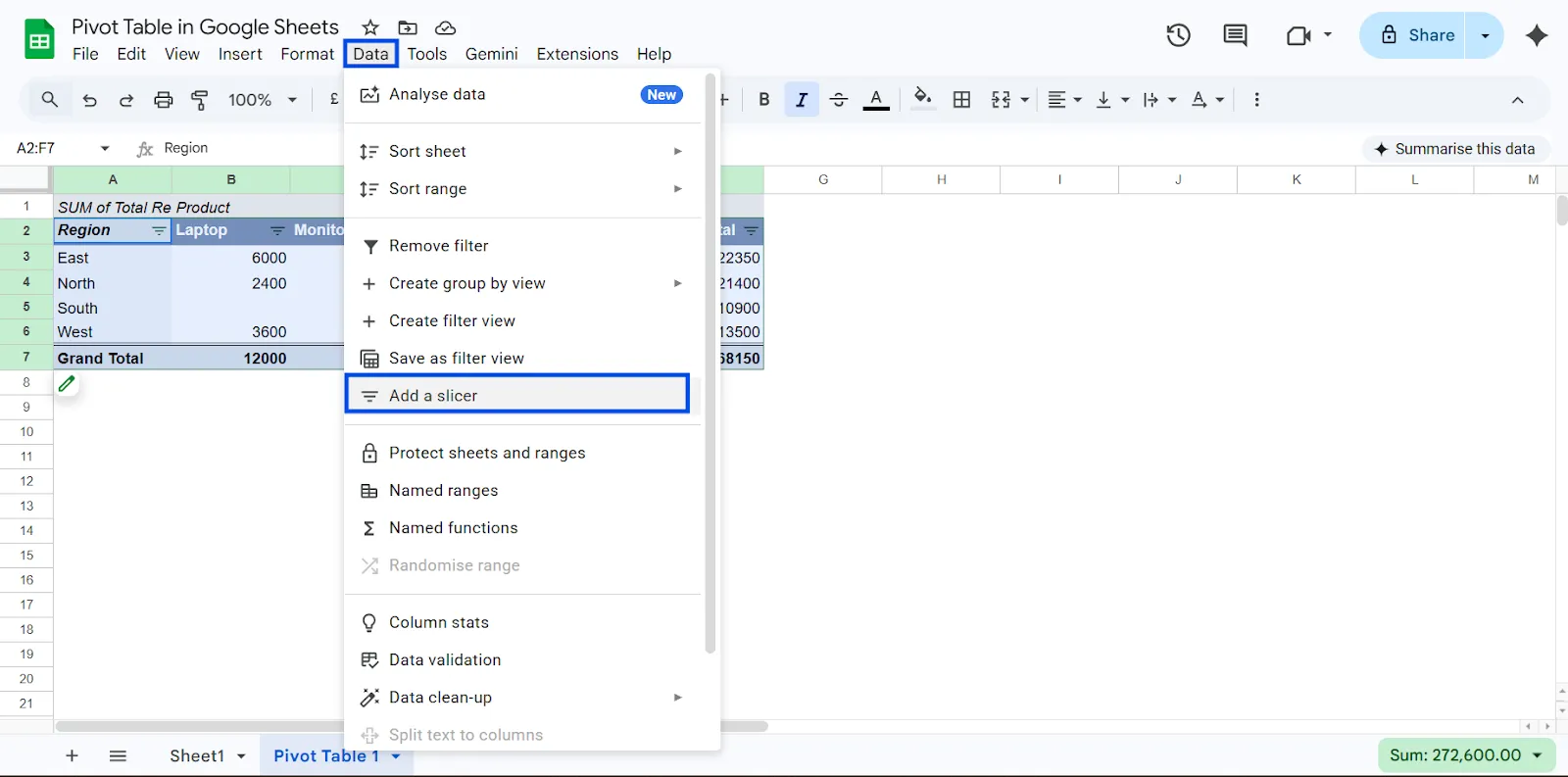
Step 2: Insert the Slicer
- Click Data in the top menu
- Select Add a slicer
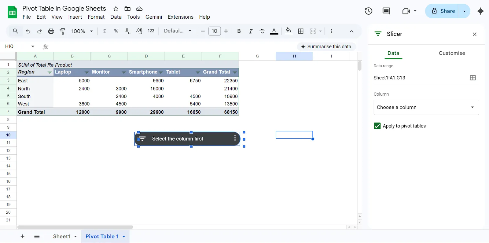
Step 3: Choose the Column to Filter
In the slicer settings panel:
- Select the column you want to filter (for example: Region, Product, Month, or Salesperson)
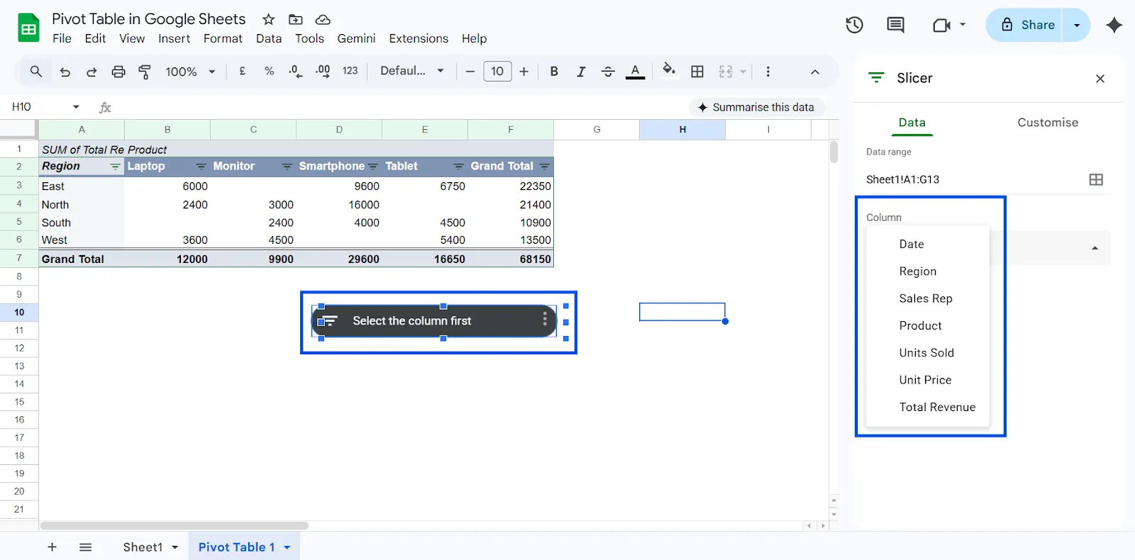
The slicer will now appear on your sheet as a dropdown filter box.
Common Mistakes to Avoid
Even experienced users make errors when building a pivot table in Google Sheets. Most issues are not technical. They come from small oversights that affect accuracy and clarity. If you want reliable insights from your Google Sheets pivot table, avoid these common mistakes.
Dirty Data
Pivot tables depend entirely on a clean structure. If your dataset contains merged cells, blank headers, inconsistent column names, or empty rows between data, the pivot table may produce incorrect results or fail to group properly.
Always ensure:
- Every column has a clear header
- No merged cells exist
- Data is stored in one continuous table
- Numbers are formatted as numbers, not text
Clean input equals accurate output.
Choosing the Wrong Summary Type
One of the most common errors is using COUNT when you actually need SUM.
For example, if you add Revenue to the Values section and the pivot defaults to COUNT, it will count the number of entries instead of calculating total revenue. This can completely distort your analysis.
Always check the setting:
- Values → Summarize by → SUM
Verify your aggregation type before trusting the numbers.
Assuming Everything Updates Automatically
Google Sheets pivot tables usually update when the source data changes. However, if your data is imported from external sources or connected via integrations, delays or formatting inconsistencies can cause issues.
If numbers look incorrect:
- Confirm new rows are included in the selected data range
- Check that imported values are recognized as numbers
- Recheck filters that may be hiding data
A quick audit prevents reporting errors.
Overcomplicating the Layout
Many users try to add too many fields at once. This creates cluttered pivot tables that are hard to interpret.
Start simple:
- Add one Row field
- Add one Value field
Understand the output first. Then gradually introduce Columns, Filters, or additional metrics. Clarity beats complexity every time.
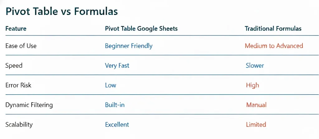
Pivot Table vs Formulas
When comparing a pivot table in Google Sheets with traditional spreadsheet formulas, the difference in efficiency is clear.
A Google Sheets pivot table is far more beginner-friendly because it allows users to summarize and analyze data using a visual interface instead of writing complex formulas.
It is also much faster for large datasets, since you can group, filter, and calculate results instantly without building multiple formula columns.
The risk of errors is lower because calculations such as sums, counts, and averages are handled automatically by the pivot table, whereas traditional formulas require manual setup and are easier to break.
Pivot tables also include built-in dynamic filtering, allowing you to adjust views with a few clicks, while formulas often require manual filtering or additional functions.
In terms of scalability, pivot tables handle growing datasets much better, making them ideal for dashboards and reports, while formula-heavy sheets can become slow, cluttered, and difficult to maintain over time.
Final Thoughts
Raw spreadsheets alone do not create insight. What matters is how quickly you can analyze and understand the information inside them. If you are still manually filtering rows, writing repetitive formulas, or building separate reports, you are spending more time than necessary on tasks that can be automated.
Start using pivot tables in Google Sheets to transform messy datasets into clear summaries and meaningful reports. A well-built Google Sheets pivot table can help you generate actionable insights, build professional dashboards, and make smarter strategic decisions faster. Once you master this skill, working with large datasets becomes far more efficient and far less stressful.
You can also take things further by connecting your pivot data to tools like ChartApps, which help you turn spreadsheet insights into visual dashboards and shareable reports without complex setup.
Once you master this workflow, your pivot table Google Sheets reports become the foundation for faster analysis, cleaner dashboards, and better decisions across your team.
Frequently Asked Questions (FAQ)
1. What is the use of a pivot table?
A pivot table is used to quickly summarize, analyze, and explore large datasets. It allows you to dynamically group, filter, and rearrange data to uncover trends, patterns, and comparisons without modifying the source data. This makes it easy to answer specific business questions in just a few clicks.
2. How do I summarize data with a PivotTable?
You can summarize data with a PivotTable by inserting one, adding fields to Rows to group the data, and placing numbers in Values to calculate totals, counts, or averages automatically.
3. When should you use a PivotTable?
Use a PivotTable when you need to quickly summarize large amounts of data and analyze numbers in detail. It is especially useful when you want to explore different angles of your data, compare categories, or answer unexpected questions without rebuilding your spreadsheet from scratch.
4. Are pivot tables difficult to learn?
No, pivot tables are not difficult to learn. Once you understand the basic fields, they’re easy to use and very powerful for analyzing data.
5. Which is better, VLookup or Pivot Table?
VLOOKUP is best for finding specific data, while a pivot table is best for summarizing and analyzing data.