Bar graphs are one of the simplest and most effective ways to visualize data. Whether you're comparing sales numbers, tracking performance, or analyzing survey results, a bar chart in Google Sheets makes data easier to understand at a glance.
A bar graph (or bar chart) represents data using rectangular bars. Each bar's length corresponds to the value it represents, making it easy to compare different categories.
In this guide, you'll learn how to create a bar chart in Google Sheets step-by-step, customize it, and use it effectively for data visualization.
Step 1: Enter the Data into Google Sheets
Start by opening a new spreadsheet in Google Sheets and entering the dataset.
- Open Google Sheets.
- Create a new blank spreadsheet.
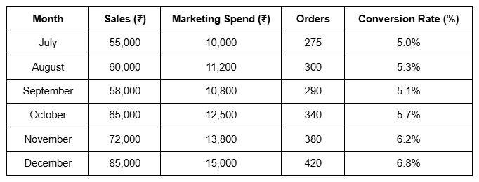
- Enter the headers in the first row:
- A1 → Month
- B1 → Sales (₹)
- C1 → Marketing Spend (₹)
- D1 → Orders
- E1 → Conversion Rate (%)
Next, fill in the rows with the monthly data shown in the table.
Organizing your data properly is important when you create a bar chart in Google Sheets, because the chart tool automatically reads the first column as labels and the numeric columns as values.
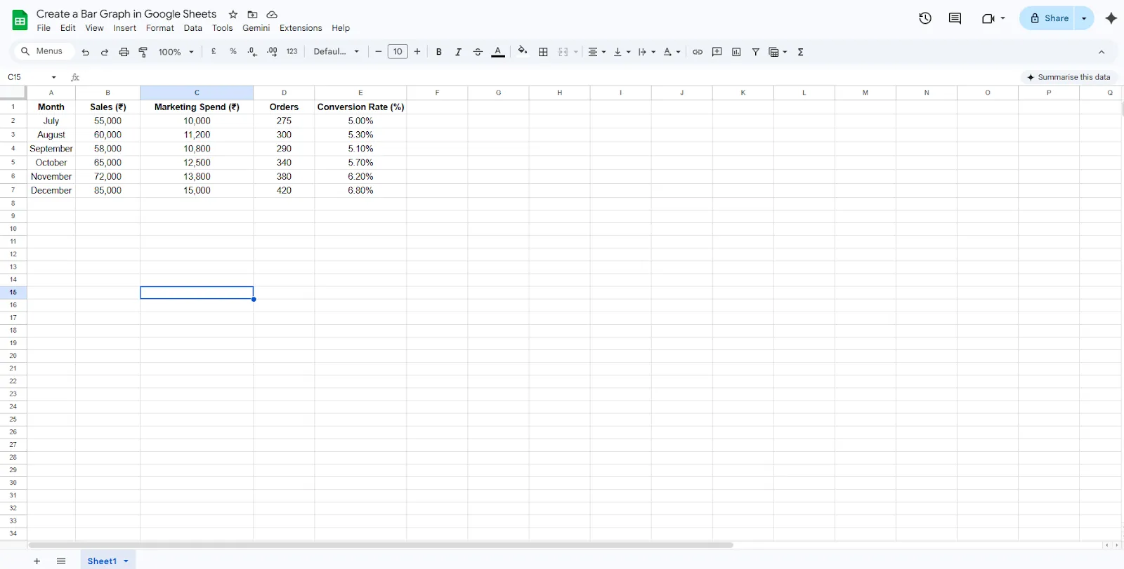
Step 2: Select the Data for the Chart
After entering the dataset, the next step is selecting the correct range of data.
For this example:
- Click on cell A1.
- Drag your cursor to B7 to select both the Month and Sales columns.
The selected range should look like this: A1:B7
This selection ensures that months appear on the axis while the sales values form the bars in the graph.
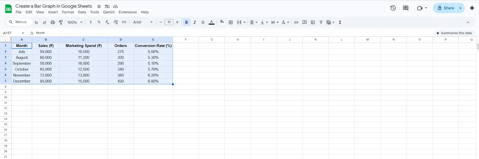
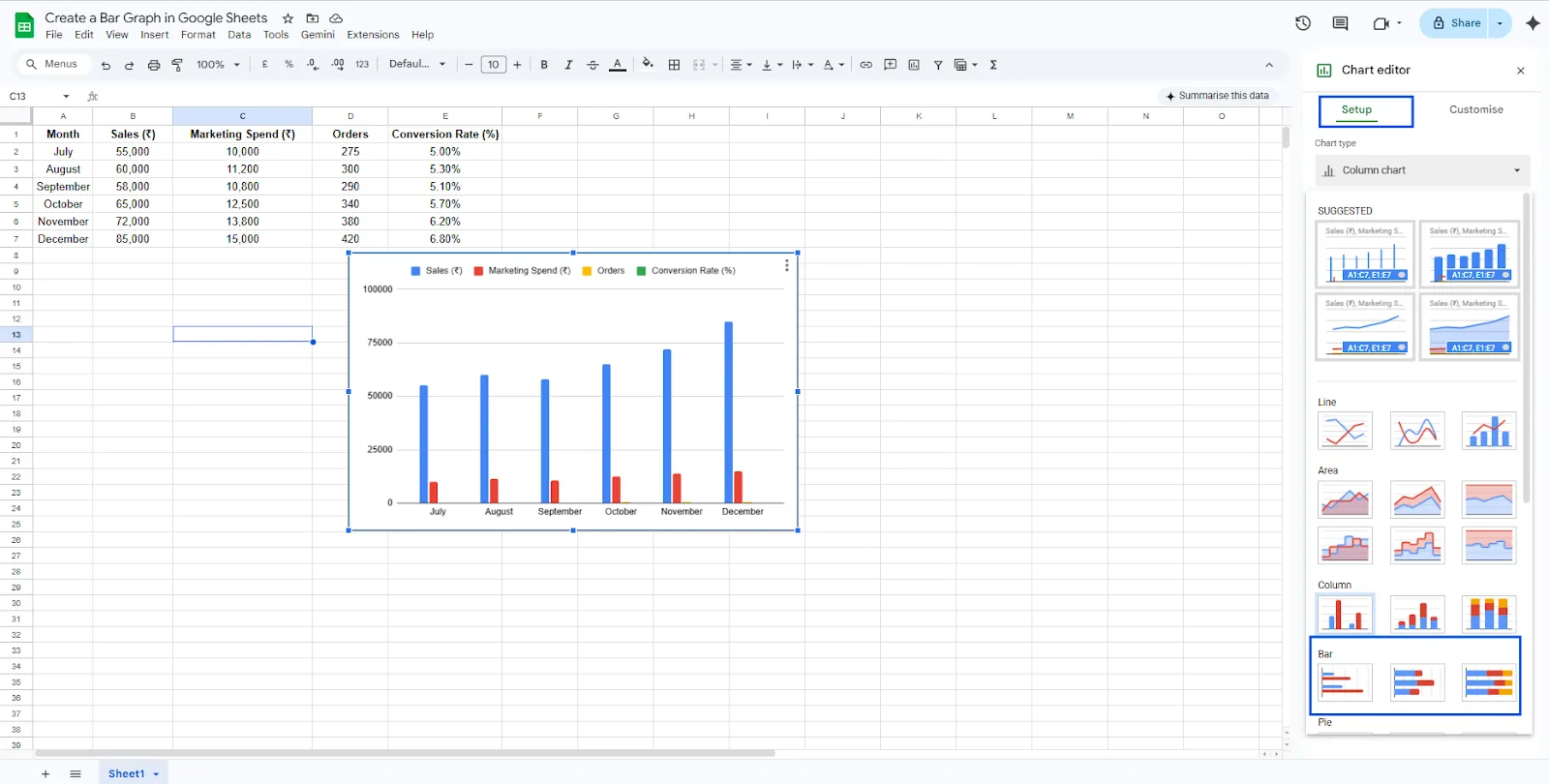
Step 3: Insert a Chart
Now you can generate the chart.
- Click Insert in the top menu.
- Select Chart.
Google Sheets will automatically create a graph in your spreadsheets. By default, Sheets may generate a column chart, but this can be changed easily in the next step.
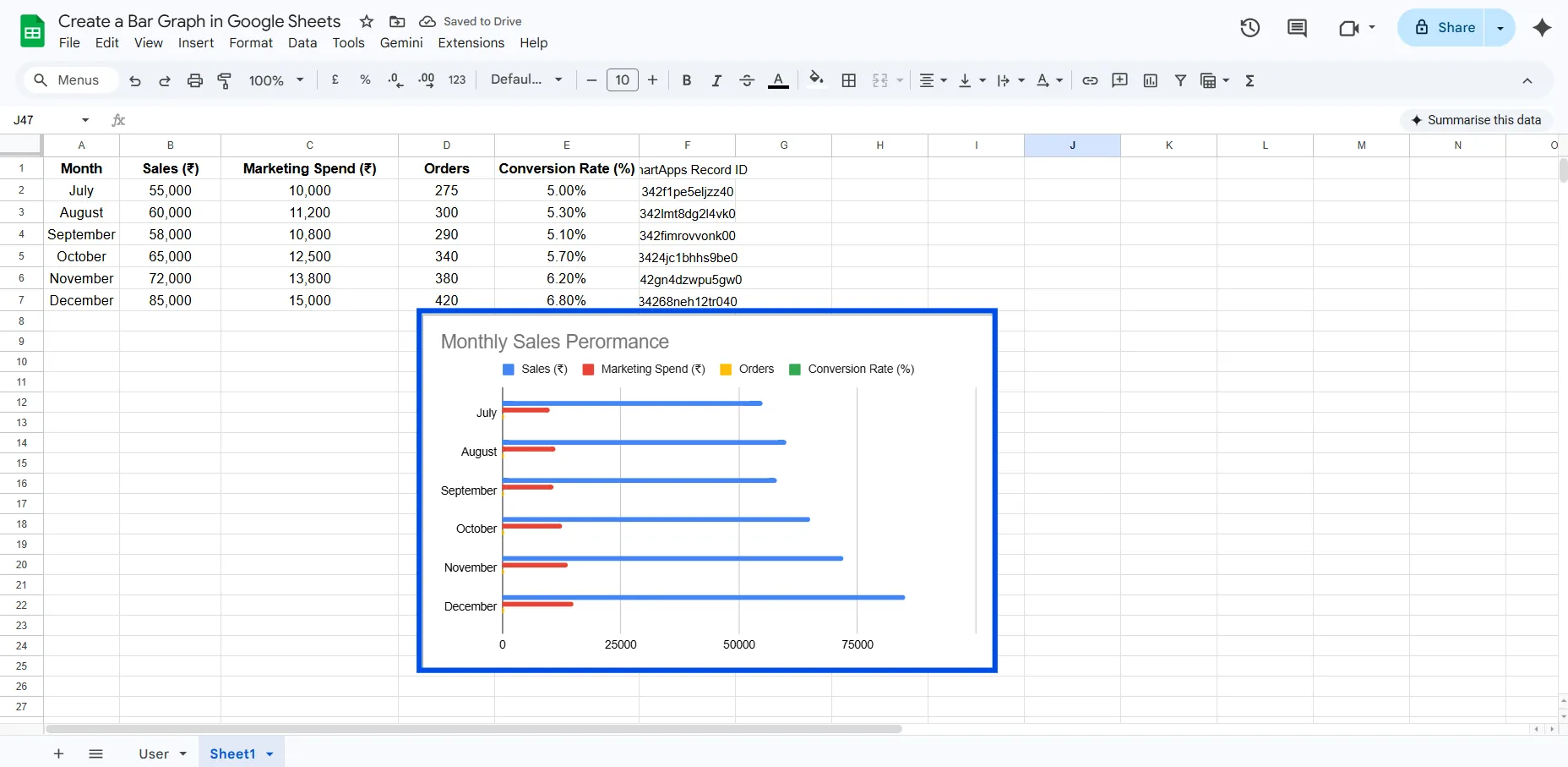
Step 4: Change the Chart Type to Bar Chart
To properly create a bar chart in Google Sheets, adjust the chart type.
- After inserting the chart, the Chart Editor panel will appear on the right side.
- Go to the Setup tab.
- Locate the Chart Type dropdown menu.
- Select Bar Chart.
Your visualization will now switch to a horizontal bar chart, where each bar represents the sales value for a specific month.
This format is especially useful when comparing multiple categories because it improves readability.
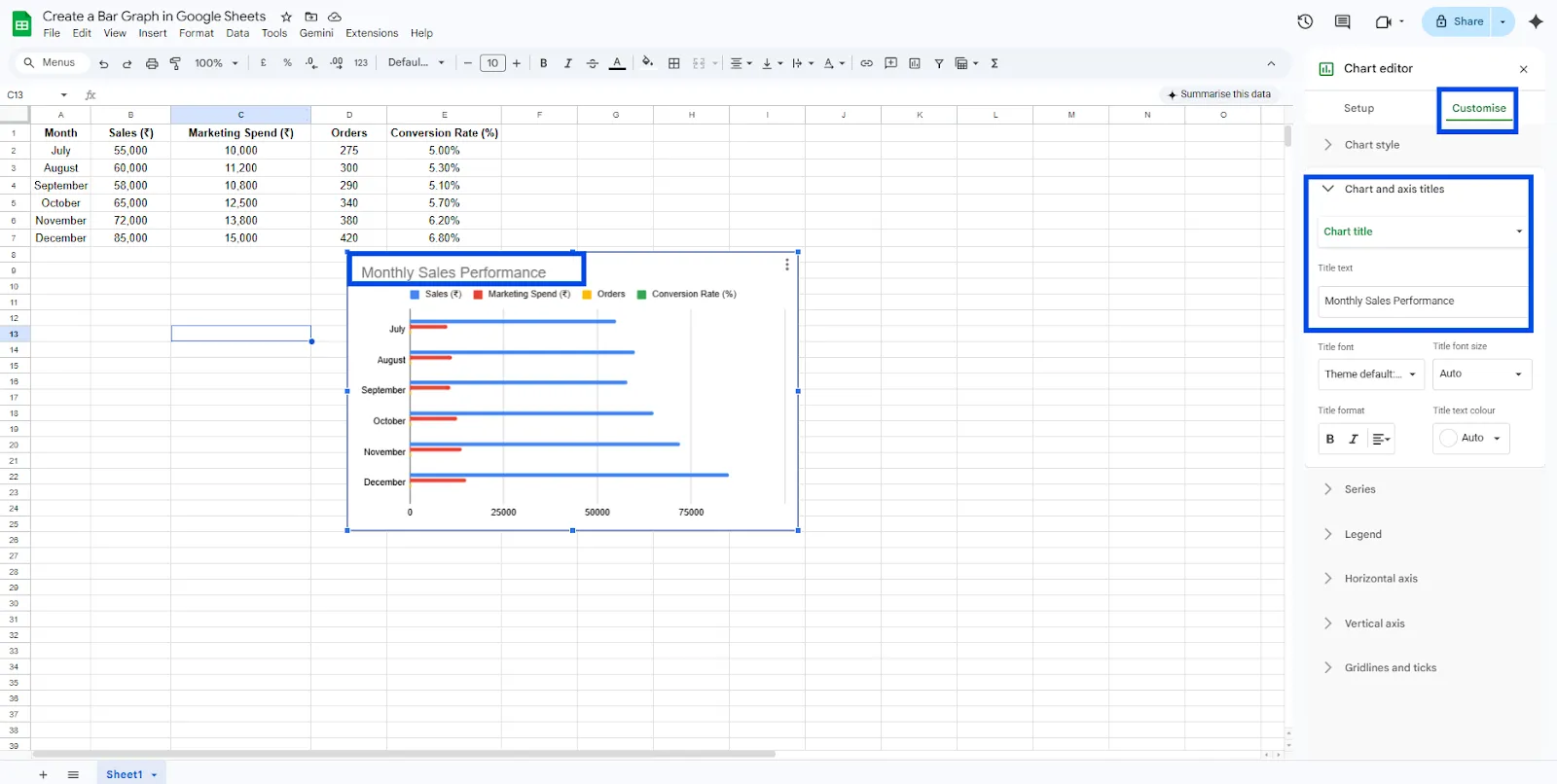
Step 5: Customize the Bar Chart
Customization helps make your chart more informative and visually appealing.
Add a Chart Title
- Go to Customize in the Chart Editor.
- Select Chart & Axis Titles.
- Add a title such as: Monthly Sales Performance
A clear title helps viewers understand the purpose of the chart immediately.
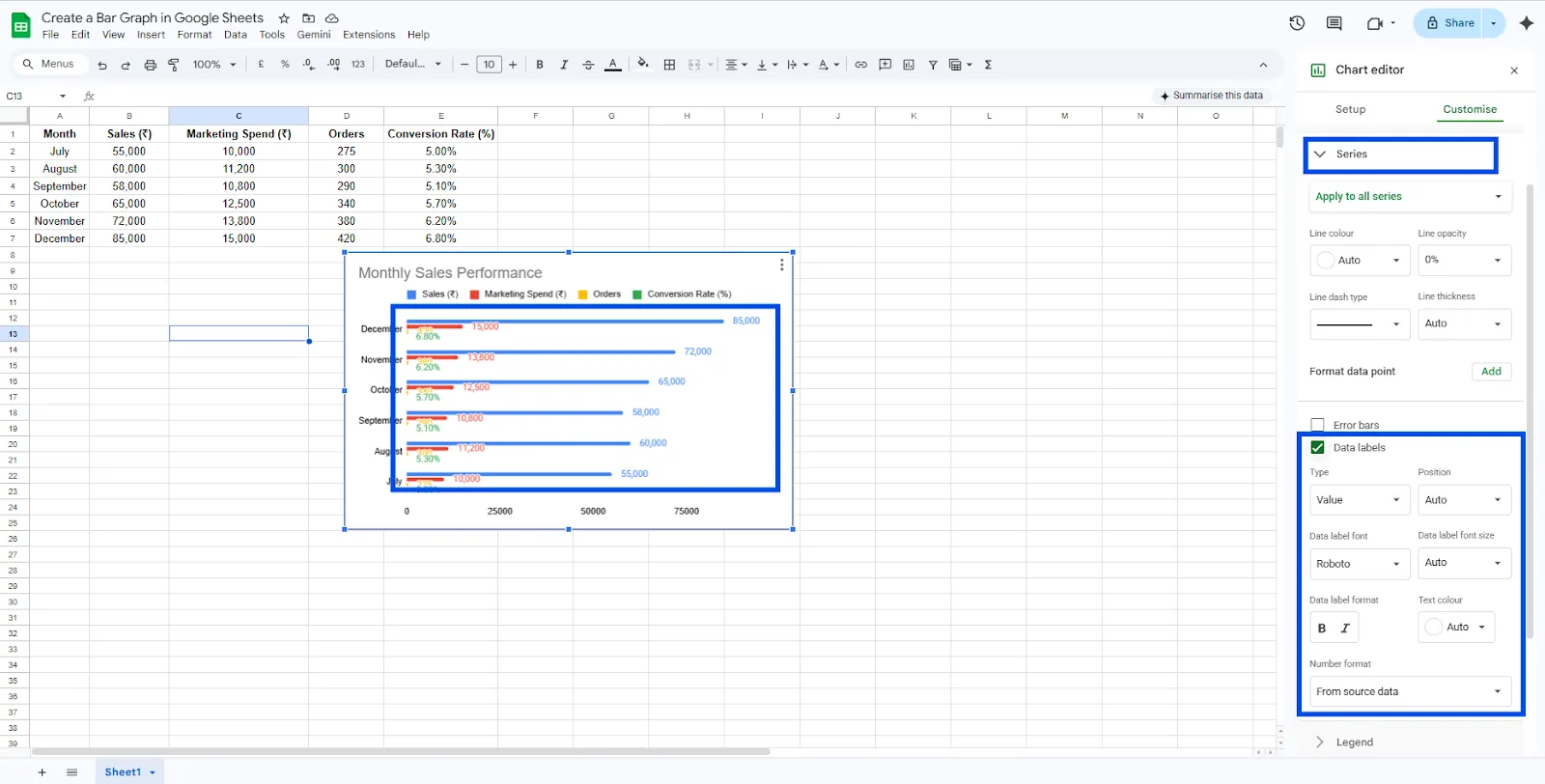
Enable Data Labels
To show exact numbers on each bar:
- Navigate to Customize → Series
- Enable Data Labels
This displays the actual sales values directly on the bars.
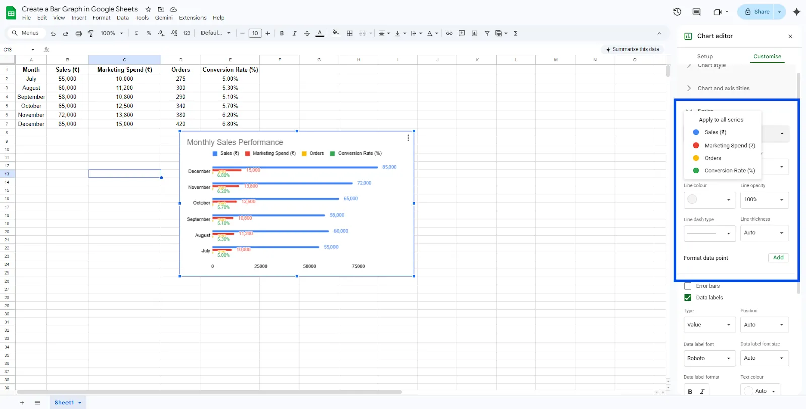
Change Bar Colors
You can also modify the appearance of the chart by changing the color of the bars:
- Go to Customize → Series
- Select a different color for better contrast or branding.
These small adjustments make your bar graph in Google Sheets easier to interpret.
Step 6: Resize or Move the Chart
Once your chart is ready, you can position it anywhere on the spreadsheet.
- Click and drag the chart to move it.
- Use the corners of the chart to resize it.
This is useful when preparing reports or dashboards inside Google Sheets.
Types of Bar Charts in Google Sheets
When you create a bar chart in Google Sheets, you can choose between different variations depending on how you want to present the data.
Standard Bar Chart
This is the most commonly used chart type. Each category is represented by a single horizontal bar, making it easy to compare values across categories such as months, products, or regions.
Stacked Bar Chart
A stacked bar chart allows you to display multiple data series within a single bar. Instead of showing separate bars for each dataset, the values are stacked together.
For example, you could compare Sales and Marketing Spend for each month. Each bar would contain segments representing the contribution of each metric.
This type of chart helps you understand both the total value and how different components contribute to that total.
How to Turn a Chart into a Stacked Bar Chart
- Click on the chart you created.
- Open the Chart Editor panel on the right.
- Go to the Setup tab.
- Scroll down to the Stacking option.
- Select Standard.
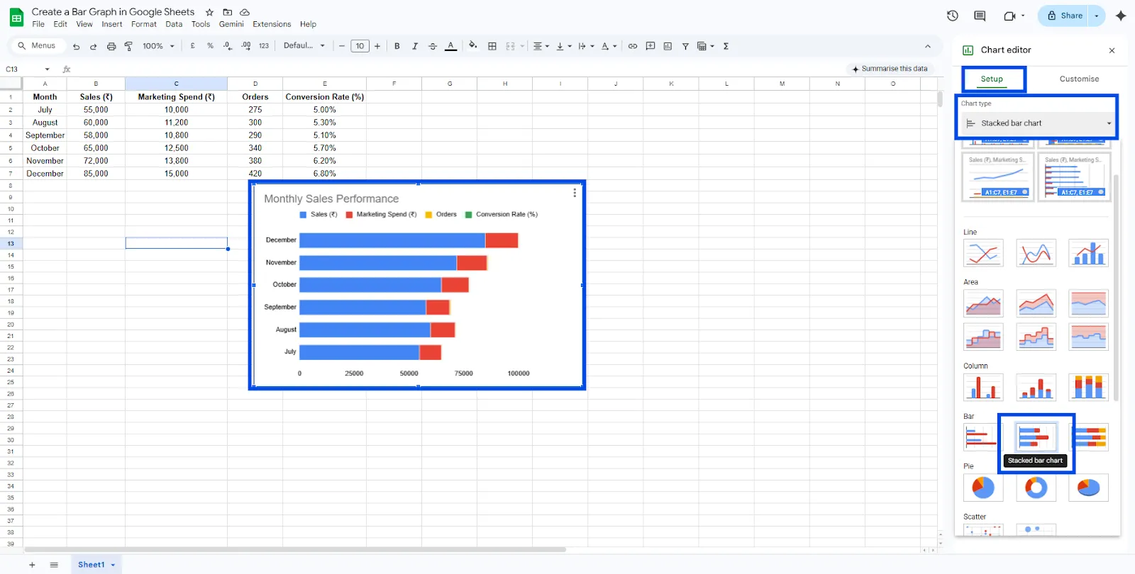
Google Sheets will now stack the values of multiple series into a single bar for each category.
Stacked charts are useful when you want to visualize how multiple variables combine to form a total value.
100% Stacked Bar Chart
A 100% stacked bar chart focuses on percentage distribution rather than absolute values. Each bar represents 100% of the total, and the segments within the bar show the relative contribution of each data series.
For example, if you are analyzing traffic sources, the chart can show how much each channel (organic, paid, referral, social) contributes to the total traffic.
How to Create a 100% Stacked Bar Chart
- Click on your bar chart in Google Sheets.
- Open the Chart Editor.
- Navigate to the Setup tab.
- Find the Stacking option.
- Select 100%.
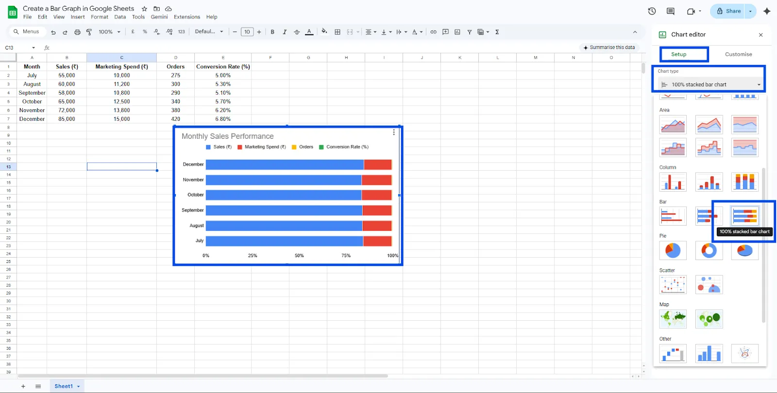
Google Sheets will convert the chart so that each bar equals 100%, while the segments show the percentage contribution of each data series.
This chart type is particularly useful when your goal is to compare proportions instead of raw values.
Using these variations, you can easily create a bar chart in Google Sheets that best fits your data analysis needs. Whether you want a simple comparison, a breakdown of totals, or a percentage distribution, Google Sheets provides flexible options for bar chart visualization.
When to Use a Bar Graph
A bar graph is best used when you want to compare values across different categories.
You should make a bar graph in Google Sheets when:
- You want to compare values across categories, such as months or products
- Your dataset contains discrete categories
- You want an easy-to-read visual comparison
- The differences between values need to be clearly highlighted
For example, using a bar chart to compare monthly sales helps quickly identify which months performed better.
Create Bar Charts Instantly with ChartApps
While Google Sheets provides a simple way to create bar charts, tools like ChartApps can help you generate bar charts faster and with more customization options.
ChartApps is a data visualization platform that allows you to quickly convert spreadsheet data into clean and professional charts. Instead of manually selecting chart types and adjusting settings, you can simply upload or connect your dataset and generate a bar chart instantly.
How to Create a Bar Chart Using ChartApps
Creating a bar chart in ChartApps is quick and straightforward.
- Sign up or sign in to ChartApps.
- Connect your Google Sheets data to ChartApps.
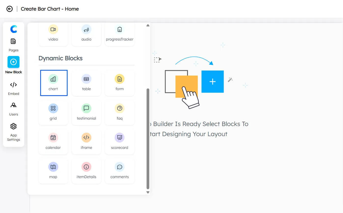
- Click “New Block” and add a Chart Block. A chart with dummy data will appear, allowing you to experiment with the chart.
- Select your Data Source
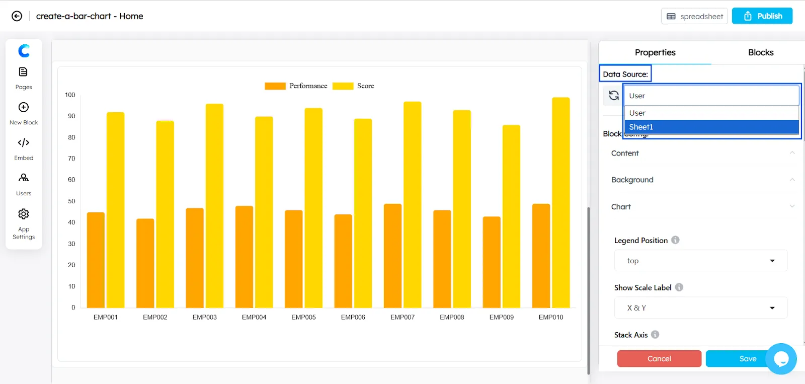
- Choose the X-axis in the Chart Configuration (for example, Month).
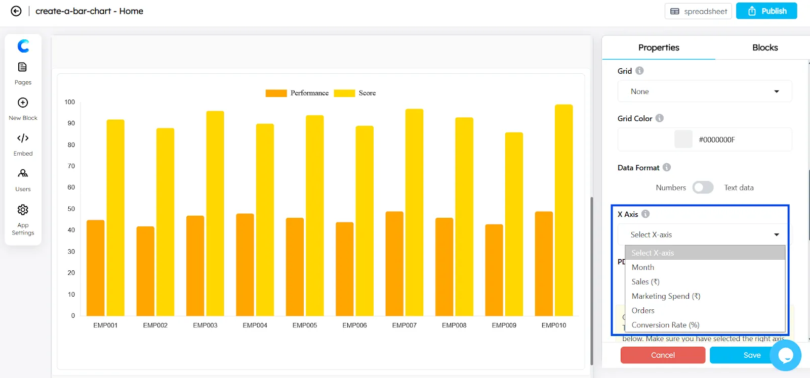
- Add the Y-axis using the Axes Configuration.
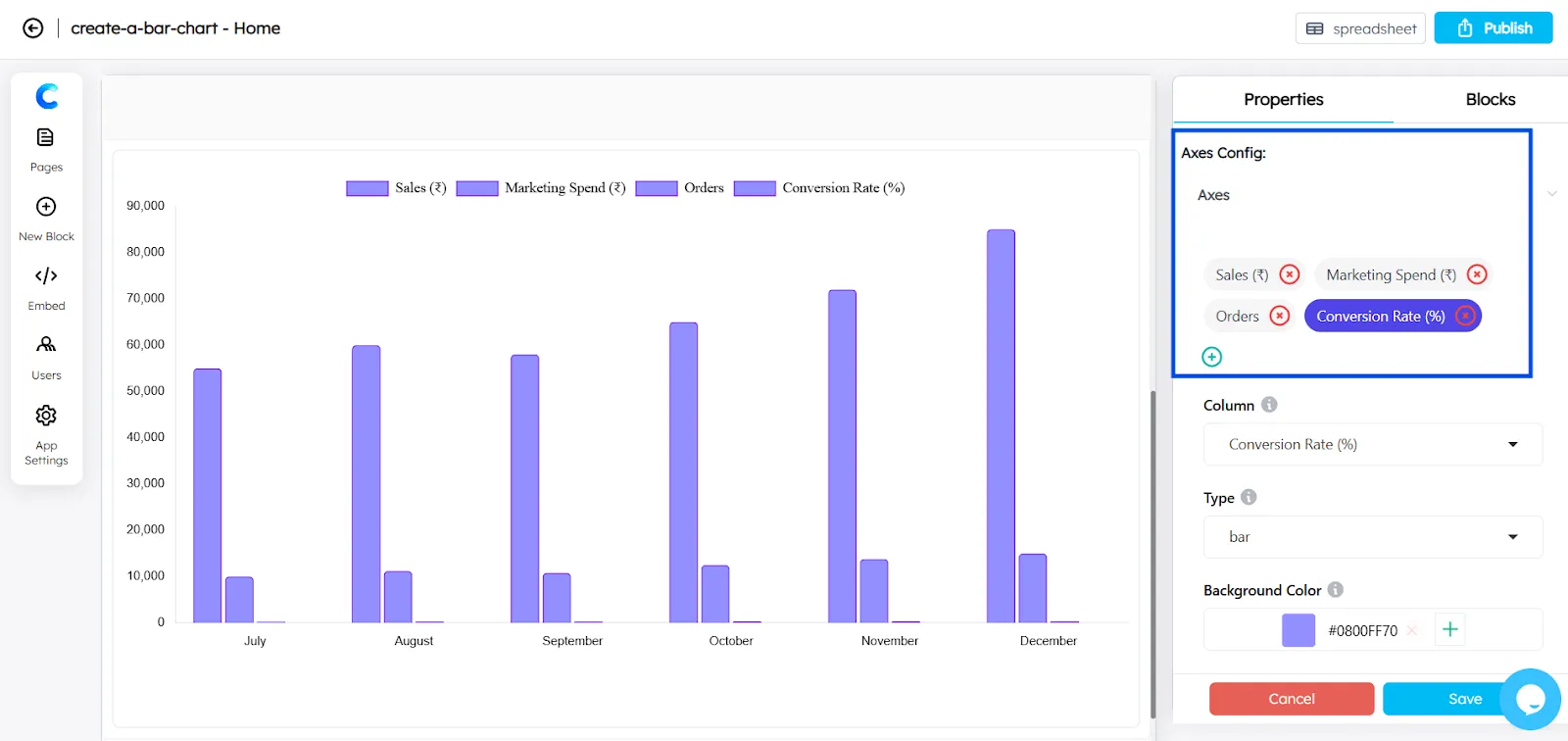
- You can select Bar Chart or Horizontal Bar Chart for each axis from the available chart types.
- You can convert the chart into a Stacked Bar Chart by enabling the “Stack” option in the axis settings.
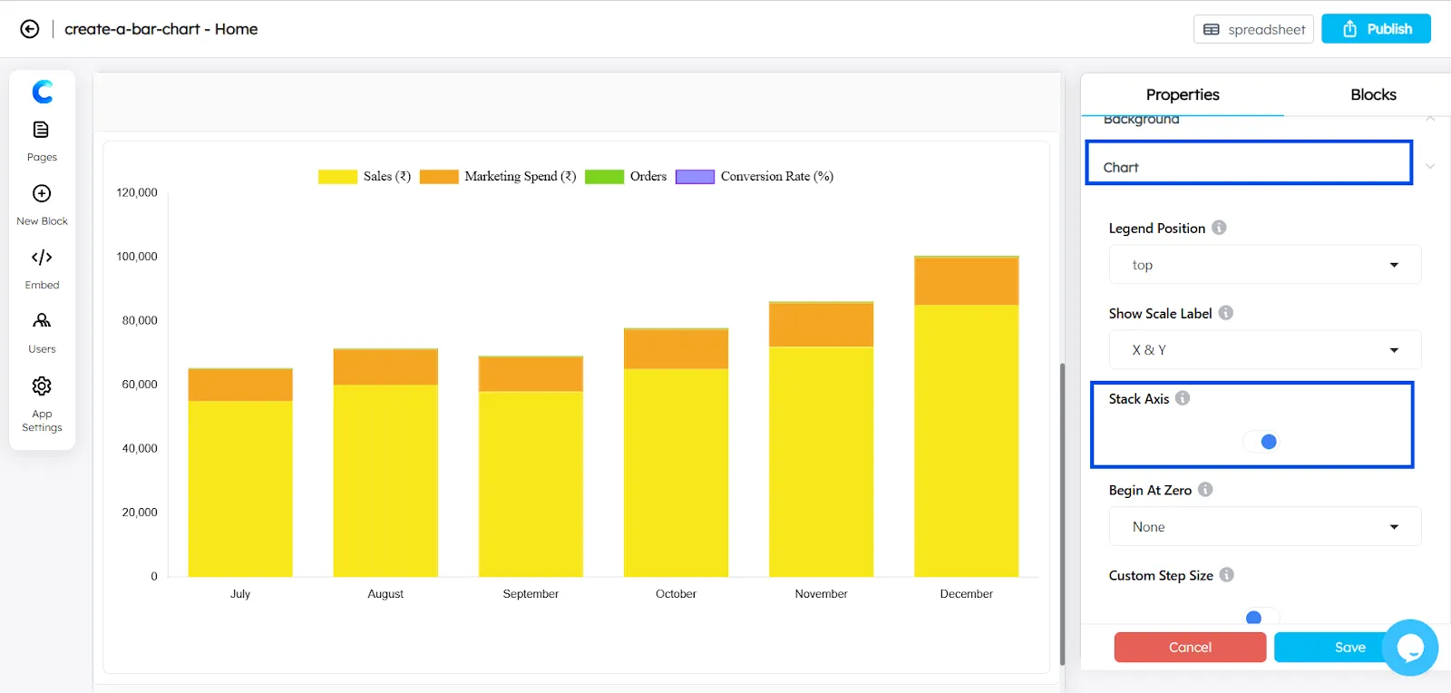
The graph in ChartApps is fully customizable, giving you greater control over how your data is displayed.
Final Result
After completing these steps, you will have successfully learned how to create a bar chart in Google Sheets using real data. The chart visually compares monthly sales and makes it easier to identify trends or growth over time.
Bar charts are widely used in business reporting, marketing analysis, and performance tracking because they provide a quick and clear way to compare values. With ChartApps, you can further customize and embed these charts to present your data more effectively.
Frequently Asked Questions
How to format a bar graph?
To format a bar graph, customize elements like the chart title, axis labels, colors, and data labels using the Chart Editor. Proper formatting improves readability and helps viewers understand the data quickly.
How to create a 3D bar chart in Google Sheets?
Select your data and click Insert → Chart, then choose Bar Chart in the Chart Editor. Enable the 3D option under the Customize settings to give the chart a three-dimensional appearance.
What are some common mistakes when making bar graphs?
Common mistakes include using too many categories, unclear labels, and inconsistent axis scales. Poor color choices and missing titles can also make the chart harder to understand.