If you've ever looked at a wall of numbers and thought there must be a better way, you're right. A pie chart turns rows of data into a visual story that anyone can read in seconds. And if you're working in Google Sheets, you're in luck: creating one is faster and easier than most people think.
In this guide, we'll walk you through exactly how to make a pie chart in Google Sheets, from scratch, step by step. Whether you're visualizing a budget, survey results, sales breakdown, or team task distribution, this tutorial has you covered. We'll also go beyond the basics and show you how to customize, troubleshoot, and get the most out of your Google Sheets pie charts.
TL; DR: Select your data → Insert → Chart → Change chart type to Pie → Customize → Done. Keep reading for the full walkthrough, pro tips, and common fixes.
What Is a Pie Chart (and When Should You Use One)?
A pie chart is a circular chart divided into slices, where each slice represents a category's proportion of the whole. The bigger the slice, the bigger its share.
Use a Google Sheets pie chart when:
- You have one data series (one set of values)
- You want to show how parts contribute to a total
- You have between 2 and 7 categories (too many slices get hard to read)
- Your data values are all positive numbers
Avoid pie charts when:
- You need to compare multiple data series
- You have more than 7 - 8 categories
- The differences between values are very small
Pro Tip: If your categories have very similar values, a bar chart often communicates differences more clearly than a pie chart. Refer to this article on how to create a bar graph in Google Sheets.
If You want to show change over time (use a line chart instead - see our step-by-step guide on how to create a line chart in Google Sheets)
Now, let’s walk through how to create a pie chart in Google Sheets.
Step 1 - Prepare Your Data the Right Way
Before you can create a pie chart in Google Sheets, your data needs to be structured correctly. This is where many people run into problems and it's usually a simple fix.
The Correct Data Format
Your spreadsheet needs exactly two columns:
- Column A: Category labels (text)
- Column B: Values (positive numbers)
Here's an example of well-structured data for a monthly budget pie chart:
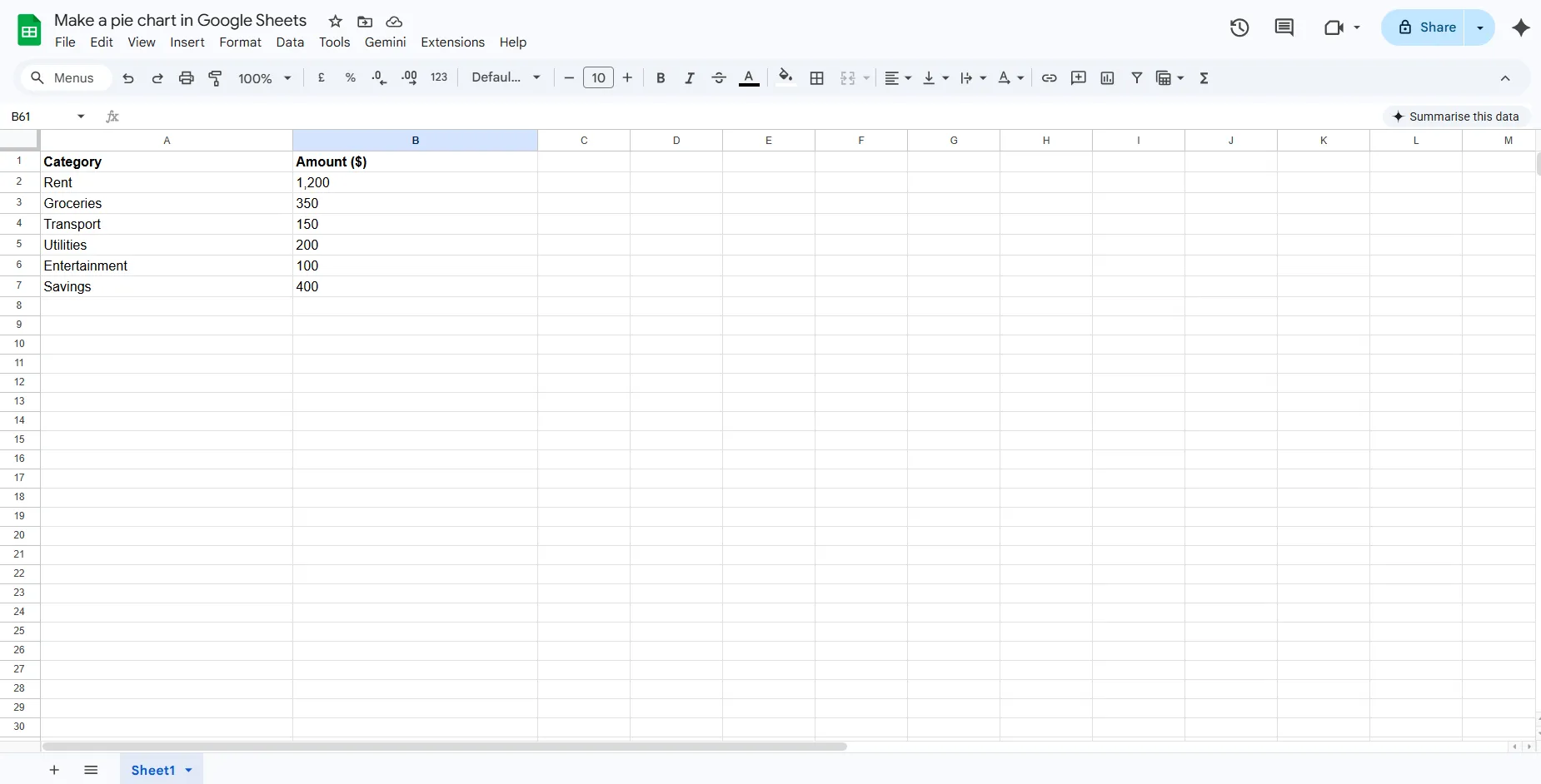
Note: Google Sheets needs positive numbers in the values column. Zero and negative numbers will be ignored and won't appear in the chart.
What If Your Data Is Non-Numeric?
A very common question in the Google Sheets community is: how do you create a pie chart when your data consists only of text categories with no numbers? For example, if there is a survey column with responses like “Yes,” “No,” and “Maybe,” there are no numeric values, only text.
The fix: use COUNTIF to count how many times each response appears, then chart those counts.
Example formula:
=COUNTIF(A:A,"Yes")
Once you have counts in a second column, you can create your pie chart from that new two-column range. This is the right approach for survey data, form responses, and any other text-based categories.
Step 2 - How to Create a Pie Chart in Google Sheets (Step-by-Step)
Here's the complete process for creating a Google Sheets pie chart, explained clearly.
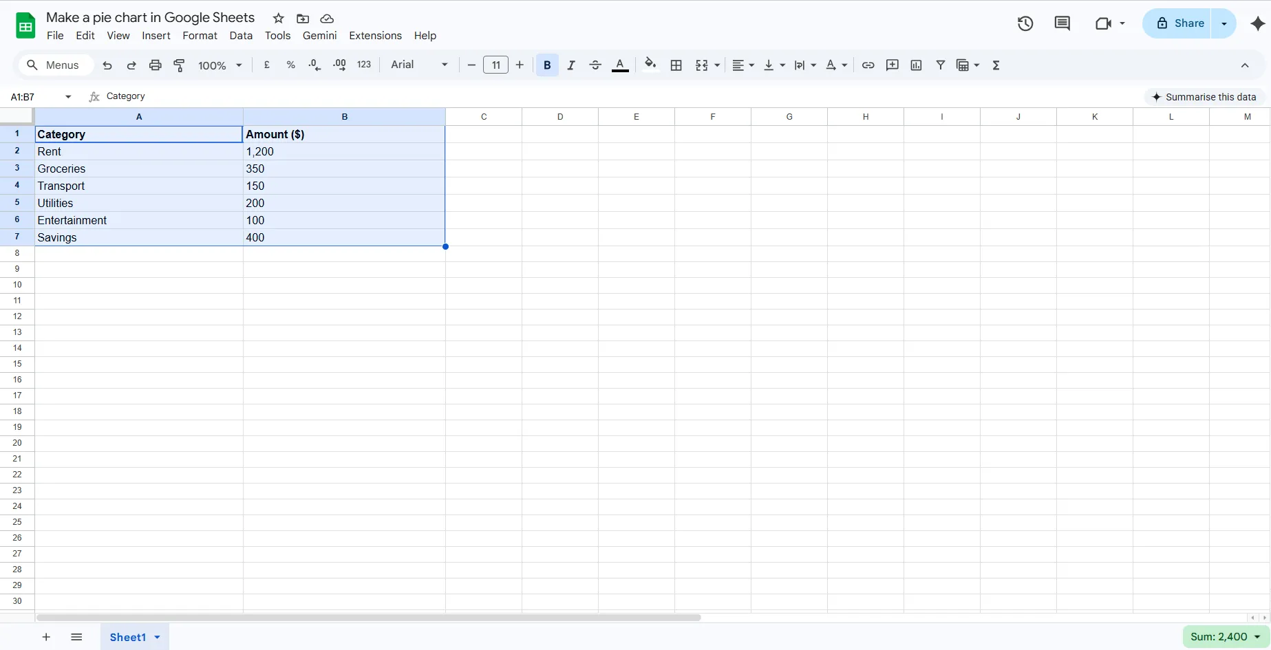
Select Your Data
Click on the first cell of your data, for example A1, and drag to include all your categories and values, such as A1:B7. Make sure your header row is included, as Google Sheets uses it to label the chart.
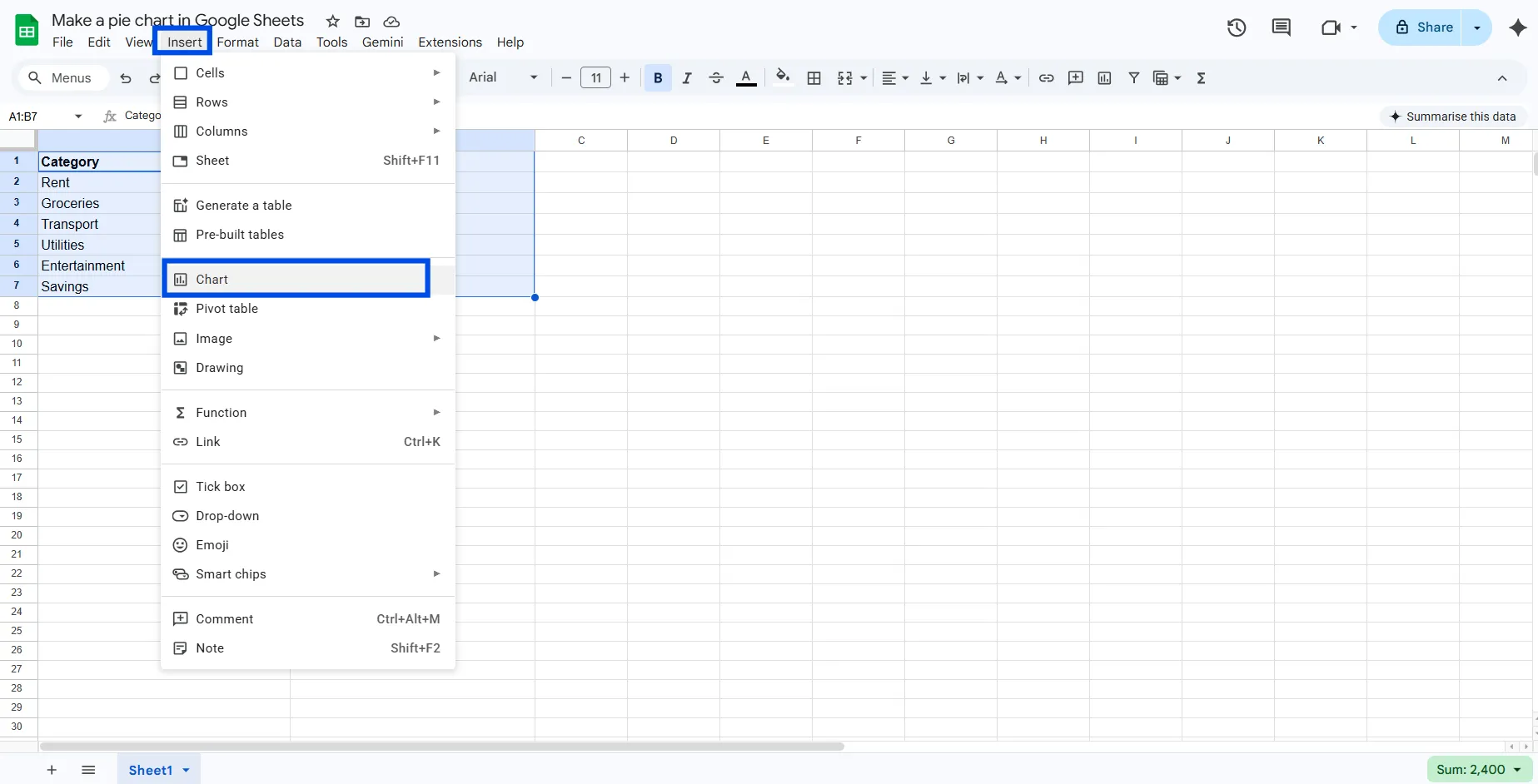
Open the Insert Menu
With your data selected, click Insert in the top menu bar, then click Chart. Google Sheets will immediately create a chart in your spreadsheet and open the Chart Editor panel on the right side of the screen.
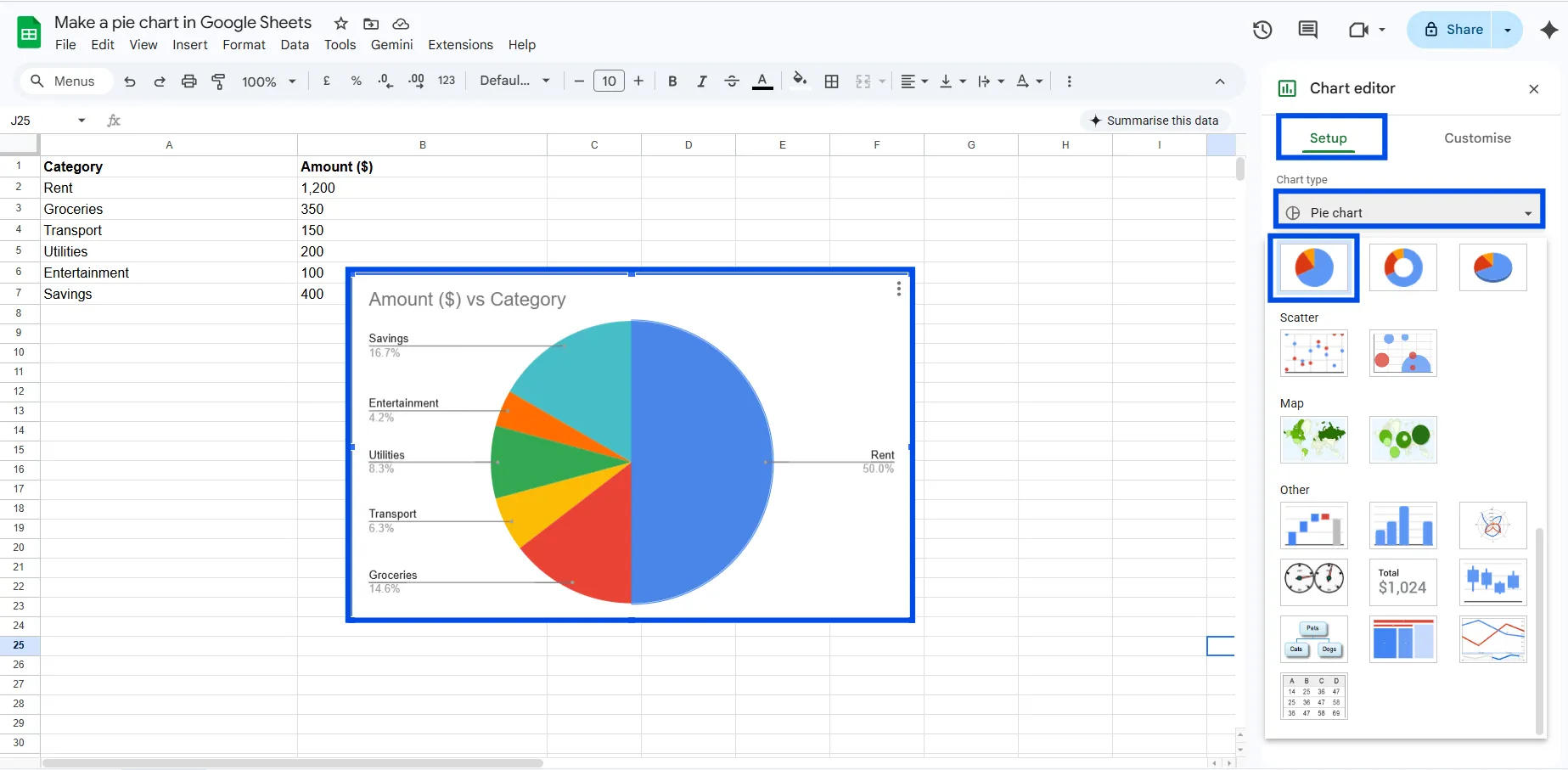
Change the Chart Type to Pie
In the Chart Editor, under the Setup tab, look for the Chart type dropdown. Click it and scroll down to find the pie chart. Select it to switch your chart to a pie chart. Google Sheets might automatically detect the pie chart type if your data is formatted correctly, but it is best to double-check.
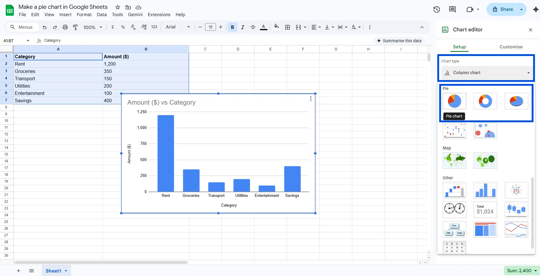
Verify Your Data Range
Still in the Setup tab, confirm that the Data range field shows the correct range (e.g., A1:B7). If it looks wrong, click the field and manually type or select the right range.
Click Customize to Style It
Click the Customize tab at the top of the Chart Editor. This is where you can change colors, add percentage labels, move the legend, and more. We'll cover customization in detail in the next section.
Step 3 - Customize Your Google Sheets Pie Chart
A default pie chart gets the job done, but a customized one gets noticed. Here's how to make yours look clean and professional.
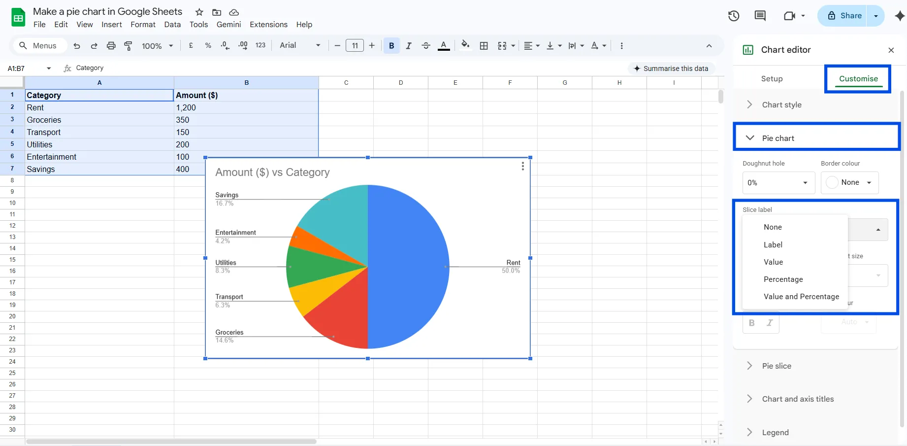
How to Add Percentage Labels to Pie Slices
By default, Google Sheets may not show labels on your pie slices. To add them:
- Double-click your chart to open Chart Editor
- Go to Customize > Pie chart
- Under the Slice label, choose: Label (shows category name), Value (shows the number), or Percentage (shows the % of the whole)
Percentage labels are usually the most informative option for a Google Sheets pie chart.
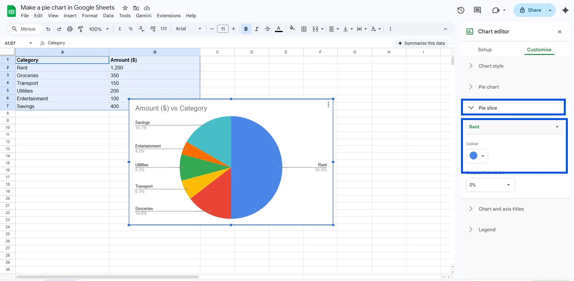
How to Change Pie Slice Colors
- Open Chart Editor (double-click the chart)
- Go to Customize > Pie slice
- Select a specific slice from the dropdown
- Use the color picker to choose a new color
Tip: Use your brand colors or a consistent color palette to make the chart look more intentional and polished.
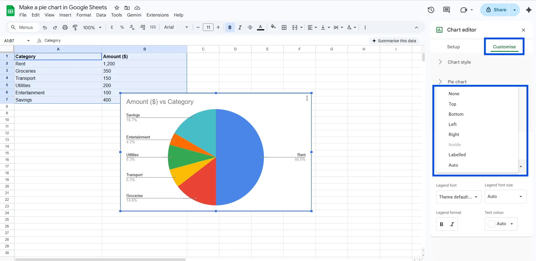
How to Move or Format the Legend
- Go to Customize > Legend
- Change the Position to Bottom, Top, Left, Right, or None
- Adjust font size and style as needed
For presentations, placing the legend at the bottom usually makes the chart layout feel more balanced.
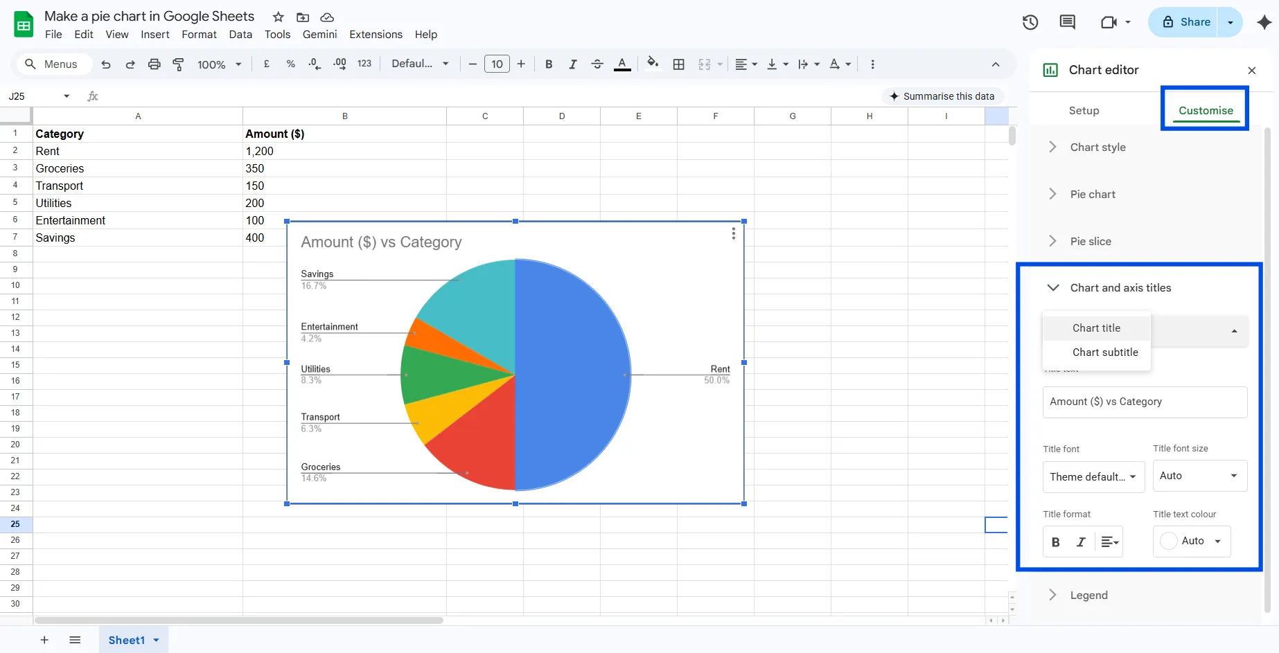
How to Add a Chart Title
- Go to Customize > Chart & axis titles
- Type your title in the Title text field
- Format the font, size, and color to match your document style
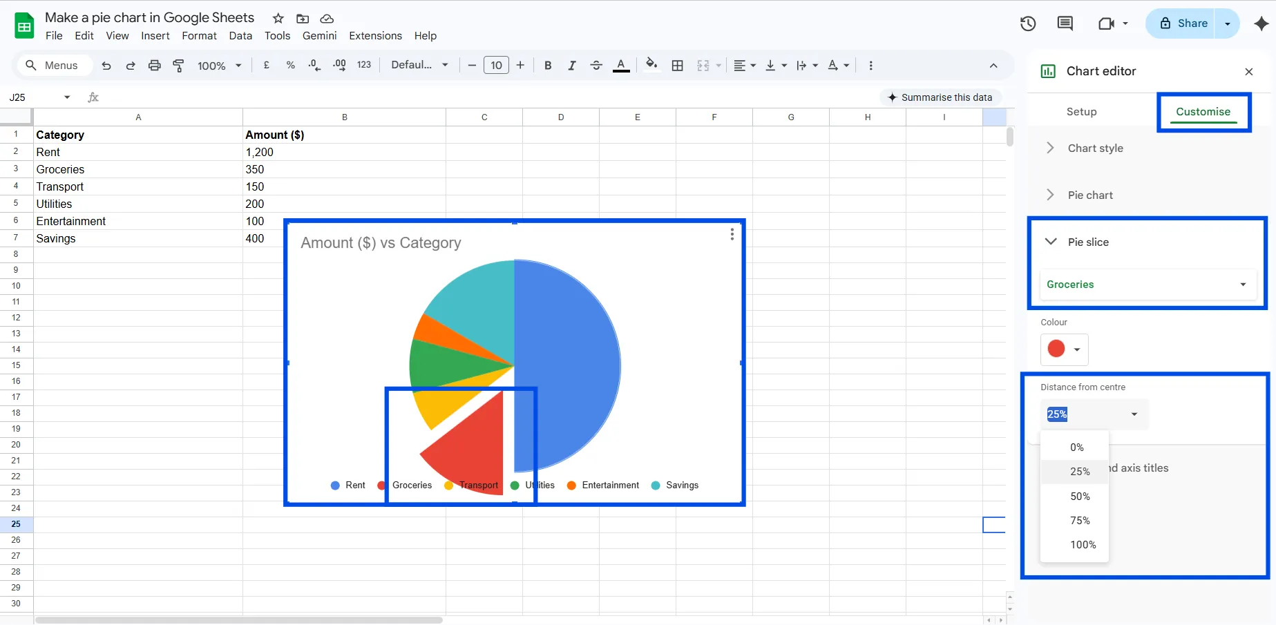
How to Pull Out a Slice (Exploded Pie Chart)
Want to draw attention to one slice? You can pull it away from the center:
- Go to Customize > Pie slice
- Select the slice you want to highlight
- Increase the Distance from center slider
This is great for emphasizing a specific category, like the biggest expense in a budget breakdown.
Pie Chart Variations in Google Sheets
Google Sheets gives you a few different pie chart styles. Here's when to use each one.
Standard Pie Chart
The classic circular pie chart. It is best for straightforward part-to-whole comparisons with 3 to 6 categories.
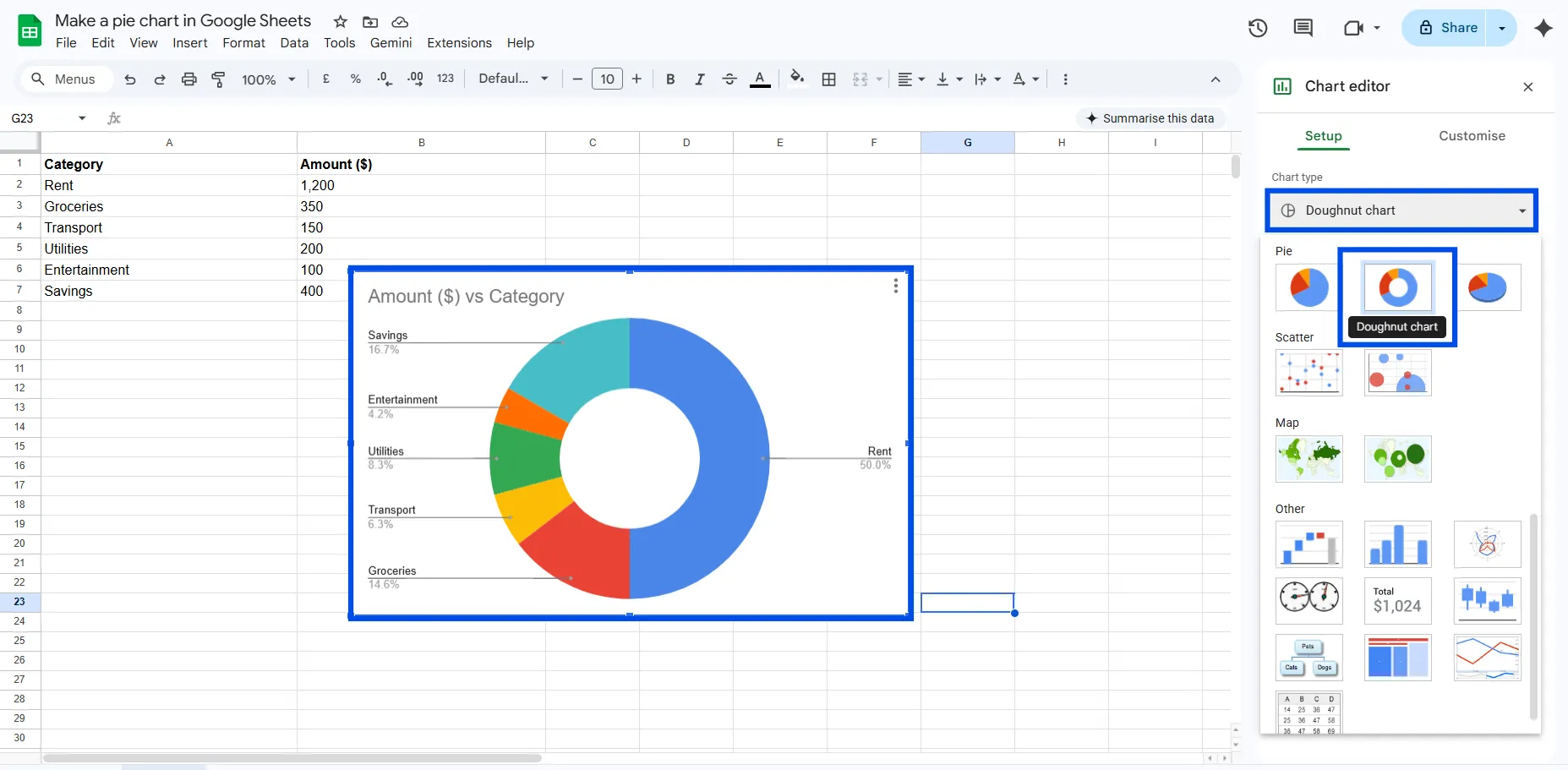
Doughnut Chart
A doughnut chart is essentially a pie chart with the center removed. It has a cleaner, more modern look and works well in dashboards. To create one, go to Chart Editor > Customize > Pie chart and increase the Donut hole percentage slider.
3D Pie Chart
Google Sheets also supports a 3D pie chart option under Chart type. It adds visual depth but use it carefully because 3D charts can distort slice sizes and make comparisons harder to interpret. It is best used for presentation aesthetics.
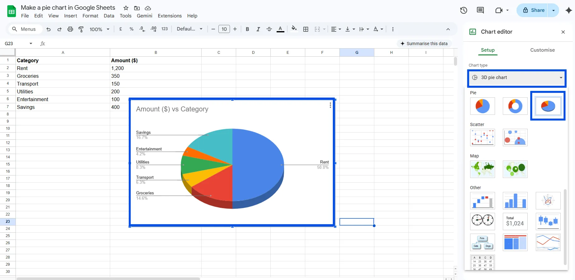
Tip: For data accuracy and clarity, flat 2D pie charts and donut charts are almost always better choices than 3D pie charts.
Common Problems and How to Fix Them
Google Sheets shows a bar chart instead of a pie chart
Fix: Manually change the chart type in Chart Editor > Setup > Chart type > Pie chart.
My pie chart is missing some categories
Fix: Check your data for zero values, negative numbers, or empty cells. Google Sheets automatically excludes these. Either remove them or replace zeros with a very small number if you still want them visible.
The chart shows numbers instead of category names
Fix: Make sure your first column contains text labels. If Google Sheets is treating your label column as data, you may need to adjust which column is set as labels in Chart Editor > Setup > Label.
Non-numeric data isn't charting
Fix: You can't directly chart text responses. Use COUNTIF to convert your text data into counts, then chart those counts. See the data preparation section above.
My pie chart doesn't update after I edit the data
Fix: Google Sheets charts are linked to their data range and should auto-update. If they don't, double-click the chart and verify the data range in Chart Editor > Setup > Data range.
Pro Tips for Better Google Sheets Pie Charts
- Keep it to 5-6 slices maximum. More than that, and the chart becomes hard to read. Group smaller categories into an 'Other' bucket.
- Always use percentage labels. Raw numbers in a pie chart are less intuitive than percentages.
- Sort your data before charting. Largest to smallest (or grouped logically) makes the chart easier to interpret.
- Use consistent colors. If you use blue for 'Marketing' in one chart, use blue for 'Marketing' everywhere.
- Give your chart a clear, descriptive title. Don't make readers guess what they're looking at.
- Consider a donut chart for dashboards. It has a modern look and you can add a summary number in the center using a text box.
- Test with a colleague. If someone unfamiliar with the data can't read your chart in 5 seconds, simplify it.
Share or Export Your Pie Chart
Share as Part of the Google Sheet
Click the Share button in the top right corner of Google Sheets and set the appropriate permissions. Anyone with the link can view the chart within the spreadsheet.
Download as an Image
Click the chart to select it, then click the three-dot menu, choose Download, and select PNG, PDF, or SVG. PNG is best for presentations and documents.
Embed in Google Slides or Docs
Copy the chart using Ctrl+C or Cmd+C, go to your Google Slides or Docs file, and paste it. You will have the option to link the chart so it updates automatically whenever the source data changes, which is a very useful feature.
Create a Pie Chart in ChartApps
Creating a pie chart in ChartApps is a simple process that lets you quickly transform your data into a clear visual.
Step 1: Sign Up or Sign In
Step 2: Connect Your Google Sheets Data
Link your Google Sheets file to ChartApps so your data can be imported and updated automatically.
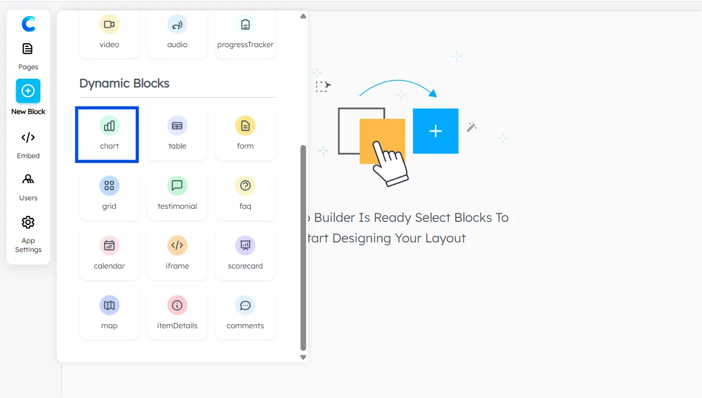
Step 3: Add a Chart Block
Click “New Block” and select Chart Block.
A chart with dummy data will appear, allowing you to preview and experiment with the layout.
A chart with dummy data will appear, allowing you to preview and experiment with the layout.
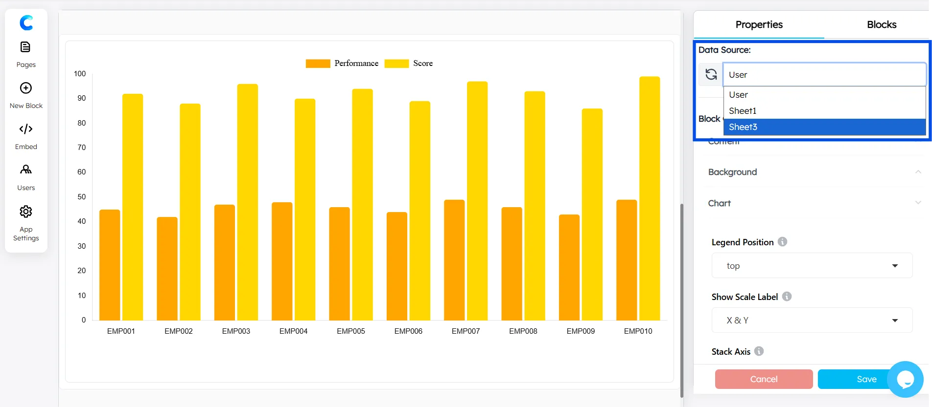
Step 4: Select Your Data Source
Choose the connected Google Sheets dataset you want to visualize.
Step 5: Configure the X-axis
In the Chart Configuration panel, select the X-axis (for example, Category labels).
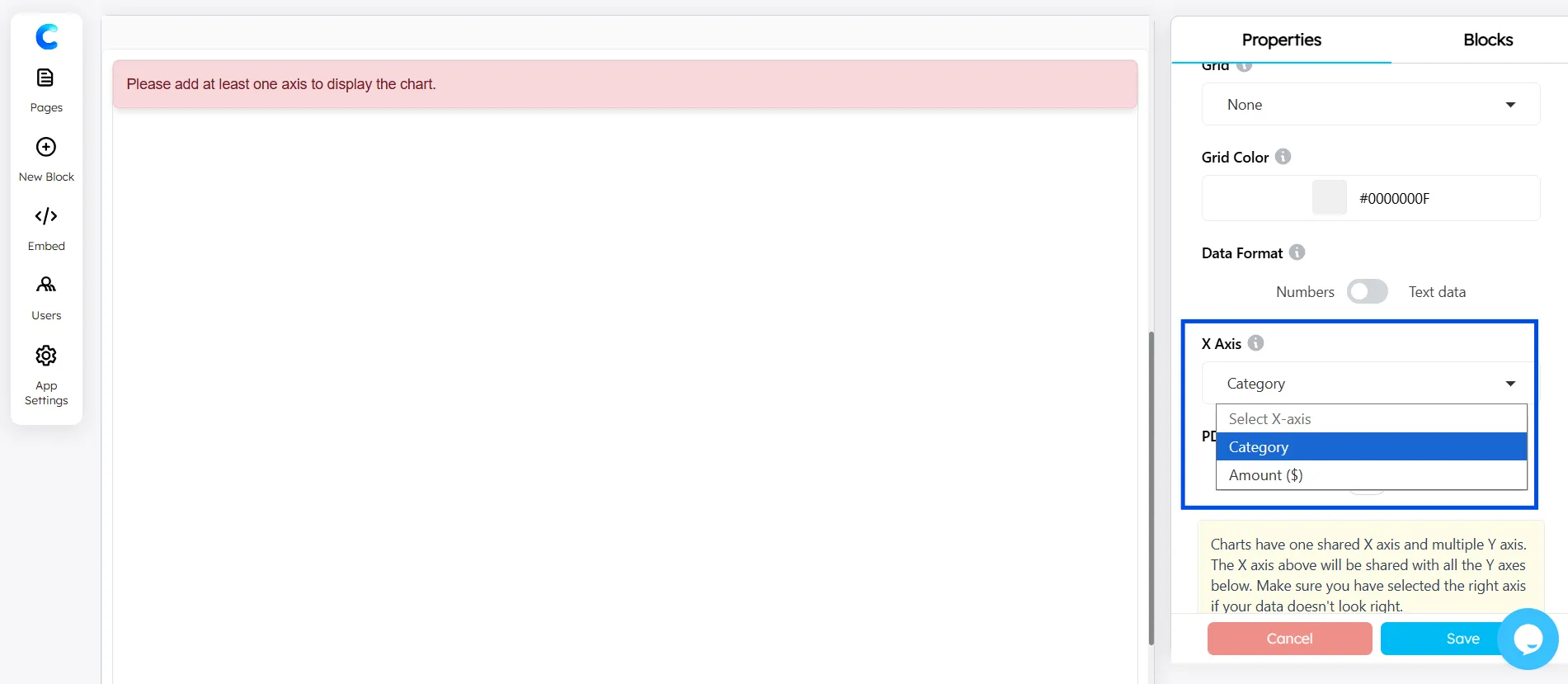
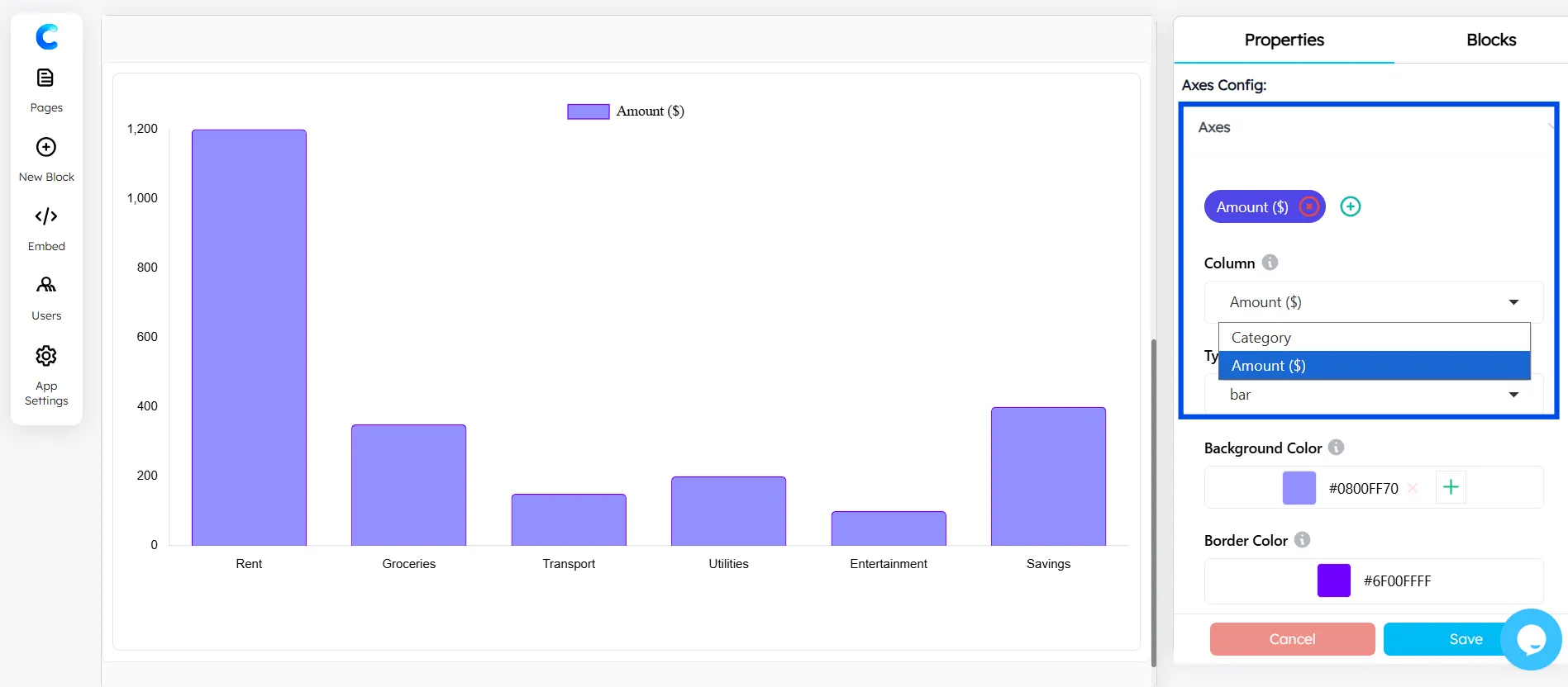
Step 6: Add the Y-axis
Use the Axes Configuration to define the Y-axis values (numerical data).
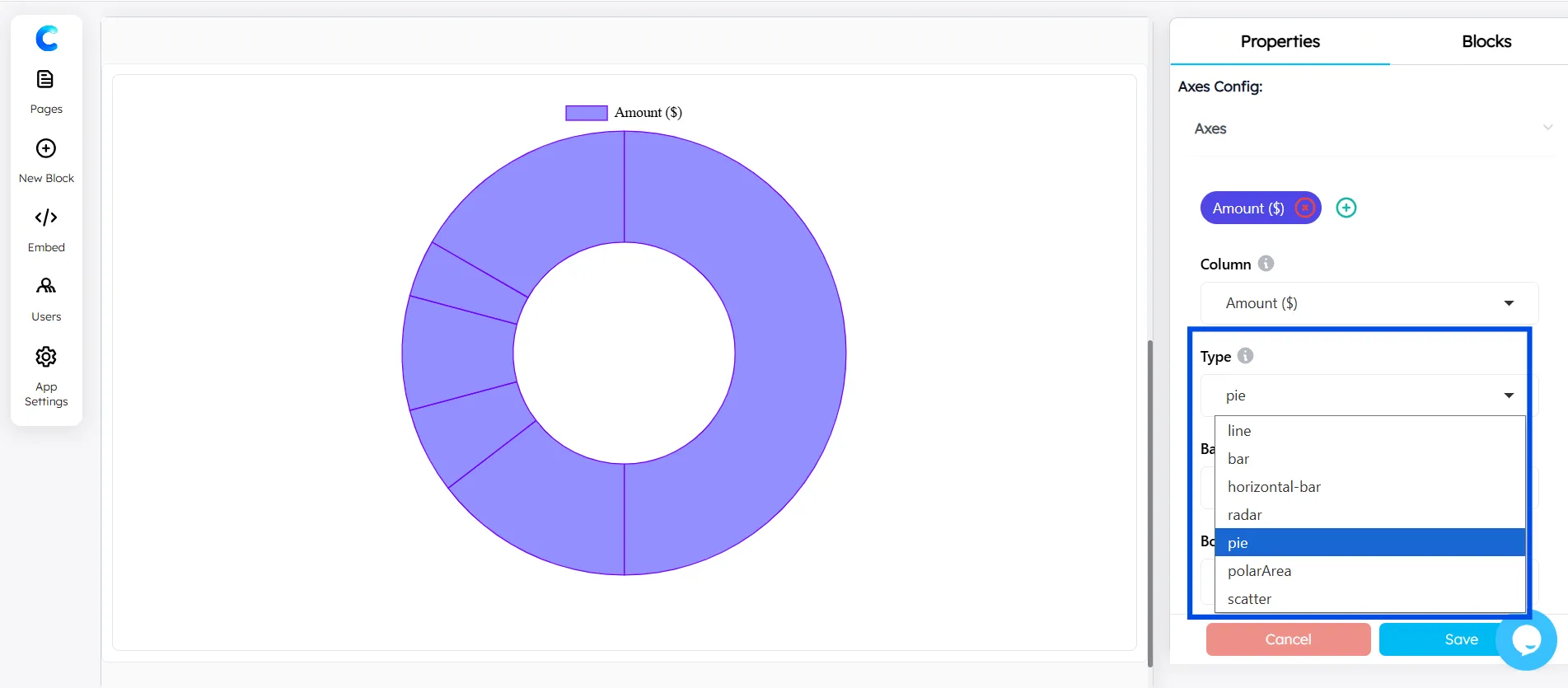
Step 7: Choose Pie Chart Type
Select Pie Chart as the chart type to display your data as proportional slices.
Step 8: Add Colors for Your Slices
To customize the appearance, click on the Plus (+) icon in the Background color section under Axes Configuration.
Assign different colors to each slice to make your chart more visually engaging and easier to interpret.
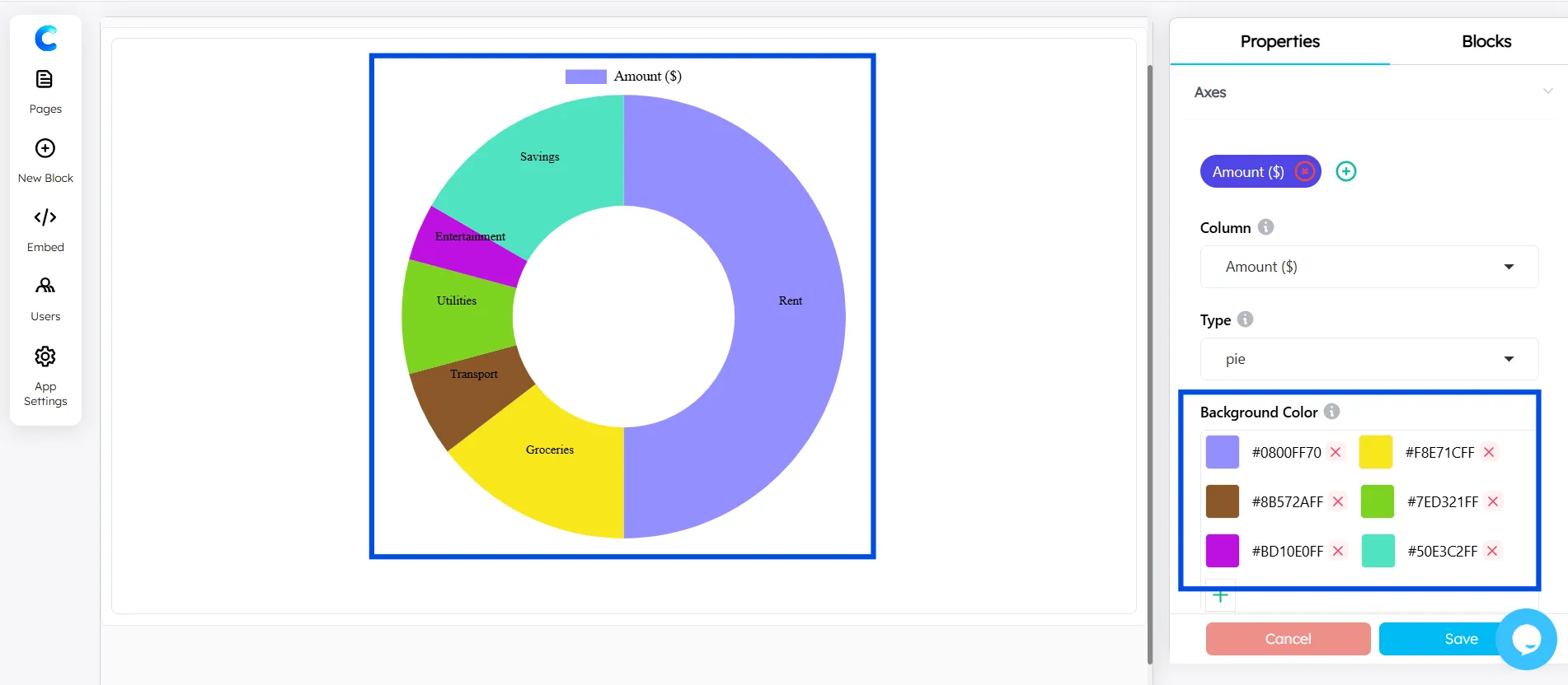
The pie chart in ChartApps is fully customizable, giving greater control over how data is visualized and styled. Colors, labels, and layout can be adjusted to create clean, professional, and presentation-ready charts.
Conclusion
Creating a pie chart in Google Sheets is one of the fastest and most effective ways to visualize data. By preparing two-column data, selecting it, inserting a chart, and switching to a pie chart format, users can generate clear visuals in minutes.
To make a pie chart more impactful, it is important to customize it properly. Adding percentage labels, improving slice readability, and including a clear title ensures better data communication and user understanding.
Pie charts are widely used for financial breakdowns, survey analysis, and task distribution. For more advanced visualization, integrating Google Sheets with ChartApps allows users to create interactive charts, apply advanced styling, and embed visuals into websites or dashboards. This combination enhances both usability and presentation quality, making data more engaging and accessible.
Frequently Asked Questions
Does a pie chart in Google Sheets update automatically?
Yes. Because the chart is linked to your data range, any changes you make to the underlying data will be reflected in the chart automatically in real time.
Can I use a pie chart for percentage data?
Absolutely. In fact, percentage data is perfect for pie charts. If your values already add up to 100%, Google Sheets will represent each one as its actual share of the whole.
How many data points can a Google Sheets pie chart handle?
Technically, there's no hard limit, but visually, more than 7-8 slices become hard to read. For larger datasets, group smaller values into an 'Other' category.